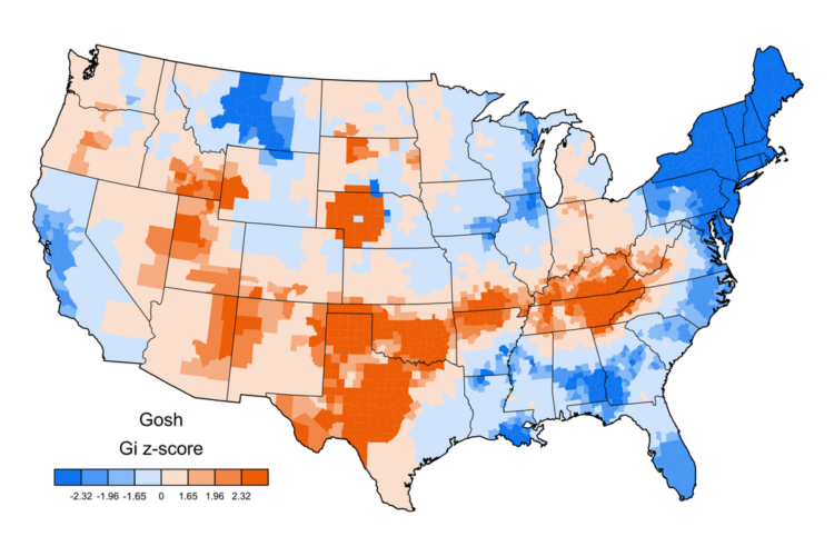
Linguist Jack Grieve posted a bunch of maps that show swearing geographically, based on geotagged tweets. Above is the map for “gosh”. The more red, the higher the relative usage in a county and the more blue, the less usage.
Read More
Linguist Jack Grieve posted a bunch of maps that show swearing geographically, based on geotagged tweets. Above is the map for “gosh”. The more red, the higher the relative usage in a county and the more blue, the less usage.
Read More
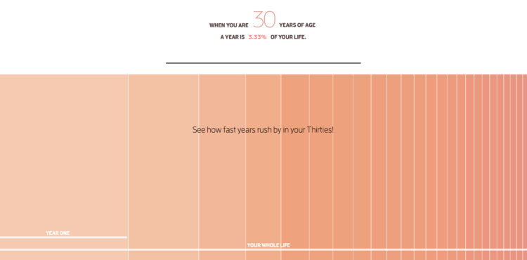
When you’re a kid, a year seems like forever. Appending “and a half” to an age seems significant and necessary. But as you get older, the years seem shorter. Heck, I can’t even remember how old I am half the time. Maximilian Kiener uses an interactive timeline to argue why this is. The more years you’re alive, the lower the percentage a year actually is of your life. And eventually, one year is just a tiny sliver.
The Aral Sea in Uzbekistan, formerly one of the largest lakes in the world, has been drying up since the 1960s and is currently 10% its original size. Peter Vojtek made a 3-D paper model that shows the shrinkage — from 1957 on top, down to 2007. Each layer represents the surface outline during the corresponding year on the right.
Vojtek also provides his paper template in case you want to fashion your own box. Nice.
Somehow these space-in-perspective graphics and interactives never get old. I guess the size of space is just that mind-blowing. In the latest addition to the collection, Josh Worth imagines the moon as one pixel for size and from there provides “a tediously accurate scale model of the Solar System.”
Read More
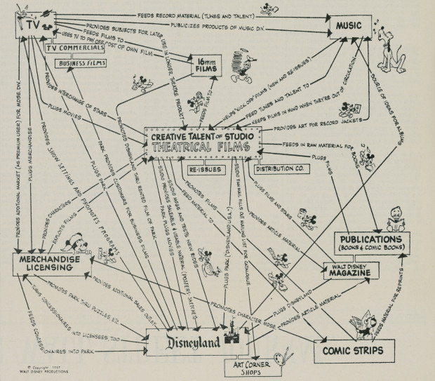
This is Walt Disney’s corporate strategy from 1957. The theatrical films serve as a foundation, and everything else — TV, music, Disneyland, etc — feed off of and back into the Disney universe. I like how each little Mickey Mouse runs in the direction of the arrow he is on and holds something unique to the place he’s running to.
See also: the Disney org chart.
Hawk-Eye is a collection of technologies that allows high-granularity sports tracking, most notably in tennis. It’s similar to what we see with basketball, football, soccer, and basically every sport where a lot of money is on the line. That means there’s a lot of data to analyze gameplay these days.
The New York Times uses Hawk-Eye data to examine the serve. More specifically, they look at the fastest serve in tennis — coming at your face. Don’t blink.

Japan has a new weather satellite in stationary orbit, Himawari-8, that takes a picture of Earth every ten minutes. String those together and you get a super-detailed time-lapse video of the living planet, which is what Derek Watkins from the New York Times did.

By way of Chris Volinsky, a quiz dilemma for students who want extra credit. It’s a variation on the Prisoner’s Dilemma, a popular game theory example that uses two criminals instead of students and lesser jail time instead of extra credit.
What’s your answer? I take the two.
Claire Cain Miller for the Upshot on when algorithms discriminate:
There is a widespread belief that software and algorithms that rely on data are objective. But software is not free of human influence. Algorithms are written and maintained by people, and machine learning algorithms adjust what they do based on people’s behavior. As a result, say researchers in computer science, ethics and law, algorithms can reinforce human prejudices.
I bring this up often, because I apparently still hold a grudge, but I will always remember the time I told someone I study statistics. He responded skeptically, “Don’t computers do that for you?”
In the words of Jeffrey Heer: “It’s an absolute myth that you can send an algorithm over raw data and have insights pop up.”
Kind of fun. Branden Rishel mapped just the time zones. No borders or countries for context. In case you’re confused and want to know where these lines come from, BBC News made an interactive that explains why time zones are the way they are.
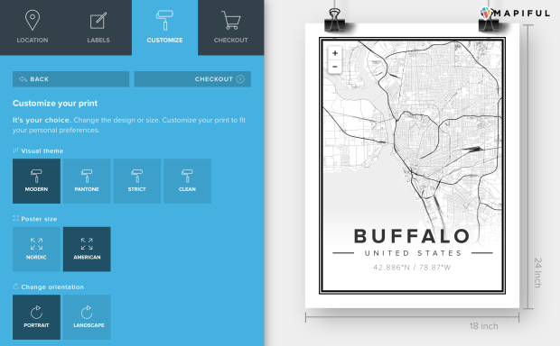
Map posters are easy to come by for major cities. But if you want one for a less densely populated area of the world, you might be out of luck. Mapiful can help. Select anywhere in the world, and get a streamlined black and white poster, based on OpenStreetMap data.
After you have your location, pan and zoom to get the exact area you want, and then customize the labeling and choose between four simple themes.
Posters not your thing? Maybe you want map clothing.
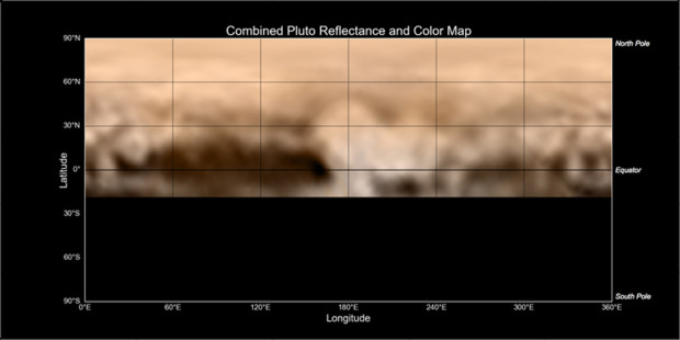
Using images taken by New Horizons between June 27 and July 3, this is the latest NASA map informally named the Whale and the Donut. Now, use your imagination here (because space!). The dark area on left is the whale, representing about 1,860 miles of length, and the tail in the left corner is cupping the donut.
Hopefully we’ll get a better look come next week. I’m guessing they’re an actual whale and donut. But I’m no scientist.
Students want to get into a school, and schools want certain students. Match. Med students want to get into a specific residency program, and certain programs want specific students. Match.
Tim Harford explains the role of matching algorithms to make picking fair for all parties. The process gets messy when you start looking at thousands of individuals and organizations with multiple preferences each.
The deferred acceptance algorithm is just the start of a successful market design, because details matter. In New York City, there are different application procedures for certain specialised schools. When assigning hospital residencies, the US National Resident Matching Program needed to cope with pairs of romantically attached doctors who wanted two job offers in the same city. These complexities sometimes mean there is no perfect matching algorithm, and the challenge is to find a system that is good enough to work.
The New Horizons spacecraft launched on January 19, 2006 and is set to fly by Pluto next week on July 14, 2015. The New York Times provides a short documentary on the journey and the hope for what the flyby provides.
It’s a combination of researcher interviews and scientific graphics. So good, even if you don’t follow space-related news. Set aside the 13 minutes and 21 seconds to watch the whole thing.
Then keep track of the event at NASA’s site for the mission.
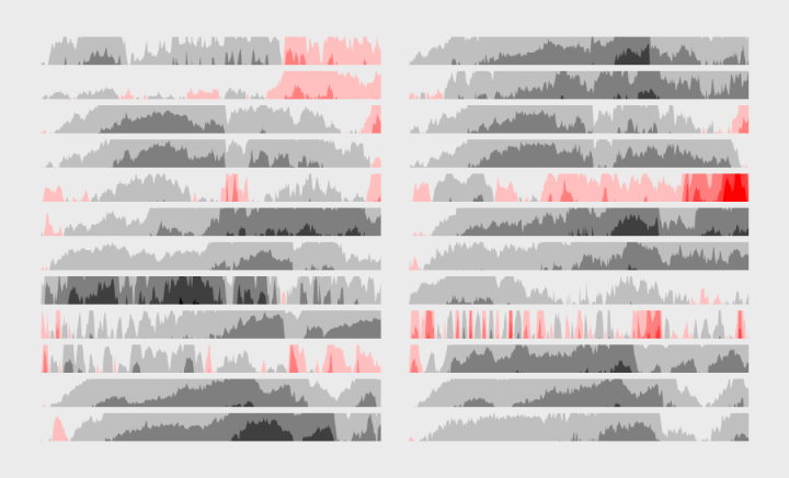
The relatively new and lesser known time series visualization can be useful if you know what you’re looking at, and they take up a lot less space.
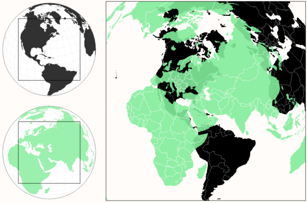
Most of us have seen the True Size of Africa graphic that squishes multiple countries into an area we normally see as much smaller. This is because of projections, which places a spherical planet in a two-dimensional space. Different projections have different tradeoffs. Even the True Size graphic has issues.
This interactive by Zan Armstrong tries a different route by overlaying two globes against each other.
Read More
I know next to nothing about soccer. Like there’s nothing, and then I’m sitting right there next to it. But, the New York Times provides an explanation of the U.S. women’s current offense-focused strategy with some simple diagrams and a video, and I feel a little more edumacated.
I like the particular frame above that shows the gaps and seams that players try to attack. Basketball uses the same terminology, so I’m familiar, but this is the first time I’ve seen it so concretely.
The Linux Foundation announced the R Consortium to provide support to the R Foundation and to organizations developing the language.
“Millions of data scientists and academic researchers use R language every day and want to collaborate with their peers to share visualization and analysis techniques,” said Jim Zemlin, executive director at The Linux Foundation. “The R Consortium will promote the sharing of ideas and accelerate findings that make R even better for business, research and academic purposes.”
Nice. I can feel the momentum. [via Simply Statistics]
Maps are fun to look at and get easier to make every day, so there’s a lot of them floating around in the world. But before you sit down to enjoy that big, juicy map, take in some advice from geographer Andrew Wiseman to avoid looking the fool. A fool? A fool, I say.
Read More
 Visualize This: The FlowingData Guide to Design, Visualization, and Statistics (2nd Edition)
New tools, refined process.


