Most of us have seen the True Size of Africa graphic that squishes multiple countries into an area we normally see as much smaller. This is because of projections, which places a spherical planet in a two-dimensional space. Different projections have different tradeoffs. Even the True Size graphic has issues.
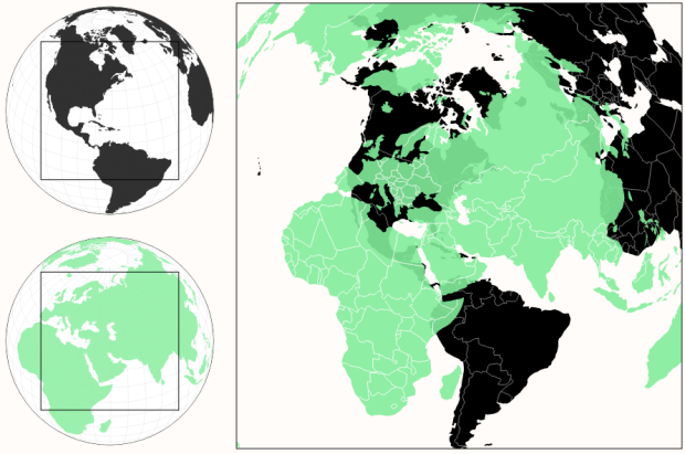
This interactive by Zan Armstrong tries a different route by overlaying two globes against each other.
I was inspired to create this after reading a friend’s account of his time fighting Ebola in Sierra Leone. He was frustrated with misunderstanding about the disease, including that a “school in New Jersey that panicked and refused to admit two elementary school children from Rwanda. Never mind that Rwanda is 2,600 miles from the epidemic area in West Africa. That’s the distance from my apartment in DC to Lake Tahoe.”
Rotate each globe on the left to the areas of interest. The globe on the right shows two highlighted areas in the same view.
Nice.
 Visualize This: The FlowingData Guide to Design, Visualization, and Statistics (2nd Edition)