Lukasz Piwek is chipping away at a collection of Tufte-style charts using R, along with the code snippets. Fittingly, the project is called Tufte in R. The Tufte stuff is nice and all, but that’s not why I like this project. Two reasons.
Read More
Lukasz Piwek is chipping away at a collection of Tufte-style charts using R, along with the code snippets. Fittingly, the project is called Tufte in R. The Tufte stuff is nice and all, but that’s not why I like this project. Two reasons.
Read More
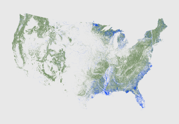
It’s like working with a bunch of tiny dots, and oh look, all of sudden patterns emerge.
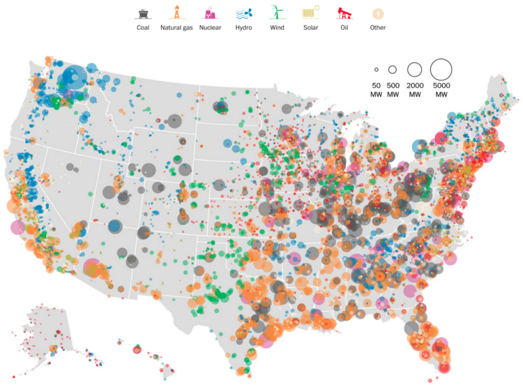
The Washington Post mapped power plants in the United States by type and capacity in megawatts. Color indicates the former, and bubble size indicates the latter. There are a lot more natural gas power plants, supplying 30 percent of the nation’s energy, than I expected.
See the article for a map for each type, along with a state-level breakdown.
Based on annual high school play and musical rankings from the magazine Dramatics, which date back to 1938, NPR charted the most popular plays by decade. For a variety of reasons — cast size, family-friendliness, and licensing — the oldies still reign.
Read More
Here’s a straightforward stacked area chart from the Economist that shows shifting market share in the technology sector. It highlights the quick shrinkage of IBM in the 1990s, Microsoft reign soon after, and the apple surge mid-2000s. Be sure to look at the nominal and real views too, because even though relative dominance shifted, the sector as a whole is up and up.
Todd Schneider likes trivia, and he plays in an online league called LearnedLeague. Curious, Schneider wondered if there was anything interesting he could glean from the performance of the LLamas (Learned League members) that might apply to knowledge in general.
Read More
You typically hear about data breaches in terms of number of records that were hacked. “A million email addresses were stolen” or “hackers ripped off 100,000 passwords.” Does anyone care? After the initial gasp-shock-horror, we move on and everyone forgets until the next time it happens.
However, if a hack affects you in some way, you pay closer attention. That long random string password reminds you every time you log in somewhere.
That’s the idea behind this quiz from the New York Times. Answer a few quick questions. See the potential information bits about you that were stolen in the past couple of years.
It’s a good spin on the record tally, and leads you right in to privacy tips and more information about each hack.
Waiting in line stinks. I purposely go to the grocery store during off-times with my son, so I don’t have to deal with the long lines. Google, I think currently only on Android phones, now provides information on when people go to the businesses around you, using a similar logic to auto traffic on Google Maps. Nice.
What is machine learning? It sounds like a bunch of computers get together in the library on Tuesdays and study during all-nighters. It’s not quite that.
Stephanie Yee and Tony Chu provide a really good visual explanation of the computer science subfield. The vertical scroller should clear up some misconceptions.
Read More
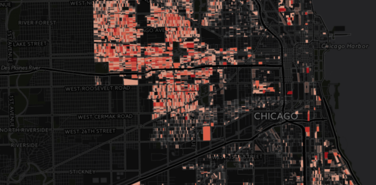
Incarceration costs a lot of money. We know this, sort of. But how much really? Million Dollar Blocks, by Daniel Cooper and Ryan Lugalia-Hollon, estimates the cost in Chicago, down to the block level.
Read More
We usually see Census data in aggregate. It comes in choropleth maps or as statistics about various subpopulations and geographies. Is there value in seeing the numbers as individuals? What about the people behind the numbers? FiveThirtyEight intern Jia Zhang experiments on Twitter.
Read More
CompStat is a program that started in the New York Police Department, and several other departments have implemented it since. Officers are held accountable by tracking crime over time. Crime goes up, based on the data, and you can ask why. It seems like a fine idea, but problems arise when humans game the system to fill quotas. FiveThirtyEight highlights one such case within the NYPD.
Watch the Documentary
I was flipping through the channels the other night and happened on the Tour de France. It’s cycling, in case you’re unfamiliar, and it’s not the most interesting sport to watch. But when you get a sense of what these athletes are actually doing — how fast they ride, how high they climb — it’s a whole lot more impressive.
The Guardian put together a wide view of one of the major climbs, up Alpe d’Huez, to help you see. My legs are tired just thinking about it.
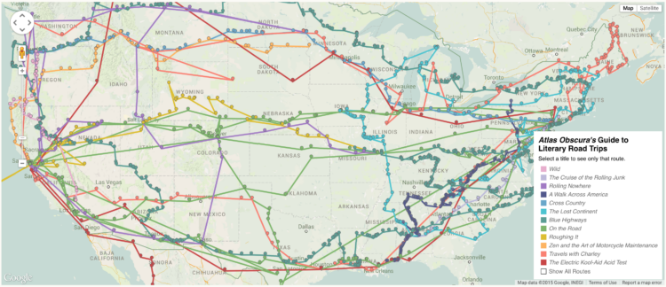
Ever wanted to follow in the footsteps of a famous writer or literary character in their journey across the country? Well now you can. Richard Kreitner for Atlas Obscura hand-cataloged the road trips — more than 1,500 entries — from twelve works of literature and Steven Melendez mapped the paths.
Read More
This is a fun one. Software Galaxies by Andrei Kashcha visualizes popular software package managers as interactive galaxies. Each node is a package and connections indicate dependencies between packages. Use the keyboard and mouse to explore the 3-D world, rotating and shifting through clusters in each galaxy. Mouse over nodes to see what you’re looking at.
I don’t know much about the makeup or structure of the package managers, but it’s fun to fly around nevertheless. It feels like a game.
Find out more about the process or download the code on Github. [Thanks, Andrei]
There’s been all sorts of weird stuff going on at Reddit lately, but who’s got time for that when you can download 1.6 billion comments left on Reddit, since 2007 through May 2015?
This is an archive of Reddit comments from October of 2007 until May of 2015 (complete month). This reflects 14 months of work and a lot of API calls. This dataset includes nearly every publicly available Reddit comment. Approximately 350,000 comments out of ~1.65 billion were unavailable due to Reddit API issues.
Timestamp, comment ids, controversiality score, and of course the comment text. It’s 5 gigabytes compressed and available over torrent.
Git er done.
You’ve probably seen those “maps” where people from other countries draw the United States and end up with a wobbly New York, Los Angeles, and some stuff in the middle. Here’s what happens when cartographers draw boundaries by hand. It’s called Project Linework.
Read More
Geoff McGhee for National Geographic highlights a handful of projects that form a genre that he calls “Steampunk” infographics. When I was remaking the Statistical Atlas with current data I didn’t have steampunk in mind, but I like it.
By the way, if you haven’t seen McGhee’s documentary on visualization and journalism from a few years back, it’s worth marking for later.
 Visualize This: The FlowingData Guide to Design, Visualization, and Statistics (2nd Edition)
New tools, refined process.


