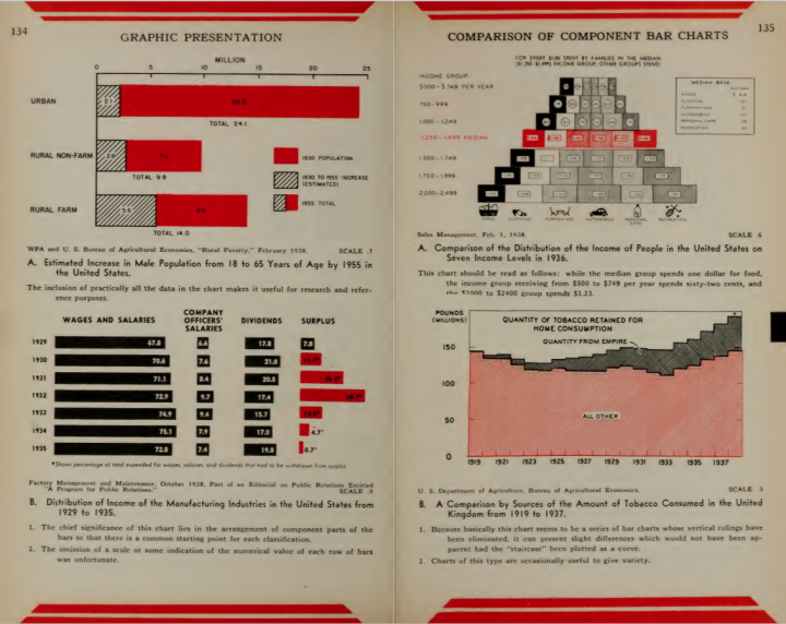
• Membership
  • Newsletter
  • Projects
  • Learning
  • About
  • Member Login
  • Spurious Correlations, the book

    June 12, 2015

    Topic

    Statistics  /  book, humor

    Spurious Correlations the bookLast year Tyler Vigen put together a fun project that found strong correlation between random things, such as divorce rate and cheese consumption or honey production and political action committees. The continuously running script has found over 30,000 ridiculous correlations to date. Now it’s a book. It fits well in your hands as you go number two.

  • On visualizing data well

    June 12, 2015

    Topic

    Design

    On Writing WellOn Writing Well by William Zinsser is a bestselling guide on writing well. Yep. Ben Jones parallels some of the principles in the book to visualization, seven principles in particular.

    As I read On Writing Well it struck me that his advice for communicating well with words applies directly to the craft of communicating visually with data. His seven principles in Part I — The Transaction, Simplicity, Clutter, Style, The Audience, Words, and Usage — could be written about visualizing data as well.

    Makes sense.

  • R is quirky, flawed, and an enormous success

    June 11, 2015

    Topic

    Coding  /  lunch talk, R

    Most people who use R on the regular learned the language in the context of a subject outside of programming. They learned R as they learned statistical methods, or they picked up bits of R as they learned about visualization. However, if you learn R purely as just a language — without the domain-specificity — or you already program in a different language, R might seem strange at times.

    In this talk, John D. Cook explains some of the “quirks” in R and why, maybe, they’re not so strange.
    Watch the talk

  • Oldest person in the world keeps dying

    June 11, 2015

    Topic

    Statistics  /  death, FiveThirtyEight

    Gertrude Weaver, 116 years old, was the oldest person in the world for five days before she passed. These short tenures have grown more common in recent years. David Goldenberger for FiveThirtyEight looks at the tenure of previous record holders.
    Read More

  • Loans from Freddie and Fannie that defaulted after the bubble

    June 10, 2015

    Topic

    Statistics  /  economics, loans, mortgage

    Under the directive of the Federal Housing Finance Agency, started to release detailed loan-level data in 2013. Todd W. Schneider looked at the data recently, evaluating default rates — the proportion of loans that fell into deliquency — with a bit of geography.
    Read More

  • Reddit button ends, and here’s the click data

    June 9, 2015

    Topic

    Data Sources  /  button, Reddit

    On April 1, Reddit posted a simple button with a 60-second timer that counted down to zero. Every time the button was pressed by a unique Reddit user, the timer reset to 60 seconds. Yesterday, more than two months and 1,008,316 presses later, the timer finally made it to zero seconds without a press.

    It was the social experiment that just kept on going, and Reddit released the click data — a timestamp for each click. Could be fun if you’re looking for a time series to play with.

  • Cost to replace cable with streaming services, etc

    June 9, 2015

    Topic

    Statistics  /  cable, cut the cord

    The Washington Post has a straightforward calculator to figure out how much it will cost you to cut out cable television and replace it with streaming services. Just select the features you want, and the cost on the right tells you how much. Kind of fun to click at.
    Read More

  • Length of the average master’s thesis

    June 9, 2015

    Topic

    Statistical Visualization  /  R, thesis

    A while back beckmw found the average length of a dissertation for various fields of study, based on digital archives at the University of Minnesota. Here’s a follow-up to that data scrape with average lengths of masters’ theses, again for various fields. Medical Chemistry wins this round.

    By the way, the colors don’t mean anything. They’re just there for flourish.

    On the upside, the R code for scraping along with the resulting data is available for download.

  • More presidential candidates please

    June 8, 2015

    Topic

    Infographics  /  elections, government, New York Times

    “If it seems as if the list of presidential candidates for 2016 is growing by the day, that is because it is, at least on the Republican side.” Alicia Parlapiano for the New York Times charts the changing campaign calendar with more candidates and earlier starts. Because you know, we’re not even halfway through 2015 yet.

    On the upside: more charts.

  • A color analysis of Western films

    June 8, 2015

    Topic

    Statistics  /  color, movies, Western

    Kevin Ferguson examined color usage in Western films from various angles. One of those was the sum image using the movie frames every ten seconds.

    These shapes and colors are evocative in a way that tea leaves and tarot are: they don’t actually tell you much about what you’re looking at, but they allow you an emotional response confirmed or denied once you come to discover what the image “really” is.

    The methods themselves you’ve seen before, but probably not used in this way.

  • Aggregate the Los Angeles realtime bus feed

    June 5, 2015

    Topic

    Data Sources  /  bus, Los Angeles, transportation

    There is a realtime feed for the location of Los Angeles buses. It’s a bit messy. Morgan Herlocker made it straightforward to aggregate. Have at it. [Thanks, @augustjoki]

  • Iowa liquor sales data, 3m rows

    June 5, 2015

    Topic

    Data Sources  /  Iowa, liquor

    Iowa released liquor sales data for weekly purchases at the store level.

    This dataset contains the spirits purchase information of Iowa Class “E” liquor licensees by product and date of purchase from January 1, 2014 to current. The dataset can be used to analyze total spirits sales in Iowa of individual products at the store level.

    There are over three million rows that contain a store name, address, liquor category, liquor vendor, and cost. I imagine this could be a fun spatial time series dataset to play with. Look for seasonal trends, when stores expect to sell more rum or vodka, brand bestsellers, or regional favorites. Even though it’s just for Iowa, there’s probably a close relationship to national sales.

    See some preliminary documentation by Dan Nguyen on how to get started.

  • Endangered species depicted with geometric pieces

    June 5, 2015

    Topic

    Infographics  /  CSS, species

    In Pieces by designer Bryan James is an animated piece that uses simple geometric shapes to depict thirty endangered species.
    Read More

  • Getting bees to construct geographic maps

    June 4, 2015

    Topic

    Data Art  /  bees, physical

    In an exploration of the connection between humans an nature, artist Ren Ri uses beeswax as his medium and the bee colony as the builder. Yeah.

    Because a colony will follow the queen bee and build a hive based on the pheromones that she releases, Ri is able to move the queen such that the others in the colony act accordingly.
    Read More

  • Browser extension shows where you really are on the web

    June 3, 2015

    Topic

    Self-surveillance  /  browser, privacy

    The Citizen Ex browser extension guesses where you’re geographically located on the web. That is, it guesses where the server — the one you just pulled that website from — is in the world. It also guesses where you are physically located. The extension keeps track of these locations and computers something called Algorithmic Citizenship.
    Read More

  • Growth of Las Vegas metro and skyline

    June 2, 2015

    Topic

    Maps  /  drought, Las Vegas, ProPublica

    Western cities are growing but water supplies are decreasing. That’s not good. ProPublica, as part of their series Killing the Colorado, focuses on the fastest growing Western city: Las Vegas.
    Read More

  • Counting people killed by police

    June 2, 2015

    Topic

    Data Sources  /  deaths, Guardian, police

    The US government doesn’t keep a complete record of fatal shootings by police, but with recent events, it’s become increasingly obvious why such data is important. So instead of waiting, the Guardian built their own database.
    Read More

  • Chess piece moving patterns

    June 1, 2015

    Topic

    Maps  /  chess

    Million Base is a database of 2.2 million chess games. Steve Tung visualized chess piece journeys based on this data, for each piece on the board. Above is the footprint for the white knight. Each thin line represents 500 moves, and from what looks like a little bit of random noise to offset each line, you see a more prominent path for more frequent hops.
    Read More

  • From European cities, how long it takes to travel elsewhere

    May 29, 2015

    Topic

    Maps  /  isochrone, transportation

    After seeing an isochrone map drawn by Francis Galton, Peter Kerpedjiev was curious if he could apply the method to travel times in Europe.
    Read More

  • Page 197 of 391
  • <
  • 1
  • ...
  • 194
  • 195
  • 196
  • 197
  • 198
  • 199
  • ...
  • 391
  • >

Analyze, visualize, and communicate data usefully, beyond the defaults.

Become a member →

Recently for Members

May 8, 2025
When the data is not what it seems

May 1, 2025
Finding the Right Charts

April 24, 2025
Visualization Tools, Datasets, and Resources – April 2025 Roundup

April 17, 2025
Breaking Out of Chart Software Defaults

April 15, 2025
Line Chart with Decorative Neon Accents

Browse by Chart Type See All →

Parallel Sets Unit Chart Baseline Chart Alluvial Diagram Moving Bubbles Connected Scatter Plot Line Map Bump Chart Frequency Trails Parallel Coordinates

Browse By Topic

  • Visualization

    Seeing data

  • Maps

    Seeing geographic data

  • Infographics

    Explaining data

  • Networks

    Connecting data

  • Statistics

    Analyzing data

  • Software

    Working with data

  • Sources

    Getting data

  • Design

    Making data readable

Get the Book

Visualize This: The FlowingData Guide to Design, Visualization, and Statistics

Available now.

Order: Amazon / Bookshop

Made by FlowingData

  • The Process

  • Data Underload

  • Chart Everything

  • Guides

  • Books

  • Shop

  • About
  • Contact
  • Newsletter
  • LinkedIn
  • Instagram
  • Bluesky
  • RSS
Copyright © 2007-Present FlowingData. All rights reserved.