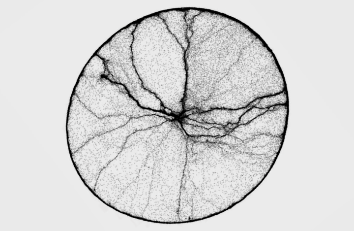
I don’t know exactly how much data NASA has in the bank, but I think it’s a lot. Explained in the video below, they estimated the age of ice layers in Greenland by flying a plane over the Greenland Ice Sheet and pulsing radar to gather information.
Read More
-
-
Celebrating the 100th year of the National Geographic cartographic department, they provide a truncated roundup of the thousands of maps they’ve made over the past century. I liked this tidbit about the Germany map above:
Our maps haven’t just chronicled history; they’ve made it. General Dwight D. Eisenhower carried our map of Germany during his 1945 offensive. When a B-17 carrying Admiral Chester Nimitz got lost in a rainstorm, the pilot landed safely using the Society’s map of the Pacific war theater. The map, Nimitz later wrote Gilbert H. Grosvenor, “lent an unexpected but most welcome helping hand.”
It’s true. Maps, even on paper, can be useful.
-
John Edmark made some pretty things.
Read More -
Members Only
Fill those empty polygons with color, based on shapefile or external data.
-
Seth Stephens-Davidowitz continues with his Google search data-related op-eds for the New York Times. This time he looks at the insecurities in sex, based on the search volume of various phrases.
Interesting. But preface the results with a big fat question of sample population before you make too many conclusions.
For example, a straightforward conclusion from the above graphic is that boyfriends avoid sex way more than girlfriends. That seems off. Could it be that boyfriends avoiding sex confuses the girlfriends more than the other way around, thus making it more likely for girlfriends to search?
-
The process to purchase a MetroCard for the New York Subway is different from the process to purchase tickets for the Bay Area Rapid Transit in San Francisco. From the flowchart above by Aaron Reiss, it’s clear that it takes a lot more screen touches to get a MetroCard, but that’s only part of the story. The interesting part is why the two systems’ machines are so different. Different timing means different goals.
-
The simple analysis is to approach data blind, as machine output. But this almost always produces an incomplete analysis and a detached, less than meaningful visualization. Jacob Harris, a developer at the New York Times, talks context, empathy, and what the dots represent.
In reference to the New York Times’ map of deaths in Baghdad after receiving the Wikileaks war logs:
Before it was a final graphic though, it was a demo piece I hastily hacked into Google Earth using its KML format. I remember feeling pretty proud of myself at how cool even a crude rendering like this looked, and the detailed work I had done to pull out all the data within reports to see these dots surge and wane as I dragged the slider. Then I remembered that each of those data points was a life snuffed out, and I suddenly felt ashamed of my pride in my programming chops. As data journalists, we often prefer the “20,000 foot view,” placing points on a map or trends on a chart. And so we often grapple with the problems such a perspective creates for us and our readers—and from a distance, it’s easy to forget the dots are people. If I lose sight of that while I am making the map, how can I expect my readers to see it in the final product?
-
Think big data, and it’s tough not to associate it with big corporations who have their own interests in mind. Use data. Make money. It doesn’t have to always be like that though. Jen Lowe, for the Deep Lab Lecture Series, talks about reclaiming some of that power with silent gestures through the web and using data for good.
Read More -
This seems like fun. The NodeJS package shp2stl by Doug McCune lets you convert a shapefile to a 3-D model, which can then send to your favorite 3-D printer (because you know we all have at least two of them lying around). Assuming you have NodeJS setup, simply point the package to your shapefile, specify which attribute to use for height, and presto changeo there’s your 3-D model.
-
In efforts to emphasize the importance of the library (very), the British Library released a video that simply shows ten minutes of book checkouts. Nothing fancy. Just an updating log of activity — and yet there’s something mesmerizing about it.
Read More -
It’s been known for decades that the sounds that whales make show patterns and have a certain musicality to them. David Rothenberg and Mike Deal talk about the history of visualizing and analyzing the sounds, along with a visual interpretation of their own.
Read More -
The way that people get around can say a lot about how a place is made up. Here’s an interactive map that shows how people get to work in America.
-
When you look at overall global temperatures over time, you see a rising line and new heat records set. Instead of just one line though, Tom Randall and Blacki Migliozzi for Bloomberg split up the time series by year and animated it.
Each year is overlaid on top of the other with a new time series in each frame. The dotted line rises too as new records are set, and as time passes, the older time series lines fade to the background.
You still get the rising effect as you would with a single time series over the past 135 years, but this view provides more focus to the increase, closer to present time.
-
When it comes to storytelling, copious amounts of data often means lots of charts. Sometimes though, a chart isn’t what you need. Sarah Slobin, a graphics editor for the Wall Street Journal, talks about such an experience. The urge was to chart all the things, but in the end, there was a better route.
Losing the graphics made sense to all of us on the project. What worked best for the story won out, as it should. We didn’t need graphics for the sake of graphics, especially graphics that weren’t working in service of the piece. And photos, while not numbers, are also data in their own right. My own internal calculus, data = charts, was based on habit and that habit had become like armor over time, I put it on without thinking before trudging off to battle. So now, at the outset of each project, I’m working on learning to be really honest with myself each time I sort through a set of statistics; “What does the reader really need here?” Not, “What cool thing can I do with these data?”
-
If you ever wondered what it looks like when QWOP-like figures learn to walk through mutation as dictated by a simplified genetic algorithm, here’s your answer. Rafael Matsunaga made a simulation that starts with a bunch of walkers, and the one that stays upright the longest moves on to the next generation. Adjust the probability of mutation and the amount, and there’s a chance the next generation of walkers could go further.
See also genetic algorithm cars. Same idea but with blocky car-like figures. [via kottke]
-
A short post on Bloomberg from 2013 describes the fall of U.S. mens’ income for the past forty years. To illustrate, the author uses the chart above, and we’re like, “Oh gee willikers, that sure is a big drop in income. I guess mens’ income is well on its way to zero dollars. Gosh darn it to heck.”
But maybe we’re riled up for nothing.
Eric Portelance takes a small step back to see what’s going on in this simple chart. It’s the classic case of cherry-picked data points, less attention to axes, and ignoring the details.
-
With Google’s image search, the results kind of exist in isolation. There isn’t a ton of context until you click through to see how an image is placed among words. So, researchers at Google are trying an approach similar to how they translate languages to automatically create captions for the images.
Now Oriol Vinyals and pals at Google are using a similar approach to translate images into words. Their technique is to use a neural network to study a dataset of 100,000 images and their captions and so learn how to classify the content of images.
But instead of producing a set of words that describe the image, their algorithm produces a vector that represents the relationship between the words. This vector can then be plugged into Google’s existing translation algorithm to produce a caption in English, or indeed in any other language. In effect, Google’s machine learning approach has learnt to “translate” images into words.
-
Data-Driven Documents, or D3.js, is a flexible JavaScript library that lets you draw and move things in the browser. If it isn’t yet, it’s on its way to becoming the tool of choice for visualization on the web. It’s important to remember though that the library isn’t just for charts, graphs, and maps (although those things are nice). Case-in-point is John Firebaugh’s new project to make one animated art piece a day.
-
Tommy Caldwell and Kevin Jorgeson are free-climbing almost 3,000 feet up El Capitan, basically with their fingers. The New York Times shows the ascent with a route placed on top of a 3-D model. Scroll in a WebGL-enabled browser on the biggest screen possible for a smidgen of feeling for what the climb is like.
See also Caldwell’s Facebook page for some amazing pictures of what they’ve experienced so far.
Update: The Times just published a high-res image of the wall. Click on the links in the caption to see Jorgeson, but a tiny speck.