The Upshot, the data analysis-centric site from the New York Times, has a new editor, and her name is Amanda Cox.
I have asked Amanda to take on this job because she is the best person to lift The Upshot to new heights. But I also want to note an underlying message in her appointment. Visual journalism – graphics, interactives, photography, video, virtual reality – is a growing part of our report, and it’s an area where we excel. In the future, visual journalists, and those, like Amanda, whose background spans both words and visuals, are a crucial part of the future leadership of The Times.
So great and well-deserved.
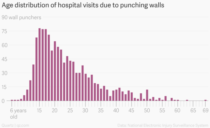
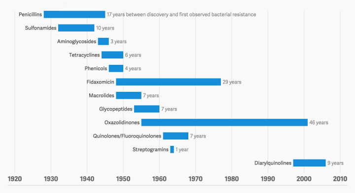
If you read FlowingData, you’ve seen her work, but if not, here’s a refresher.


 Visualize This: The FlowingData Guide to Design, Visualization, and Statistics (2nd Edition)


