Venn Diagrams: Read and Use Them the Right Way

Venn diagrams seem like a straightforward way to show combinations. In their most basic form, you have two circles that each represent a thing or a group, and the overlap represents the combination of the two. Non-overlapping areas represent separation. The entire area of the diagram, including the space outside the circles, represents all possible values, groups, or populations.
That’s about it. But mistakes happen, and they seem to be common enough that makes me think these Venn diagram things might need some explaining.
For example, the July 29, 2015 Indy Week magazine used a Venn diagram on the front page.

(Thanks, Timothy.)
At a glance and an immediate shift of attention to the headline, the diagram maybe seems fine. Disregard the top right corner or the rectangle that overlaps.
Think about what the middle intersection means.
The left circle represents the files they wanted. The right circle represents the files the governor’s office had. So if the office really provided that overlap, they gave Indy Week all the files the publication wanted that the office had. Indy Week didn’t want the rest of the files, based on the Venn.
In other words, Indy Week is suing for one reason, and the diagram represents the opposite. They make this bold statement but represent it incorrectly, and all I can think of is Biff Tannon from Back to the Future.

So let’s take a step back and go over how this thing works.
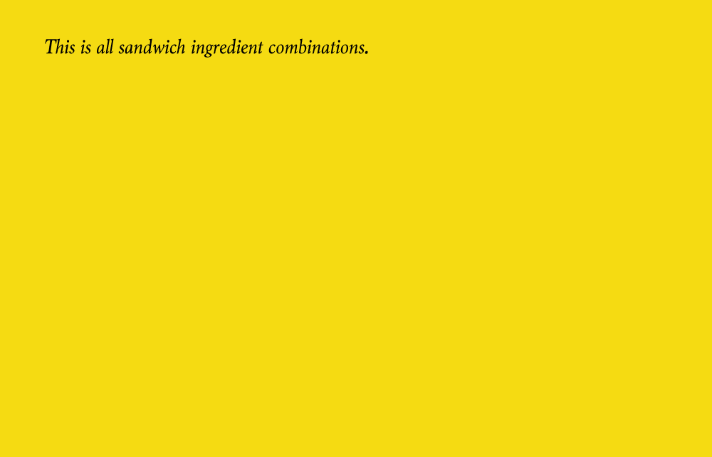
We start with the full area of the diagram. This represents all possible values. To make it concrete, let’s say we look at sandwich ingredient combinations that go in between bread pieces. This includes things like turkey, lettuce, bacon, and tomato.
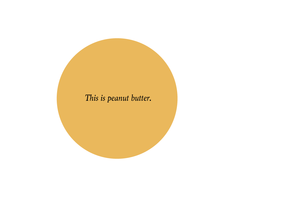
Turning attention to the peanut butter and jelly sandwich, here’s one of the important ingredients:
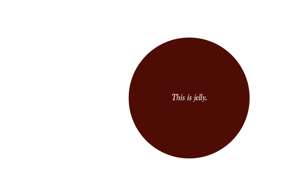
Here’s jelly:
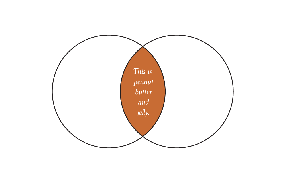
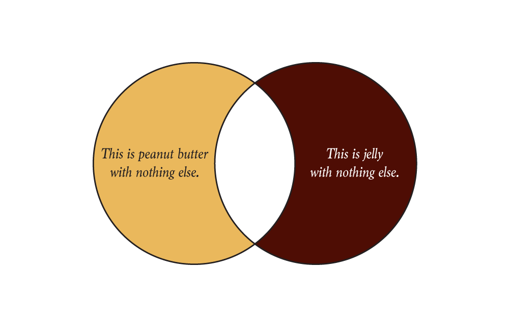
Overlap the two, and you’ve got yourself a nice peanut butter and jelly sandwich:
The non-overlapping areas are just peanut butter or just jelly:
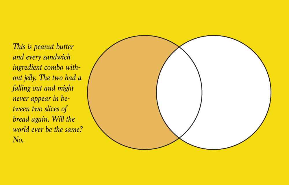
Finally, you could highlight peanut butter and the universe, and you show every sandwich ingredient combination except for those that include jelly:
That’s it. Now go forth and make Venn diagrams that make sense. Make like a tree and get outta here.
Analyze, visualize, and communicate data usefully — beyond the defaults. Become a member →
FlowingData Delivered to Your Inbox
Chart Type Used
