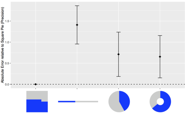
Artist Neil Harbisson is completely colorblind, so he sees in black and white. But he still perceives color. Harbisson has an implant in the back of his head that’s essentially an antenna with a color sensor attached. The sensor signals are transposed to audio and he listens through bone conduction.
Watch the video
-
-
-
Schiphol Airport in Amsterdam put a camera on a piece of checked luggage and recorded the winding path of conveyer belts and luggage lifts. It’s like a scene straight out of a cartoon.
Be sure to check out the 360 version too. It’s the same route as above but you can click and drag to see all around as the luggage moves through. [via Laughing Squid]
-
There have been over 2,000 nuclear detonations since 1945. Orbital Mechanics mapped each documented test in animated form. It’s mostly about mood and the individual explosions. More journal-like, although not much annotation unfortunately.
Red represents atmospheric explosions, yellow represents underground, and blue represents underwater.
See also artist Isao Hashimoto’s rendition from a few years ago. It’s the same data with an entirely different feel.
[iframe id=”https://www.youtube.com/embed/cjAqR1zICA0?rel=0&showinfo=0″ autoplay=”no”]
[via kottke]
-
If you own a home or have gone to a home improvement store recently (in California at least), you’ve probably heard the solar panel pitch by now. They always start by asking about your electric bill and then provide rough estimates for what you might save if you got solar panels. For a more accurate estimate, you schedule a consultation. Project Sunroof from Google aims to provide a more objective summary.
Currently providing information for the San Francisco Bay Area, Fresno, and Greater Boston, the project lets you punch in an address to see both potential energy and potential savings if you were to lease solar panels, pay for them in installments, or to buy outright.
The project calculates estimates based on 3-d models of rooftops, shade from nearby trees and structures, sun positions over a year, and historical cloud and temperature patterns.
The Sustainable Design Lab at MIT and MoDe Studio did something similar to this a few years ago for the Cambridge, Massachusetts area. I’m guessing their project served as inspiration for Sunroof. Hopefully Google can expand to more areas. [via Ars Technica]
-
-
Color in visualization can be a finicky process. You want colors to correspond with the topic at hand, you must make sure that readers can actually see the palette you choose, and people must decode appropriate differences between shades.
So here’s a game to help hone your skills.
The straightforward game by Method of Action shows you a color palette, and the goal is simply to match. Each stage gets a bit more difficult and surprisingly more challenging.
-
How much can you find out from “just the metadata” about your cell phone? ABC News in Australia aims to find out.
Australia’s new data retention laws mean phone and internet companies have to save this information for two years: that’s every time you call someone, where you call them from, which cell tower your phone pings every time it connects to the internet, and more.
On a mission to find out what that data might reveal, ABC reporter Will Ockenden took a ‘surveillance selfie’: he got access to his own metadata, and now for the first time you can see what an individual Australian’s metadata actually looks like.
They’ve started with a few summary interactives that show where Ockenden goes during the week through cell tower connections and who he communicates with through call logs. They’ll be going deeper in the coming weeks. Also, Ockenden’s data is available to download so that you can look for information too.
The Paul Revere example came to mind. Just metadata?
-
-
Ted Benson used a straightforward hack to repurpose Amazon’s quick-order button. Its intended use is to automatically order an item from Amazon when you push the button. Benson avoided that part, and instead used a button press to trigger other things.
A lot of people made fun of Dash Buttons when Amazon launched them on the day before April Fool’s Day. But regardless of what you think about Dash as a consumer product, it’s an undeniably compelling prototype of what the Internet of Things is going to look like.
If you have the right setup, you could be up and running with a button data collector in about ten minutes.
-
There are a handful of ways to express laughter online, and it appears there are subtle differences in demographics, based on what you use. After reading an anecdotal story in the New Yorker by Sarah Larson, Facebook Research looked at the data.
Read More -
Reddit user noveltysin wore a Fitbit during sex, and then posted a screenshot of her heart rate estimates.
So yeah. There that is. See the reddit thread for a mature and academic discussion of the data, including a line-by-line adult parody of Eminem’s Lose Yourself.
Doesn’t quite beat the marriage proposal heartbeat.
-
I already revived the first Statistical Atlas of the United States from 1870 with modern data, but there’s still more data to look at. So I kept on going.
-
-
There are rules—usually for specific chart types meant to be read in a specific way—that you shouldn’t break. When they are, everyone loses. This is that small handful.
-
Elisa Long, a professor in Decisions, Operations, and Technology Management at the University of California, Los Angeles, was diagnosed with breast cancer. The Price is Right films a breast cancer awareness episode every August. Long wanted to get on that show. So she watched episodes during her 6-hour chemotherapy sessions to familiarize herself with games and rules, and most importantly, to maximize her odds of winning.
Long describes her thought process and probability calculations on her way to surviving cancer and winning it all on The Price is Right.
My goal in going on “The Price Is Right” was to play the best I possibly could given tremendous uncertainty about the outcome. The same was true for my breast cancer. The stakes were just higher.
Ah, the uncertainty of life.
-
Analytics continues its spread into the various facets of sports. Just recently, the Denver Broncos hired a director of analytics, Mitch Tanney, who will be available to coaches on the field to provide probabilities that inform in-game decisions.
Read More -
In the most recent update to their atlas coming in September, National Geographic explains the shrinking Arctic through the lens of previous atlas maps. It’s not looking good.
Read More -
When you first learn statistics, visualization, or any data-related subject, the data usually is given to you in a ready-to-use format. This is so that you can spend most of your time on the topic of interest. But once you step outside the learning bubble, data rarely comes in the format you want.
Marc Bellemare, an associate professor in the Department of Applied Economics at the University of Minnesota, provides some practical tips on how to deal with this. Bellemare’s parting advice:
Really, there is no big secret to cleaning data other than “Document everything” and to save everything in different files and in different locations (i.e., your computer, Dropbox, Google Drive), and there is no other way to learn data cleaning than by doing it.
Yep.
Some of the tips are in the context of specific software environment, but you can easily apply them to more general situations.
-
Tabula, available for Windows and Mac, lets you extract data from PDF files, and it just got an update. The user interface got an overhaul and it’s now easier to grab data from multiple pages. I wrote about Tabula last year, but orgs continue to publish data in PDF files, and sometimes PDF is just all there is. So this is definitely a good thing.
Keep it in your toolbox.