• Membership
  • Newsletter
  • Projects
  • Learning
  • About
  • Member Login
  • Super Tuesday simulation to show uncertainty

    March 1, 2016

    Topic

    Infographics  /  elections, simulation, uncertainty, Upshot

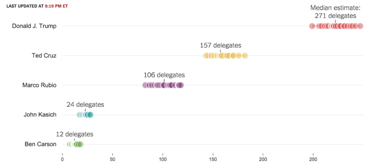
    As we know, there are various outcomes during election season, with uncertainty in each round. The Upshot is currently using a simulation to show the expectations of tonight.

    These estimates, which include states that have not yet reported all their votes, are based on several factors: Our expectations of every candidate’s performance, the voting results in other states and the demographic makeup and historical voting patterns of voters in each state. As votes come in, we expect the uncertainty around our estimates will narrow.

    Nice.

  • Impact of Best Picture Oscar nomination on profit

    March 1, 2016

    Topic

    Infographics  /  box office, movies, Oscars

    I think the general assumption is that getting an Oscar nomination for Best Picture has a direct effect on profits. Krisztina Szucs put together a straightforward interactive that shows this isn’t typically the case.

    Each bar represents a percentage of profit for a film. Roll over a bar, and you see three highlighted ones. The first represents the percentage of profit before a nomination, the second represents percentage of profit after a nomination but before the winner announcement, and the third bar represents percentage of profit after the ceremony.

    So what you’re looking for is height before the red bar and after it. For impact level, you expect the third bar to be higher or at least the same as the first, but as you can see, most movies make the bulk of their profit in the beginning regardless.

  • Possible paths for a Trump nomination loss or win

    February 29, 2016

    Topic

    Infographics  /  elections, government, simulation, Upshot

    It pains me to imagine a time when Donald Drumpf earns a Republican nomination. There are a number of ways he can get there, but there are a number of ways Marco Rubio can win the nod too. The Upshot simulated the possible routes.

    To figure out what it will take for Donald J. Trump — or Marco Rubio or Ted Cruz — to win the Republican nomination, we built the G.O.P. presidential nomination process in code. This interactive delegate calculator uses each state’s delegate allocation rules, along with estimates of how favorable each district is for each candidate, to simulate how the race might unfold.

    And if you have a different idea of what the results will be like, you can adjust the sliders for each candidate to simulate your own results.

  • Screen-capping Google Maps for traffic

    February 26, 2016

    Topic

    Software  /  Google Maps, screen capture

    Traffic
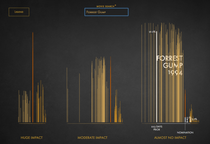
Alyson Hurt quickly wrote some code to take screen captures of a Google Maps window periodically.

    The original intention was to see the change in traffic during the January 2016 blizzard on the east coast, but this seems like it might come in handy for something else. I’m not sure for what, but I’m bookmarking it just in case.

  • Vega-Lite for quick online charts

    February 25, 2016

    Topic

    Software  /  Trifacta

    A few years ago, Trifacta released Vega, a “visualization grammar” that lets you create charts with a JSON file. But you still have to declare a lot of things to make something standard like a bar chart. Vega-Lite, recently released by the University Washington Interactive Data Lab, lets you take advantage of Vega but with much fewer specifications.

    As you might have guessed, Vega-Lite is built on top of Vega, a visualization grammar built using D3. Vega and D3 provide a lot of flexibility for custom visualization designs; however, that power comes with a cost. With Vega or D3, a basic bar chart requires dozens of lines of code and specification of low-level components such as scales and axes. In contrast, Vega-Lite is a higher-level language that simplifies the creation of common charts. In Vega-Lite, a bar chart is simply an encoding with two fields.

    That sounds good to me. Gonna give it a shot.

  • Code as microorganism

    February 24, 2016

    Topic

    Data Art  /  code, GitHub

    Taking a step beyond 2-D glyphs, Codeology depicts GitHub user activity based on what they have contributed as 3-D objects made of ASCII characters.

    The application pulls data from GitHub’s public API and creates visuals using WebGL, Three.js, and GLSL Shaders. Shape and color represent an individual language, with size being proportionate to how many characters of code were written.

    I don’t know if it was intentional, but every visual looks like a microorganism. Pretty cool. [via Waxy]

  • How much warmer your city was in 2015

    February 23, 2016

    Topic

    Statistical Visualization  /  environment, New York Times, temperature

    It was hotter in 2015 than any other year ever. K. K. Rebecca Lai for the New York Times shows just how much hotter it was in your city. Simply type in your city name or click on the arrows to browse to see a time series for the year.
    Read More

  • Social network of Earth’s plants and animals

    February 22, 2016

    Topic

    Network Visualization  /  environment, nature, video

    Plants and animals interact with each other to stay alive, which in turn forms complex systems. I think the Lion King covers the system simplistically in song-form at the beginning of the movie, but that doesn’t cut it when trying to predict the effects of things like climate. Jianxi Gao, Baruch Barzel, and Albert-László Barabási study the complexities of nature’s network in greater detail.

    Mauro Martino helps explain the work in this video for Nature. [Thanks, Mauro]

  • The Daily Mail Stole My Visualization, Twice

    February 19, 2016

    Topic

    Site News  /  Daily Mail, theft

    Last month, I published an interactive visualization that simulates how and when you will die. It reached millions of people worldwide, and I basically had one eye glued to the real-time traffic dashboard for a week. It was kind of nuts.

    A few days in, I woke up and checked the stats. The Daily Mail was in the referral list. I clicked through to the article and my interactive was fully embedded on the page, which was strange because I didn’t give permission to do that.
    Read More

  • Supreme Court shifts in power

    February 19, 2016

    Topic

    Infographics  /  government, Supreme Court, Upshot

    The Upshot has been doing a good bit on the Supreme Court dynamics after the death of Justice Antonin Scalia. In their latest, Alicia Parlapiano and Margo Sanger-Katz look at major shifts over the decades from more conservative to more liberal and vice versa.

    The shifts are based on Martin-Quinn scores, which take past court decisions into account. You can grab the data here.

  • Data scientists mostly just do arithmetic

    February 18, 2016

    Topic

    Statistics  /  data science

    Noah Lorang, a data scientist at Basecamp, explains the key for most companies isn’t finding a way to use the most advanced methods. Instead, it’s about asking the right questions.

    The dirty little secret of the ongoing “data science” boom is that most of what people talk about as being data science isn’t what businesses actually need. Businesses need accurate and actionable information to help them make decisions about how they spend their time and resources. There is a very small subset of business problems that are best solved by machine learning; most of them just need good data and an understanding of what it means that is best gained using simple methods.

    Much along the same lines as when I say you can think like a statistician without the math.

  • Emergency room data in R

    February 17, 2016

    Topic

    Data Sources  /  emergency room, Hadley Wickham, R

    For my graphic on emergency room visits over time and the other on things that get stuck, I used data from the National Electronic Injury Surveillance System, which is maintained by the Consumer Product Safety Commission.

    You can download the data, grouped annually, as Excel files and then do some munging to get the data in order. It’s not a huge burden, but it’s not that fun either. Or, if you want to skip straight to the good stuff, you can use the neiss R package by Hadley Wickham to import the data in R.

    I’d go with the latter.

  • Math of crime and terrorism

    February 17, 2016

    Topic

    Statistics  /  crime, Hannah Fry, Numberphile

    Numberphile, from the Mathematical Sciences Research Institute, is one my new favorite YouTube channels. In this episode, Hannah Fry talks crime, data, and the Poisson distribution.

    [Thanks, Mike]

  • Data Underload  /  emergency room, health, rectum

    Million to One Shot, Doc

    Between 2009 and 2014, there were an estimated 17,968 visits to the emergency room for things stuck in a rectum. Here are those things’ stories.

    Read More
  • Predictive policing

    February 15, 2016

    Topic

    Statistics  /  crime, Marshall Project, police

    Crime and data have an old history together, but because there are new methods of collection and analysis these days, there are new decisions to make. The Marshall Project, in collaboration with the Verge, looks at the current state of predictive policing and the social issues that surround it.

    As predictive policing has spread, researchers and police officers have begun exploring how it might contribute to a version of policing that downplays patrolling — as well as stopping, questioning, and frisking — and focuses more on root causes of particular crimes. Rutgers University researchers specializing in “risk terrain modeling” have been using analysis similar to HunchLab to work with police on “intervention strategies.” In one Northeast city, they have enlisted city officials to board up vacant properties linked to higher rates of violent crime, and to advertise after-school programming to kids who tend to gather near bodegas in high-risk areas.

    Of course, then there’s the whole action-reaction stuff. More time required.

  • Who marries who, by profession

    February 12, 2016

    Topic

    Network Visualization  /  Bloomberg, marriage, relationships

    People with certain professions tend to marry others with a given profession. Adam Pearce and Dorothy Gambrell for Bloomberg Business were curious.

    When it comes to falling in love, it’s not just fate that brings people together—sometimes it’s their jobs. We scanned data from the U.S. Census Bureau’s 2014 American Community Survey—which covers 3.5 million households—to find out how people are pairing up.

    You get a matrix of professions organized by more male to more female, left to right. Mouse over any profession or use the search box and lines project out to the five most common professions that the one of focus tends to marry to. The pink and blue color gradients indicate the sexes of the two spouses.

    So for each profession, you get a quick view of who people marry, whether it be outside their own or within. I like how when you mouse over the far left or the far right, you see lines jut across to the opposite side. I wonder what the tendencies are in total for male-dominant to marry female-dominant professions and vice versa.

  • International impact of China’s economic slowdown

    February 11, 2016

    Topic

    Infographics  /  China, economy, Guardian

    China’s economic slowdown means a major decline in imports from other countries, which leads to significant effects in these areas. The Guardian takes a look. The vertical axis represents lost export income as a percentage of GDP, the size of the outer red circle represents GDP, and the inner white circle represents exports to China. Dollar units are in billions of dollars. Billions.

  • How to Make an Interactive Stacked Area Chart

    Stacked area charts let you see categorical data over time. Interaction allows you to focus on specific categories without losing sight of the big picture.

  • Suite of data tools for beginners, focused on fun

    February 10, 2016

    Topic

    Apps  /  beginners, csv

    Data can be intimidating and confusing for beginners, and as a result they stay away from the spreadsheets and delimited files altogether. DataBasic, a suite of tools built as an introduction to poking at data, injects a bit of fun into the onboarding process.
    Read More

  • Page 183 of 392
  • <
  • 1
  • ...
  • 180
  • 181
  • 182
  • 183
  • 184
  • 185
  • ...
  • 392
  • >

Analyze, visualize, and communicate data usefully, beyond the defaults.

Become a member →

Recently for Members

May 8, 2025
When the data is not what it seems

May 1, 2025
Finding the Right Charts

April 24, 2025
Visualization Tools, Datasets, and Resources – April 2025 Roundup

April 17, 2025
Breaking Out of Chart Software Defaults

April 15, 2025
Line Chart with Decorative Neon Accents

Browse by Chart Type See All →

Mosaic Plot Organogram Treemap Spiral Chart Voronoi Diagram Moving Bubbles Alluvial Diagram Bar Chart Race Surface Plot Stacked Bar Chart

Browse By Topic

  • Visualization

    Seeing data

  • Maps

    Seeing geographic data

  • Infographics

    Explaining data

  • Networks

    Connecting data

  • Statistics

    Analyzing data

  • Software

    Working with data

  • Sources

    Getting data

  • Design

    Making data readable

Get the Book

Visualize This: The FlowingData Guide to Design, Visualization, and Statistics

Available now.

Order: Amazon / Bookshop

Made by FlowingData

  • The Process

  • Data Underload

  • Chart Everything

  • Guides

  • Books

  • Shop

  • About
  • Contact
  • Newsletter
  • LinkedIn
  • Instagram
  • Bluesky
  • RSS
Copyright © 2007-Present FlowingData. All rights reserved.