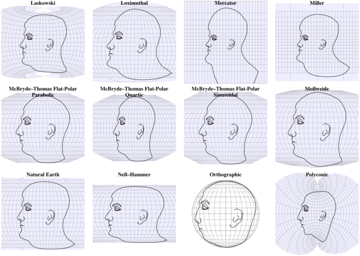
We’ve seen faces as map projections before, but this is 63 projections on one page. Plus, you can click and drag to change the center points to see how different parts of the face change.
We’ve seen faces as map projections before, but this is 63 projections on one page. Plus, you can click and drag to change the center points to see how different parts of the face change.

In a test flight, Boeing took the thing where you draw using your GPS path to a whole different level. They drew the outline of a plane that spanned the latitude of the conterminous United States.

From Rod Bogart, a Voronoi diagram of people sitting in Bryant Park. It’s a self-optimizing system to maximize sitting space.
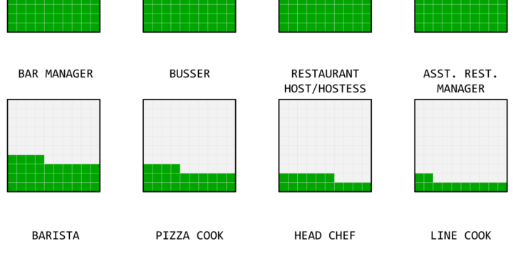
What percentage of a waiter and waitress’s income comes from tips and what comes from salary? The calculation isn’t straightforward but we can try.
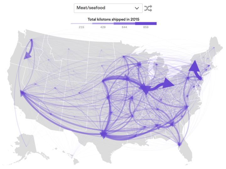
Using data from the Freight Analysis Framework, Chris Canipe for Axios mapped the flow of goods between states. Select a category of goods from the dropdown, and the map shows total kilotons of the selected goods shipped out of each state through freight. Thicker arrows represent more kilotons.
I feel like the large-volume coverage of the upcoming eclipse doesn’t quite match actual interest. I keep seeing graphics, but haven’t heard a peep in real life. But maybe that’s because I don’t live in the path. This map shows the Google search trends for eclipse, which matches the path of the full eclipse. [via @jscarto]
Newer Roomba vacuums form a map of your house to more efficiently clean areas. The company plans to sell the data, per Rhett Jones for Gizmodo:
The Roomba is generally regarded as a cute little robot friend that no one but dogs would consider to be a potential menace. But for the last couple of years, the robovacs have been quietly mapping homes to maximize efficiency. Now, the device’s makers plan to sell that data to smart home device manufacturers, turning the friendly robot into a creeping, creepy little spy.
This sounds not good.
But does the general public care? I don’t think they do. It seems like they don’t.
If you’re a FlowingData member, you can now access the new forum where I’ll hold “office hours”. Ask questions, offer suggestions, or get input about visualization and data things. I’ll be popping in twice a week on Mondays and Wednesdays.
I have no idea how this will go, but I’m interested for two reasons.
The first is that there hasn’t been a good place for you to ask questions outside specific tutorials, so the only route is email. There are often repeat questions, and because most questions come from email, there’s no way for you to see existing answers. If there’s already an answer, it’d be nice if you could see it.
The second reason is that there’s more to visualization that you’re probably curious about than what I have in tutorials and courses. I hope this can be a good place to poke at those curiosities.
Like I said though, I don’t know how this’ll go. I hope well.
So yeah, Mondays and Wednesdays. I’ll be around. Feel free to post any questions or suggestions whenever you like though.
Not a member yet? I’d love your support. You can subscribe here.
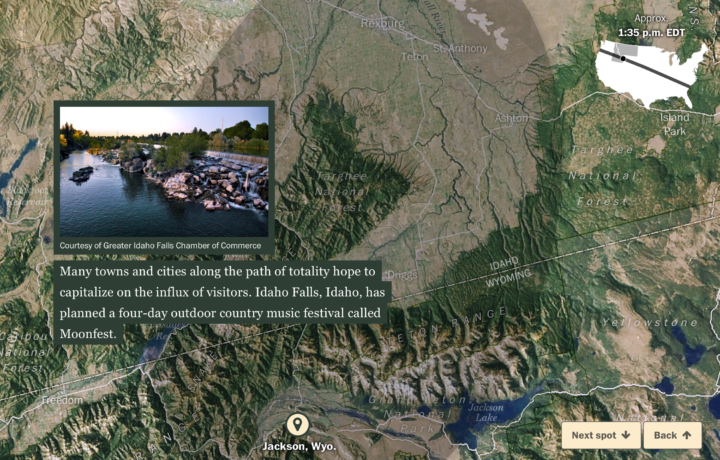
In case you didn’t hear, a solar eclipse is on the way that will be visible on August 21. The total solar eclipse will be visible along a path across the country. The Washington Post, continuing their coverage of the topic, shows the path from above using satellite imagery.
See also: every total solar eclipse ever.
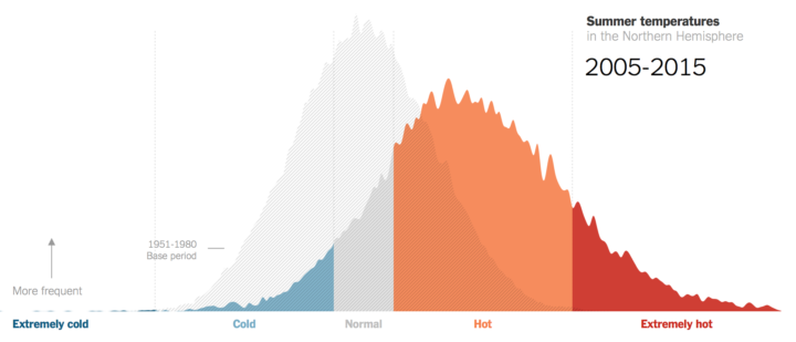
Climate scientist James Hansen and team looked at summer temperatures over several decades. The New York Times charted the increases.
To create the bell curves, Dr. Hansen and two colleagues compared actual summer temperatures for each decade since the 1980s to a fixed baseline average. During the base period, 1951 to 1980, about a third of local summer temperatures across the Northern Hemisphere were in what they called a “near average” or normal range. A third were considered cold; a third were hot.
Since then, summer temperatures have shifted drastically, the researchers found. Between 2005 and 2015, two-thirds of values were in the hot category, and nearly 15 percent were in a new category: extremely hot.
Since forever, we’ve tried to make jobs easier. More automated. In many cases, where a machine replaced a job, new jobs were created. Kurzgesagt explains why it’s different this time around.
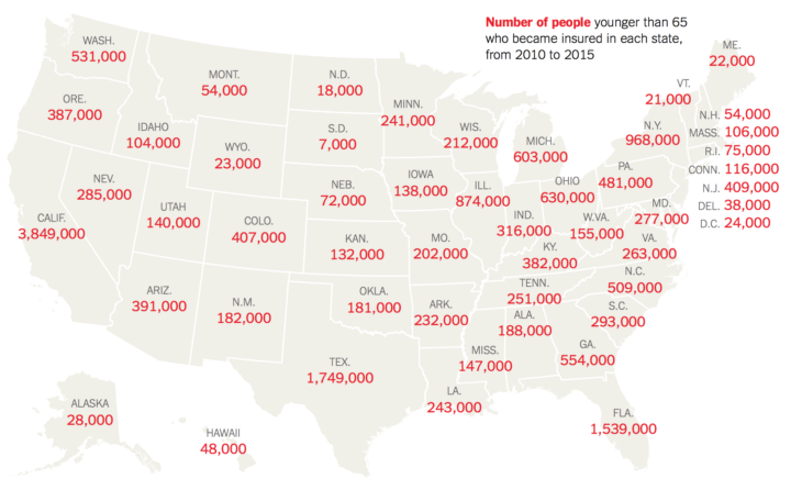
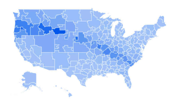
The Urban Institute estimated how many people in each state gained health insurance through the Affordable Care Act. Now they might lose it. The New York Times reports.
Oof.

Nicky Case, who has a knack for making complex topics playfully fun, delves into the evolution of trust between people and groups using game theory. And naturally, the explainer is in the format of a game. See how the golden rule plays out, how cheaters prosper in the short run but lose in the end, and how communication is key.
The game takes about 30 minutes to play. Worth your time.
FlowingData turned a decade last month. June 25 to be exact. Woo woo.
I had to buy hosting for some graduate school project in 2007, and it came with a free domain name. Looking for some variation of data flows, I settled on flowingdata.com. I used it as a sandbox for stray HTML pages, and then on some idle day when I didn’t want to write my dissertation, I setup WordPress. I wrote stuff. I rambled. I wrote about Flash. I shared things that I thought were interesting.
I initially didn’t set specific goals for the site, but I knew I didn’t want to be someone who critiqued charts all of the time. And I was way too inexperienced with visualization anyways. Who was I to judge – when I could barely step outside of the bounds of default plots in R? Visualizing data for a million people is very different from visualizing data for a few.
I decided FlowingData would be a happy place to highlight work I liked and a place I could put up my own stuff. It would be a place where people could see data was fun — enjoy it even — and then learn in the process. I learned too.
So not much changed in a decade. I hope to not change for many more years.
I thank my lucky stars that this is what I get to do for a living.
Thanks for reading. Thank you for supporting.
Some jobs tend towards higher divorce rates. Some towards lower. Salary also probably plays a role.
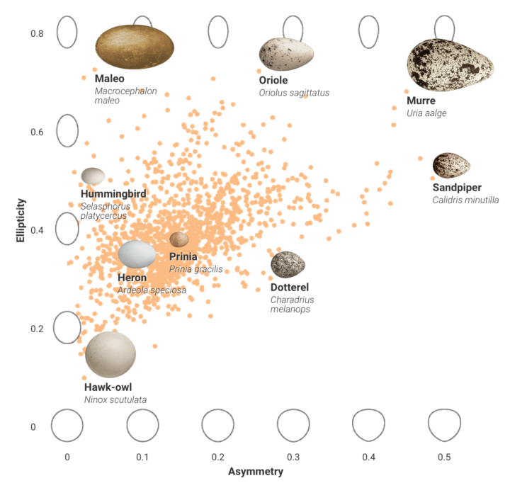
Bird eggs come in all shapes and sizes, and people didn’t really know why. After analyzing a number of variables, researchers think they found their answer.
After crunching the numbers, the scientists found the links they’d been looking for: the length of an egg correlates with bird body size. The shape of an egg—how asymmetrical or elliptical it is—relates to flying habits. And the stronger a bird’s flight, the more asymmetrical or elliptical its eggs will be.
Lots of charts and probably more information about bird eggs than you ever thought you wanted to know.
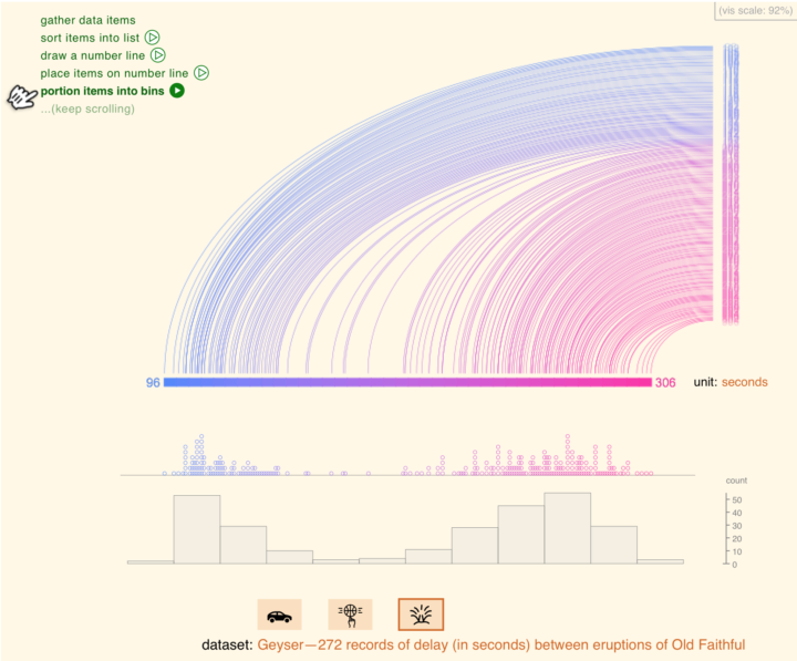
Histograms require some statistical knowledge to grasp, and without the tidbits, the distribution chart looks like any other bar chart. So much more though. They can show a lot about your data, and statisticians start nearly every analysis with at least one. Aran Lunzer and Amelia McNamara provide a visual essay to explain how they work, so that you too can reap the rewards.
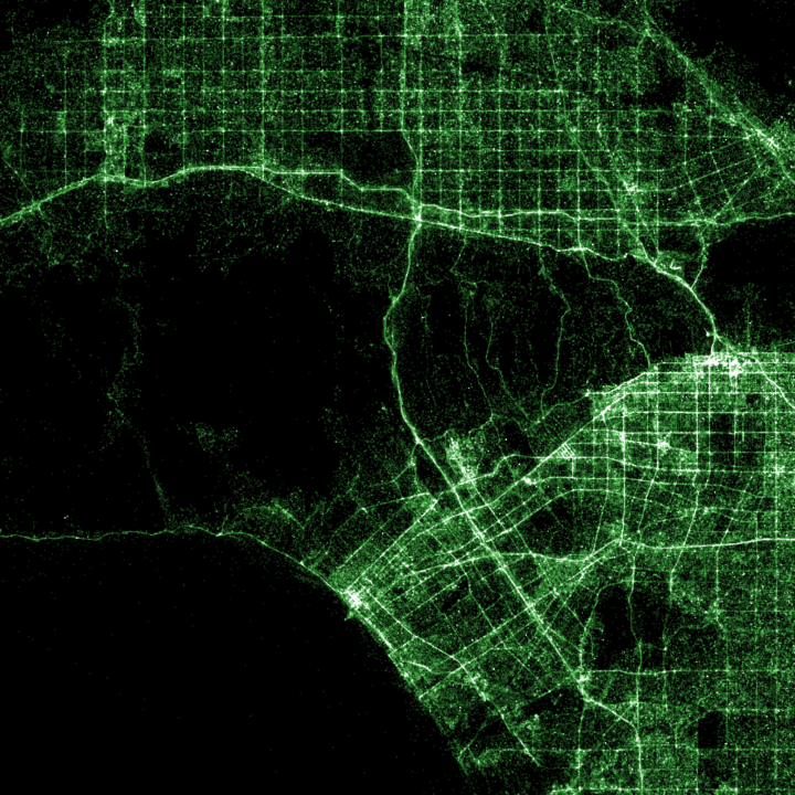
Shazam is a service with an app that lets you point your phone towards some music to identify the name and artist of a song. For a hack day, Umar Hansa mapped a billion recognitions. Some of the maps color-code recognitions by iPhone and Android use which is kind of interesting.
Hansa used Eric Fischer’s datamaps, in case you’re interested in making your own.
 Visualize This: The FlowingData Guide to Design, Visualization, and Statistics (2nd Edition)
New tools, refined process.


