• Membership
  • Books
  • Projects
  • Learning
  • About
  • Member Login
  • Compare your commute time to others

    March 30, 2017

    Topic

    Maps  /  commute

    Commuting sucks. Here’s a straightforward map to compare how much or less your commute sucks compared to others in your area. Enter your ZIP code, and you get a simple comparison to the average, based on 2006-2011 U.S. Census American Community Survey.

  • Trump approval ratings compared to past presidents

    March 29, 2017

    Topic

    Statistical Visualization  /  FiveThirtyEight, government

    Using multiple polls as their source data, FiveThirtyEight is tracking approval and disapproval ratings for Donald Trump. The page leads with overall estimates with a couple of bands of uncertainty for projections into the next few months. I still wonder what proportion of readers understand the ranges, but I’m glad they’re there.

    Scroll down the page to see how Trump’s ratings compare to past presidents. You can switch between approval, disapproval, and net approval, along with options to change the time span — which is nice for a page that updates for the next four years.

  • Scrabble data and analysis

    March 29, 2017

    Topic

    Data Sources  /  R, Scrabble

    Looking for some data to play with? James P. Curley compiled Scrabble data using computer-played games in Quackle Scrabble. Check out his summary analysis or grab the data for yourself in the R package scrabblr.

  • Complement data with emotion for full effect

    March 28, 2017

    Topic

    Statistics  /  emotion, human

    Data is a great vehicle for arguments, but the (not just visual) perception can change completely depending how a reader feels. Cognitive neuroscientist Tali Sharot talks facts and emotions on Hidden Brain.

    The example at the end is interesting. Tell a person a joke when they’re sad, and they probably won’t think the joke is funny. Make the person happy first, and it’s more likely they’ll see the joke from your point of view. How does this transfer to the communication of data? [via Kim Rees]

  • LOOPY is a tool to think in systems

    March 27, 2017

    Topic

    Visualization  /  simulation

    Nicky Case, whose projects to simulate segregation and systems with emoji you might recognize, likes to think in systems. Piece together steps and objects, and let them interact with each other using various probabilities and weights. Simulate. See what happens.

    Case’s newest project, LOOPY, is a tool to build your own systems. No programming required. Just click-and-drag things and press play.

  • All major meteor showers, as seen from space

    March 27, 2017

    Topic

    Maps  /  meteor, space

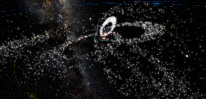
    There are a lot of meteoroids circling around in space. Ian Webster visualized all of the major ones at once.

    Meteor showers on Earth are caused by streams of meteoroids hitting our atmosphere. These meteoroids are sand- and pebble-sized bits of rock that were once released from their parent comet. Some comets are no longer active and are now called asteroids.

    This visualization shows these meteoroid streams orbiting the Sun, some stretching to the outer regions of the solar system.

    Pan and zoom, filter by time, select specific showers, and watch from multiple vantage points. Nice. (It was sluggish in Safari but was smooth in Chrome.)

    See also Webster’s Asterank.

  • Fastest way to alphabetize your bookshelf

    March 24, 2017

    Topic

    Infographics  /  sorting

    Sorting algorithms. Apparently there are an endless number of ways to visualize them in various contexts, and somehow it never gets old. Here sorting in the context of books on a shelf.

  • Towards simple visualization

    March 23, 2017

    Topic

    Visualization  /  career

    Irene Ros, the Director of Data Visualization at Bocoup, talks about her path through the field of visualization, which kind of doubles as a quick history of the past decade.

    These days, I’ve relaxed the demands I put on myself around the visual wow-ness of my work. Sure, it’s really wonderful to have recognition from my peers in the industry, but it’s actually even more wonderful to build a really simple tool for small clinic practitioners to track their patient experience data in a digital way for the first time; to show and explain to them a box plot and suddenly see them make use of it. A box plot is never going to win awards, but a well crafted tool that is simple to use is going to make someone’s life better, or at least a little easier.

  • Catching a real ball in virtual reality

    March 23, 2017

    Topic

    Visualization  /  Disney, physical, VR

    Man wears virtual reality headset. Another man throws a ball to headset-wearing man. Headset-wearing man catches actual ball displayed in virtual reality. There’s something magical about the quick data processing going on here.

  • Economics of airline class

    March 22, 2017

    Topic

    Statistics  /  flights, money

    Wendover Productions explains basic economics of airline classes. The passengers in first class and business, assuming seats are occupied, make much more for airlines than the economy class. Sounds familiar.

  • Conflicted public opinion about global warming

    March 22, 2017

    Topic

    Maps  /  global warming, New York Times, opinion

    Based on estimates from the Yale Program on Climate Change Communication, The New York Times mapped the percentage of people who think global warming will harm the country against the percentage of people who think it will harm them personally. It’s a big contrast. A delayed trend essentially, which is a big source of why action is so slow-moving.

    Check out the Yale interactive too to see more contrasting opinions.

  • Simulation shows how your mouth works when you talk

    March 21, 2017

    Topic

    Infographics  /  simulation, talking

    You have a mouth with a bunch of tissue in it and manipulate your tongue, lips, throat, and other pieces so that somehow words come out. A lot of variables figure in, which can make the whole process of talking a complex process. Neil Thapen makes it more understandable with a fun simulator he calls Pink Trombone. Turn your sound on, and click and drag any of the words to see how voice changes when you modulate parts of the mouth.

  • Shifting national budget

    March 20, 2017

    Topic

    Infographics  /  budget, government, Washington Post

    The Washington Post looks at the shifting national budget over the past 40 years. Be sure to keep scrolling past the first overall to see the funding for departments separately. The consistent vertical scale works well.

  • Data Underload  /  sex, virginity

    When Straight Americans Lost Their Virginity

    Everyone has his or her own timeline, but here it is in general for Americans.

    Read More
  • Penrose map binning

    March 16, 2017

    Topic

    Maps  /  Penrose

    Cartographer Daniel Huffman tried out Penrose tiling for binning in maps:

    A Penrose tiling is a form of tessellation. It’s fun and unique in that it fills the entire plane, but has no repeats. Wikipedia has more detail about how these things are cool. Mostly, I thought of them because they look interesting and are sort of regular, without being too regular.

    He recently came back to the method to look at elevation for the pretty result above.

  • Interactive or not to interactive visualization?

    March 15, 2017

    Topic

    Design  /  interactive

    In a recent talk, New York Times graphics editor Gregor Aisch noted that only 10 to 15 percent of readers who visit an interactive visualization on their site actually click on anything. That’s a lot of people who don’t get everything that New York Times interactives have to offer, which begs the question: Is it worth the time and effort to make these things?

    As with most design-related things, it depends on the goals and the audience of your visualization. Dominikus Baur explains in detail, drawing experiences from his own work.

  • Visualization choice depends on the data and the questions

    March 15, 2017

    Topic

    Design  /  questions

    When you don’t know where to start with a dataset, try to come up with a question. It’ll point you in the direction you want to go, as this guide by Frédérik Ruys shows you. [via @maartenzam]

  • Most typical city in America

    March 14, 2017

    Topic

    Statistics  /  average, demographics

    Here’s a fun piece by Karl Sluis. He looked at eight demographic metrics, such as population, age, and income (based on estimates from the American Community Survey) and found the “most typical” city in America that sat around the median of all the measurements.

    According to the averages across these eight measures, the Lynchburg, Virginia Statistical Area is the most typical statistical area in the country. Made of four counties and eleven communities, Lynchburg’s statistics are less than half of a standard deviation from average across every measure. In fact, the median income of Lynchburg’s residents ($46,913) lies closer to the average ($46,871) than any other city.

    Congratulations, Lynchburg. You get the award for most average.

  • Scale of Aleppo against Berlin and London

    March 13, 2017

    Topic

    Maps  /  Aleppo, scale

    A lot of people around the world including myself don’t quite understand the scale of what’s going on in Syria. We just know it’s bad. Hans Hack overlaid Aleppo on top of London and Berlin to give you a better idea.

    As a geographical reference point, the historical center of Aleppo (The Citadel of Aleppo) has been superimposed on that of Berlin (Museum Island) and London (The Tower of London). The reprojected destruction is indicated by randomly selected buildings marked in red. To make it more representative, the distribution of the reprojected destruction has also been mapped with respect to Aleppo’s administrative borders provided by OCHA.

  • Find a safe bike route with this map

    March 10, 2017

    Topic

    Maps  /  biking, Mapzen

    Spring is in the air in a lot of places, and that means it’s time to dig up the bicycle from winter hibernation and have a ride. Not much beats the satisfaction of a casual ride in perfect weather. A gentle breeze kisses your face. The sun shines on you but it’s not too hot.

    But then you realize you’re on a road without a bike lane and there’s heavy traffic. A semi truck rushes past you and you feel the weight of air almost blow you off your bike. Shoot. If only there was a map that you looked at beforehand that showed you the safe places to ride.

    Oh wait, there’s this bike riding map from Mapzen that colors roads by three tiers of safety. Score.

  • Page 167 of 394
  • <
  • 1
  • ...
  • 164
  • 165
  • 166
  • 167
  • 168
  • 169
  • ...
  • 394
  • >

Analyze, visualize, and communicate data usefully, beyond the defaults.

Become a member →

Recently for Members

June 19, 2025
Making Data Relatable

June 12, 2025
Comparing multiples

June 5, 2025
Caring Data

May 29, 2025
Visualization Tools and Resources, May 2025 Roundup

May 22, 2025
Conflicting points of view over the same data

Second Edition

Visualize This: The FlowingData Guide to Design, Visualization, and Statistics (2nd Edition)

New tools, refined process.

Order: Amazon / Bookshop

Browse by Chart Type See All →

Mosaic Plot Chord Diagram Calendar Sankey Diagram Choropleth Map Line Map Surface Plot Donut Chart Parallel Sets Cartogram

Browse By Topic

  • Visualization

    Seeing data

  • Maps

    Seeing geographic data

  • Infographics

    Explaining data

  • Networks

    Connecting data

  • Statistics

    Analyzing data

  • Software

    Working with data

  • Sources

    Getting data

  • Design

    Making data readable

Made by FlowingData

  • The Process

  • Data Underload

  • Chart Everything

  • Guides

  • Books

  • Shop

  • About
  • Contact
  • Newsletter
  • LinkedIn
  • Instagram
  • Bluesky
  • RSS
Copyright © 2007-Present FlowingData. All rights reserved.