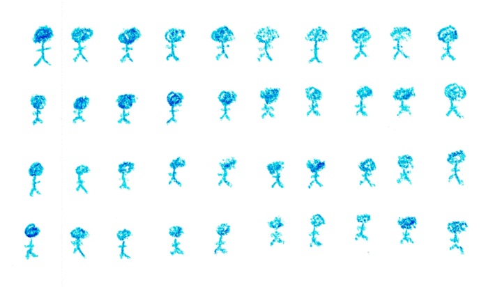
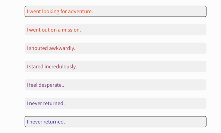
• Membership
  • Newsletter
  • Projects
  • Learning
  • About
  • Member Login
  • Bread bag alignment chart

    August 11, 2017

    Topic

    Infographics  /  alignment chart, bread, humor

    From @aurelianrabbit, the bread bag alignment chart. Lawful neutral, right here.

  • Where North Korea can reach with its missiles

    August 11, 2017

    Topic

    Maps  /  missile, New York Times, North Korea

    Troy Griggs and Karen Yourish for The New York Times mapped the estimated range of North Korea’s current missiles. They might be able to reach the continental United States now. Ugh. Just typing that, I feel uneasy.

  • Machine learning to find spy planes

    August 11, 2017

    Topic

    Statistics  /  BuzzFeed, flights, machine learning

    Last year, BuzzFeed News went looking for surveillance flight paths from the FBI and Homeland Security. Peter Aldhous describes how they did it. They used machine learning — a random forest algorithm to be more specific — to find the spy planes, which as you might expect tended to circle around more than normal flights.

  • Data Underload  /  Airbnb

    How Airbnb Visitors Rate Location in Major US Cities

    This is how Airbnb visitors judge location, which provides a view into where city centers begin and end.

    Read More
  • Perception of neighborhoods through Airbnb ratings

    August 10, 2017

    Topic

    Maps  /  Airbnb

    Beñat Arregi made a series of Airbnb maps with a simple premise. If you look at the average ratings for the location of listings in an area, you’ll see how the area is perceived by visitors. And that’s what he got.

  • Calculating the opposite of your job

    August 9, 2017

    Topic

    Statistics  /  Upshot, work

    Here’s a fun calculation from The Upshot.

    The Labor Department keeps detailed and at times delightfully odd records on the skills and tasks required for each job. Some of them are physical: trunk strength, speed of limb movement, the ability to stay upright. Others are more knowledge-based: economics and accounting, physics, programming. Together, they capture the essence of what makes a job distinctive.

    We’ve used these records to determine what each job’s polar opposite would be.

    Type in your job, and you see what skills are typically used in yours and your opposite’s. So in case you’re looking for something really different in your work life, here’s about as different as you can go.

  • 14 months of sleep and breast feeding

    August 8, 2017

    Topic

    Self-surveillance  /  parenting

    If you’re a parent, you’ll relate to this right away. The wife of reddit user jitney86 tracked when their infant slept and ate from 3 to 17 months. It’s a lot of noise and randomness in the beginning, and then hallelujah the schedule starts to converge to something predictable.
    Read More

  • How to Make a State Grid Map in R

    Something of a cross between a reference table and a map, the state grid provides equal space to each state and a semblance of the country to quickly pick out individual states.

  • Karate-inspired projection mapping

    August 8, 2017

    Topic

    Data Art  /  projection mapping

    I have no idea how projection mapping works, so it kind of feels like magic to me. I like it. This work projects onto a martial artist, making him bigger than life.

    [arve url=”https://vimeo.com/221538677″ /]

  • Music preference geography

    August 7, 2017

    Topic

    Maps  /  music, Upshot, YouTube

    Travel to different parts of the country, and you hear different types of music on replay. Josh Katz for The Upshot mapped the regionality based on the popularity of artists on YouTube.

    Of the artists on the Billboard Top 100 this spring, we looked at the 50 that were most watched on YouTube in the United States between January 2016 and April 2017. Each map shows relative popularity in different parts of the country. If one part of a map is lighter, it doesn’t mean people there weren’t watching the artist’s videos; it just means fans were more likely to listen to a variety of other artists.

    Nice touch at the beginning: Enter a city or ZIP to listen to the corresponding area’s playlist of popular music as you browse.

    See also Katz’s maps from last year for popular television.

  • Interactive shows map projections with a face

    August 6, 2017

    Topic

    Maps  /  projections

    We’ve seen faces as map projections before, but this is 63 projections on one page. Plus, you can click and drag to change the center points to see how different parts of the face change.

  • Boeing draws a plane in the sky with flight path

    August 4, 2017

    Topic

    Maps  /  Boeing, flight

    In a test flight, Boeing took the thing where you draw using your GPS path to a whole different level. They drew the outline of a plane that spanned the latitude of the conterminous United States.

  • Voronoi diagram of people in the park

    August 4, 2017

    Topic

    Statistical Visualization  /  park, voronoi

    From Rod Bogart, a Voronoi diagram of people sitting in Bryant Park. It’s a self-optimizing system to maximize sitting space.

  • Data Underload  /  salary, tipping

    Working on Tips, by State

    What percentage of a waiter and waitress’s income comes from tips and what comes from salary? The calculation isn’t straightforward but we can try.

    Read More
  • Flow of goods between states

    August 2, 2017

    Topic

    Maps  /  freight

    Using data from the Freight Analysis Framework, Chris Canipe for Axios mapped the flow of goods between states. Select a category of goods from the dropdown, and the map shows total kilotons of the selected goods shipped out of each state through freight. Thicker arrows represent more kilotons.

  • Google Trends eclipse interest

    August 2, 2017

    Topic

    Maps  /  eclipse, Google Trends

    I feel like the large-volume coverage of the upcoming eclipse doesn’t quite match actual interest. I keep seeing graphics, but haven’t heard a peep in real life. But maybe that’s because I don’t live in the path. This map shows the Google search trends for eclipse, which matches the path of the full eclipse. [via @jscarto]

  • Roomba selling maps of home interiors

    August 2, 2017

    Topic

    Data Sharing  /  privacy, Roomba

    Newer Roomba vacuums form a map of your house to more efficiently clean areas. The company plans to sell the data, per Rhett Jones for Gizmodo:

    The Roomba is generally regarded as a cute little robot friend that no one but dogs would consider to be a potential menace. But for the last couple of years, the robovacs have been quietly mapping homes to maximize efficiency. Now, the device’s makers plan to sell that data to smart home device manufacturers, turning the friendly robot into a creeping, creepy little spy.

    This sounds not good.

    But does the general public care? I don’t think they do. It seems like they don’t.

  • Office Hours

    August 1, 2017

    Topic

    Site News

    If you’re a FlowingData member, you can now access the new forum where I’ll hold “office hours”. Ask questions, offer suggestions, or get input about visualization and data things. I’ll be popping in twice a week on Mondays and Wednesdays.

    I have no idea how this will go, but I’m interested for two reasons.

    The first is that there hasn’t been a good place for you to ask questions outside specific tutorials, so the only route is email. There are often repeat questions, and because most questions come from email, there’s no way for you to see existing answers. If there’s already an answer, it’d be nice if you could see it.

    The second reason is that there’s more to visualization that you’re probably curious about than what I have in tutorials and courses. I hope this can be a good place to poke at those curiosities.

    Like I said though, I don’t know how this’ll go. I hope well.

    So yeah, Mondays and Wednesdays. I’ll be around. Feel free to post any questions or suggestions whenever you like though.

    Not a member yet? I’d love your support. You can subscribe here.

  • Page 158 of 392
  • <
  • 1
  • ...
  • 155
  • 156
  • 157
  • 158
  • 159
  • 160
  • ...
  • 392
  • >

Analyze, visualize, and communicate data usefully, beyond the defaults.

Become a member →

Recently for Members

May 15, 2025
Step Chart, Enhanced

May 8, 2025
When the data is not what it seems

May 1, 2025
Finding the Right Charts

April 24, 2025
Visualization Tools, Datasets, and Resources – April 2025 Roundup

April 17, 2025
Breaking Out of Chart Software Defaults

Get the Book

Visualize This: The FlowingData Guide to Design, Visualization, and Statistics

Available now.

Order: Amazon / Bookshop

Browse by Chart Type See All →

Dot Map Variable Width Bar Chart Pie Chart Treemap Barcode Chart Histogram Choropleth Map Scatter Plot Difference Chart

Browse By Topic

  • Visualization

    Seeing data

  • Maps

    Seeing geographic data

  • Infographics

    Explaining data

  • Networks

    Connecting data

  • Statistics

    Analyzing data

  • Software

    Working with data

  • Sources

    Getting data

  • Design

    Making data readable

Made by FlowingData

  • The Process

  • Data Underload

  • Chart Everything

  • Guides

  • Books

  • Shop

  • About
  • Contact
  • Newsletter
  • LinkedIn
  • Instagram
  • Bluesky
  • RSS
Copyright © 2007-Present FlowingData. All rights reserved.