I’m happy to introduce an in-depth, process-focused newsletter for FlowingData members. It’s called The Process. If you’re already a member, you should receive the first issue soon. It’ll be weekly on Thursdays. It’ll be about the how and why of visualization. It’s a benefit in addition to tutorials, courses, etc. Basically, nothing changes, except that you get more now.
If you’re not a member yet, I’d love for you to join. Find out all the benefits of membership here.
A big part of FlowingData is the what of data and visualization. I highlight the interesting work of others and publish my own projects. This all continues too.
However, with The Process I’ll talk more about the practical side of designing data graphics. That means tools, design choices, limitations, analysis, and everything else involved in visualizing data. My hope is that it gives me a chance to broaden my scope past the tutorials and courses, which tend to stick around R and JavaScript, while still providing a practical point of view.
I’m sure the newsletter evolves over time, but I’m excited to see how it develops. I think it will force me to learn new things about visualization and think more critically about the field. I want more depth. I hope you’ll join me.
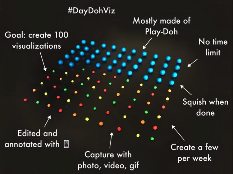
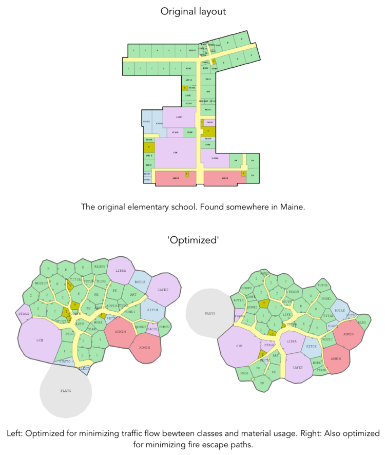
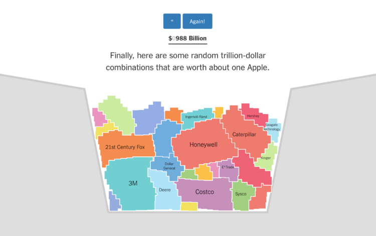
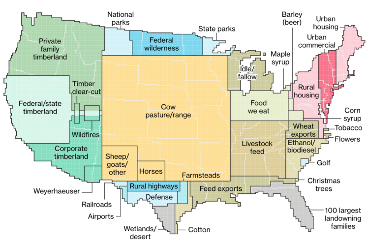
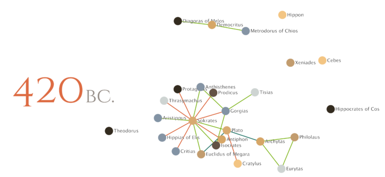
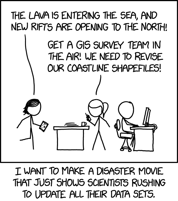 From xkcd, a


 Visualize This: The FlowingData Guide to Design, Visualization, and Statistics (2nd Edition)


