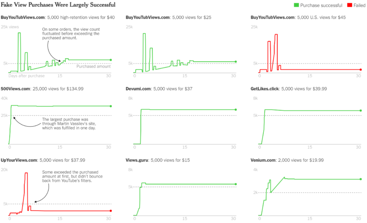
Wherever more attention or the appearance of it equates to more money, there are those who try to game the system. Michael H. Keller for The New York Times examines the business of fake YouTube views:
YouTube’s engineers, statisticians and data scientists are constantly improving in their ability to fight what Ms. O’Connor calls a “very hard problem,” but the attacks have “continually gotten stronger and more sophisticated,” she said.
After the Times reporter presented YouTube with the videos for which he had bought views, the company said sellers had exploited two vulnerabilities that had already been fixed. Later that day, the reporter bought more views from six of the same vendors. The view count rose again, though more slowly. A week later, all but two of the vendors had delivered the full amount.

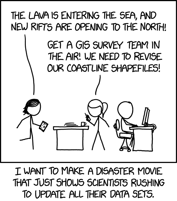 From xkcd, a


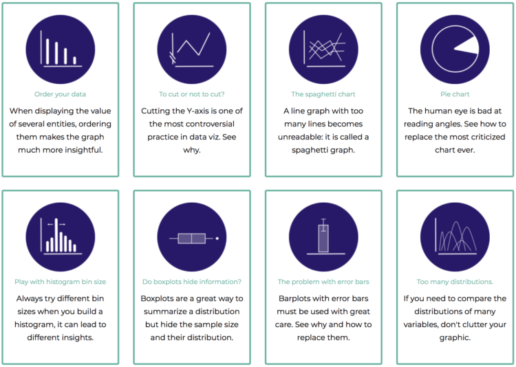
 Visualize This: The FlowingData Guide to Design, Visualization, and Statistics (2nd Edition)


