The eighth Thai boy was rescued from the flooded cave recently. Great news. The South China Morning Post has a series of graphics to explain the rescue path and strategy.
-
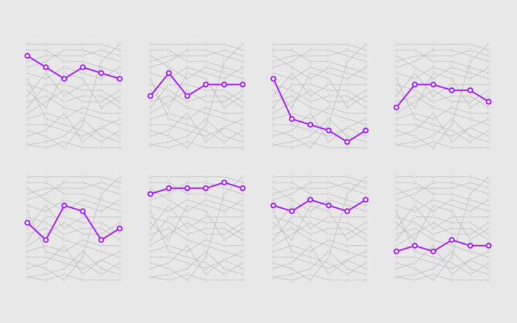
Things have a way of repeating themselves, and it can be useful to highlight these patterns in data.
-
Benjamin Pavard from France made a low-probability goal the other day. Seth Blanchard and Reuben Fischer-Baum for The Washington Post explain the rarity and use it as a segue into expected versus actual goals to gauge how teams have played.
This statistic can also tell us which teams are over and under-producing given their level of play so far, by comparing their expected goals and actual results. Surprise quarterfinalist Russia is the biggest overproducer, with an actual goal differential of +4 compared with an expected goal differential of -1.7. This can mean a lot of things. The team could be getting a bit lucky, or just playing extremely well in such a way that they finish more hard challenges than you would normally expect.
Seems right, I think. I mean, I have to take it at face value, as the sports world is essentially dead to me until basketball season starts again.
-
In the early 1990s, the CIA published internal survey results for how people within the organization interpreted probabilistic words such as “probable” and “little chance”. Participants were asked to attach a probability percentage to the words. Andrew Mauboussin and Michael J. Mauboussinran ran a public survey more recently to see how people interpret the words now.
The main point, like in the CIA poll, was that words matter. Some words like “usually” and “probably” are vague, whereas “always” and “never” are more certain.
I wonder what results would look like if instead of showing a word and asking probability, you flipped it around. Show probability and then ask people for a word to describe. I’d like to see that spectrum.
-
Pedro M. Cruz, John Wihbey, Avni Ghael and Felipe Shibuya from Northeastern University used a tree metaphor to represent a couple centuries of immigration in the United States:
Like countries, trees can be hundreds, even thousands, of years old. Cells grow slowly, and the pattern of growth influences the shape of the trunk. Just as these cells leave an informational mark in the tree, so too do incoming immigrants contribute to the country’s shape.
Feels real.
-
After an unsuccessful battery search, the natural next step was of course to look up battery sizes and chart all of them.
-
Microsoft released a comprehensive dataset for computer-generated building footprints in the United States. The method:
We developed a method that approximates the prediction pixels into polygons making decisions based on the whole prediction feature space. This is very different from standard approaches, e.g. Douglas-Pecker algorithm, which are greedy in nature. The method tries to impose some of a priory building properties, which are, at the moment, manually defined and automatically tuned.
The GeoJSON files for each state are available for download, released under the Open Data Commons Open Database License. Nice.
-
LeBron James decides where he takes his talents this summer, and the sports news outlets continue to review every scenario as rumors trickle in. Neil Paine and Gus Wezerek for FiveThirtyEight present their quantitative solution, sending James to the Philadelphia 76ers.
On one hand, they consider the chances of winning a championship in the next four years, based on projection models. On the other hand, they consider a more subjective rating in legacy-building. All in good fun of course.
I always wonder what it’s like for professional athletes who have to make these sort of decisions. Much of their job is seemingly data-driven, but does someone like James even care about this stuff? Or is it all by feel? I imagine switching jobs to a new city, and I think I’d look at a few numbers initially, but it’d all filter down to the place where my family was happiest, data be damned.
-
It’s important to consider the reasons so that we don’t overreact. Otherwise, we’re just berating, pointing, and laughing all of the time, and that’s not good for anyone.
-
ProPublica compiled spending data from a wide range of sources to calculate the total, which is still an undercount:
The vast majority of the money — at least $13.5 million, or more than 84 percent of what we tracked — was spent by Trump’s presidential campaign (including on Tag Air, the entity that operates Trump’s personal airplane). Republican Senate and House political committees and campaigns have shelled out at least another $2.1 million at Trump properties. At least $400,000 has been spent by federal, state and local agencies. (For example, the Florida Police Chiefs Association held its summer conference last year at the Trump National Doral Miami.) The state and local tally appears to be a gross undercount because of the agencies’ spotty disclosures and reporting.
Messy headed into the presidency and messy still.
Catch the interactive visualization by ProPublica and Fathom Information Design. It shows the available records in more detail, and you can download the data for yourself.
-
Kepler.gl, a collaboration between Uber and Mapbox, allows for easier mapping of large-scale data. From Shan He for Uber:
Showing geospatial data in a single web interface, kepler.gl helps users quickly validate ideas and glean insights from these visualizations. Using kepler.gl, a user can drag and drop a CSV or GeoJSON file into the browser, visualize it with different map layers, explore it by filtering and aggregating it, and eventually export the final visualization as a static map or an animated video.
It plays nice with Mapbox if that’s your jam.
-
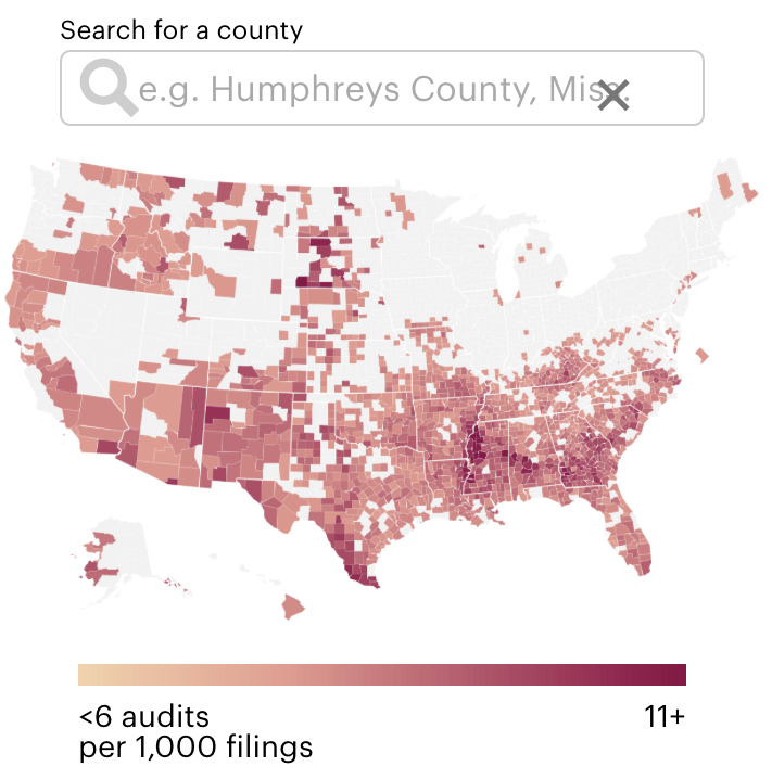
The U.S. Department of Education constantly investigates school districts and colleges for civil rights violations. Lena Groeger and Annie Waldman for ProPublica made the data more accessible, providing the status of past, present, and pending investigations. Search for the place of interest, and you get a calendar and list view of all the cases on record.
-
[arve url=”https://www.youtube.com/watch?v=lx3QlyeG_mI” /]
Condé Nast Traveler got 70 people from 70 different countries to count money on camera. Many times I found myself wondering, “Why would you ever do it like that?” There’s a metaphor for data and its interpretation somewhere in there.
-
It’s in the details of 100,000 moments. I analyzed the crowd-sourced corpus to see what brought the most smiles.
-
Sandra Rendgen describes the history of “data” the word and where it stands in present day.
All through the evolution of statistics through the 19th century, data was generated by humans, and the scientific methodology of measuring and recording data had been a constant topic of debate. This is not trivial, as the question of how data is generated also answers the question of whether and how it is capable of delivering a “true” (or at least “approximated”) representation of reality. The notion that data begins to exist when it is recorded by the machine completely obscures the role that human decisions play in its creation. Who decided which data to record, who programmed the cookie, who built the sensor? And more broadly – what is the specific relationship of any digital data set to reality?
Oh, so there’s more to it than just singular versus plural. Imagine that.
-
Henry Hinnefeld answers the age-old debate of which Mario Kart character is best, using data as his guide.
Some people swore by zippy Yoshi, others argued that big, heavy Bowser was the best option. Back then there were only eight options to choose from; fast forward to the current iteration of the Mario Kart franchise and the question is even more complicated because you can select different karts and tires to go with your character. My Mario Kart reflexes aren’t what they used to be, but I am better at data science than I was as a fourth grader, so in this post I’ll use data to finally answer the question “Who is the best character in Mario Kart?”
For me, it doesn’t matter. You will smoke me regardless of which character I have, because I am world’s worst video game player.
-
A few years ago, Stephanie Yee and Tony Chu explained the introductory facets of machine learning. The piece stood out because it was such a good use of the scrollytelling format. Yee and Chu just published a follow-up that goes into more detail about bias, intentional or not. It’s equally worth your time.
(Seems to work best in Chrome.)
-
I feel like I was supposed to know what blockchain is a while ago, but I’ve only had a hand-wavy explanation on hand. And it wasn’t a very good one. Reuters provides a clear and concise visual explanation of how blockchain works. Now I can explain it to friends and family whenever there’s a Bitcoin spike or dip, or I can at least point them to this explainer.
-
Oh. So that’s why I was always placed in right field that one year.
Little League Analytics ⚾️ pic.twitter.com/THf5FyqRF7
— PetrosAndMoneyShow (@PetrosAndMoney) June 14, 2018
-
Benjamin Schmidt, an assistant professor of history at Northeastern University, explored the space between words and drew the paths to get from one word to another. The above, for example, is the path between Seinfeld and Breaking Bad. Using Google News as the corpus, the steps:
- Take any two words. I used “duck” and “soup” for my testing.
- Find a word that is, in cosine distance, between the two words: that is, that is closer to both of them than either is to each other. Select for one as close to the midpoint as possible.* With “duck” and “soup,” that word turns out to be “chicken”: it’s a bird, but it’s also something that frequently shows up in the same context as soup.
- Repeat the process to find words between “duck” and “chicken.” That, in this corpus, turns out to be “quail.” The vector here seems to be similar to the one above–quail is food relatively more often than duck, but less overwhelmingly than chicken.
- Continue subdividing each path until no more intermediaries exist. For example, “turkey” works as a point between “quail” and “chicken”; but nothing intermediates between turkey and quail, or between turkey and chicken.
Schmidt’s results actually make a lot of sense.
See also: the Google arts experiment that motivated this one.