-
Members Only
-
Niklas Elmqvist provides a detailed guide for finding and a visualization PhD program:
Unless you have a specific reason to choose a specific university (such as a geographic one; maybe you can’t relocate), don’t start from the university you want to go to, but start with the faculty member you want to work with. This is where all that idle web surfing experience can come in useful: you need to become an expert in finding faculty members that have research interests that match your own, and the only way to do so is to trawl their websites and read their papers.
And then applying:
Now, having identified some possible advisors (and don’t just pick one; you never know whether you will be admitted and whether they have funding to hire new students), you should reach out to them. In other words, don’t just apply, but send them an email with plenty of time to spare before the application deadline. Attach your CV, outline your background, and provide some of the above-mentioned commentary on their work and why you are interested in it (i.e., the “hook”). If you have a portfolio or website, link to it. Remember, no form letters!
Useful information here. You might also want to get a sense of flexibility in the department. I was two years into my PhD in statistics until I decided I wanted to go the visualization direction, which was a big switch from my original intentions of statistics education. Focus and interests tend to shift after you learn more.
Once you get into a program, see also my survival guide for avoiding burnout and finishing.
-
The stock market is in a state. So finicky the past few months. Kate Rabinowitz and Leslie Shapiro for The Washington Post provide a view further into the past for more context to the recent flux. The stretching time axis as you scroll makes for an easy-to-follow visual cue.
-
Max Read for New York Magazine describes the fake-ness of internet through the metrics, the people, and the content:
Can we still trust the metrics? After the Inversion, what’s the point? Even when we put our faith in their accuracy, there’s something not quite real about them: My favorite statistic this year was Facebook’s claim that 75 million people watched at least a minute of Facebook Watch videos every day — though, as Facebook admitted, the 60 seconds in that one minute didn’t need to be watched consecutively. Real videos, real people, fake minutes.
I wonder how the fake-ness level online compares to fraud IRL.
-
While looking through this year’s projects, picking out my favorites, I couldn’t help but reminisce about the times when the internet used to feel so care-free. It was more relaxed.
These days, there’s too much going on in the world for the internet to relax. Or rather, more of the world happens online now. This year, I felt like if I was going to spend time working on a project or writing something, it had to help people see a different perspective or teach something. I couldn’t just do it out of personal interest.
Read More -
Bloomberg charted voter turnout for the just past midterm elections, comparing 2018 against 2014. As you might expect, there are a lot of blue arrows pointed up and to the left. Turnout decreased in only two districts.
-
Visualization continues to mature and develop into a medium. There’s less focus on visualization the tool and more focus on how to use the tools. That is a good thing.
-
Matthew Conlen provides a short explainer of how kernel density estimation works. Nifty.
-
Kirk Goldsberry is back at ESPN. I put this here mainly because it’s nice to have the hexbin shot charts in the feed again.
-
The Wall Street Journal highlighted a disagreement between data and business at Netflix. Ultimately, the business side “won.” However, maybe that’s the wrong framing. Roger Peng describes the differences between analysis and the full truth:
There’s no evidence in the reporting that the content team didn’t believe the data or the analysis. It’s just that their fear of damaging a relationship with an actor overruled whatever desire they might have had to maximize clicks or views. The logic was probably along the lines of “We may take a hit in the short-run but we will benefit from this relationship in the long-run.” Whether that’s true or not is unclear, but it’s a tricky question to answer with data. It’s not even clear to me how you would formulate that question.
Data often pitches itself as the path to definitive answers, but most of the time it gives you possibilities and weighted suggestions. Follow blindly, and you end up with creepy, algorithmically-generated YouTube videos.
-
Descartes Labs used machine learning to identify all of the trees in the world where at least one-meter resolution satellite imagery is available. Tim Wallace with the maps:
The ability to map tree canopy at a such a high resolution in areas that can’t be easily reached on foot would be helpful for utility companies to pinpoint encroachment issues—or for municipalities to find possible trouble spots beyond their official tree census (if they even have one). But by zooming out to a city level, patterns in the tree canopy show off urban greenspace quirks. For example, unexpected tree deserts can be identified and neighborhoods that would most benefit from a surge of saplings revealed.
-
Jon Keegan scraped the playlist from the local radio station’s all-Christmas playlist for a few days. Then he looked at play counts and original composition dates:
Considering the year in which each song was written, my dataset spanned 484 years of published music. Of course, many of the older songs are considered “traditional” songs, without a clear writer or composer. One obvious thing about this genre is that it is rich with covers (performing a new version of someone else’s song). Of the 1,510 songs played over this period that I was examining, it turns out there are really only about 80 unique songs in the dataset. But from those 80 songs come lots of covers, medleys and live recordings.
-
Members Only
-
Computers can generate faces that look real. What a time to be alive. As it becomes easier to do so, you can bet that the software will be used at some point for less innocent reasons. You should probably know how to tell the difference between fake and real. Kyle McDonald provides a guide to the telltale signs of AI-generated faces.
-
In visual perception, a figure-ground grouping is where you recognize an object through the background. Think of the vase and two faces image. Hans Hack made a simple tool that lets you make such a diagram using OpenStreetMap data. Select a location in the world, adjust the radius of the circle, provide a label, and voilà, you have yourself a poster. Download it as an image or SVG file.
-
Euclid’s Elements is a series of 13 books produced in 300 BC that forms a collection of mathematician Euclid’s proofs and definitions. In 1847, Oliver Byrne recreated the first six books “in which coloured diagrams and symbols are used instead of letters for the greater ease of learners.” Nicholas Rougeux recreated Byrne’s work with an online interactive version:
This site was created to bring Byrne’s colorful edition to life by making it available to a modern audience by reproducing the entire book online so it would be accessible to anyone with modern equipment and a flexible design as true to the original as possible. Each diagram was created by tracing the originals and ensuring their dimensions and relationships stayed true to Euclid’s geometric principles. Proofs accompanying each diagram have been enhanced with clickable shapes to aid in understanding the shapes being referenced.
What glorious tedium. Read more on Rougeux’s process here. See also his previous recreation of the 1821 Nomenclature of Colours.
-
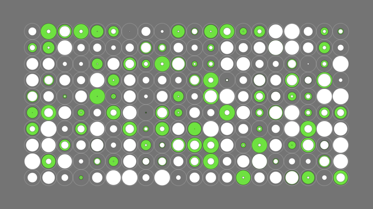
The debate rages on about the categorization of food items as soup, salad, or sandwich. Is a hot dog a sandwich? It has meat in bread. At what ratio of solid to liquid does a stew become a soup? The Soup-Salad-Sandwich Space makes the classifications more explicit. You’re welcome.
-
As I watched Google’s CEO Sundar Pichai field questions from the House Judiciary Committee it was hard not to feel like there was a big gap in how the internet works and how members of Congress think it works. Many suggested the gap was related to age, so I couldn’t help but wonder how the age distribution has changed over the years.
You can see the median age shifting older, but I’m not totally sure what to make of it. After all, the population as a whole is getting older too. On the other hand, the internet changed a lot of things in our lives, and the hope is that those forming the policies understand the ins and outs.
-
Members Only
-
The New York Times takes a closer look at the data that apps collect and what they know about you:
At least 75 companies receive anonymous, precise location data from apps whose users enable location services to get local news and weather or other information, The Times found. Several of those businesses claim to track up to 200 million mobile devices in the United States — about half those in use last year. The database reviewed by The Times — a sample of information gathered in 2017 and held by one company — reveals people’s travels in startling detail, accurate to within a few yards and in some cases updated more than 14,000 times a day.
The animated visuals in this piece are nice, strengthening the big numbers with small anecdotes. Because the only way to make people care about data privacy is to be as creepy (but responsible) as possible.