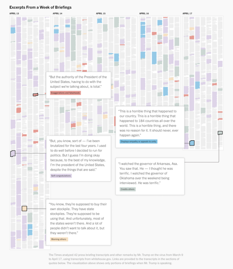
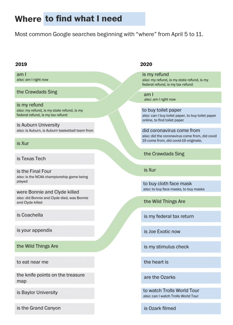
The New York Times went through the words used during press briefings, pulling out five main categories and highlighting one in particular:
Viewed simply as a pattern of Mr. Trump’s speech, the self-aggrandizement is singular for an American leader. But his approach is even more extraordinary because he is taking credit and demanding affirmation while he asks people to look beyond themselves and bear considerable hardship to help slow the spread of the virus.
Hm.


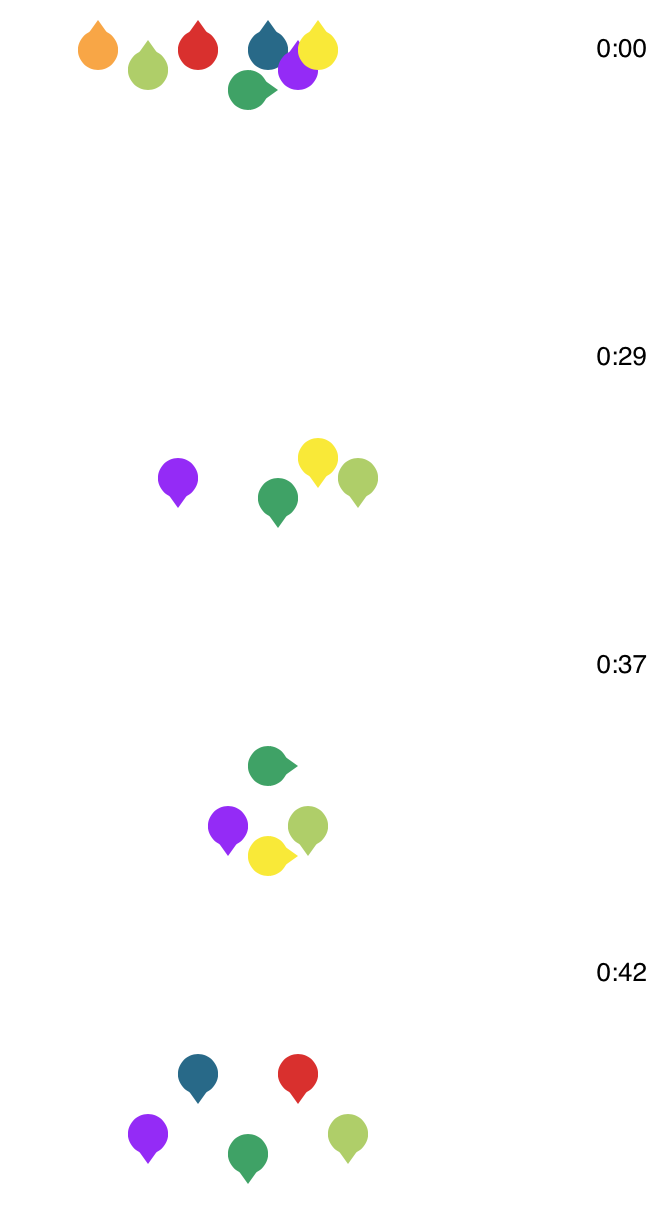 BTS, the South Korean boy band, is apparently really good at dancing. Ketchup Duck

 Visualize This: The FlowingData Guide to Design, Visualization, and Statistics (2nd Edition)


