Line Chart
Typically used to show trends over time, the slope of the line between two points shows patterns of change.
Cumulative 3-pointers for the Splash Brothers
Tonight is game six of the NBA Finals. If the Golden State Warriors…
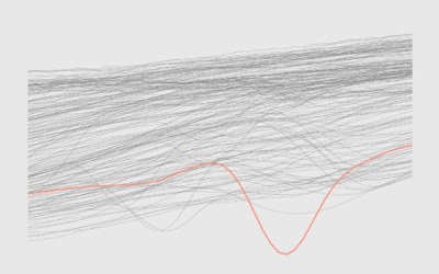
How to Make a Line Chart with a Color Gradient in R
Use color to reinforce or add another layer of meaning to a regular line chart.
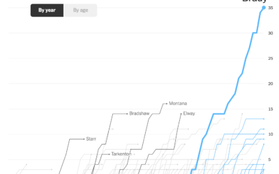
Charts showing Tom Brady’s standout career
Tom Brady announced his retirement from the National Football League, which ends a…

Declining U.S. Births
The number of births per month has been decreasing over the past decade. The pandemic seems to have sped up the process in the beginning.
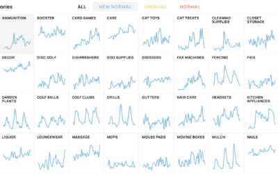
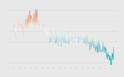
New shopping search patterns from the pandemic
Schema Design, Google Trends, and Axios collaborated on The New Normal, looking at…
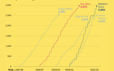
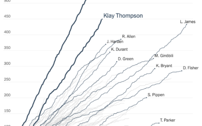
Stephen Curry career threes compared to other players
Stephen Curry is about to break the record for number of three-pointers made…
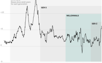
Inflation in the context of age generations
When you compare the price of things today against prices one year ago,…
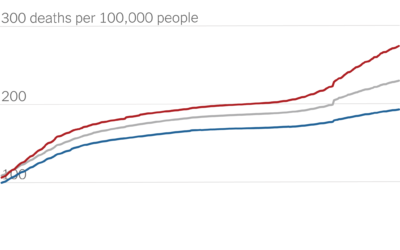
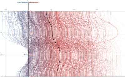
Partisan gap in Covid death counts
David Leonhardt for The New York Times looked at the partisan gap for…
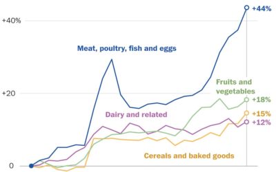
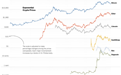
Rising prices of everything
Using Consumer Price Index, Alyssa Fowers and Rachel Siegel for The Washington Post…
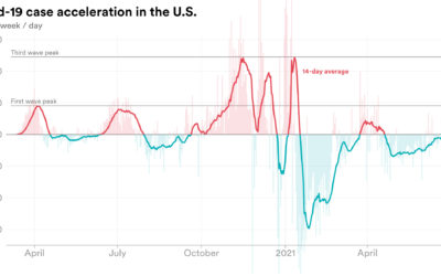
Rate of change in Covid-19 cases
We’re all familiar with the Covid-19 line charts that show cases over time,…
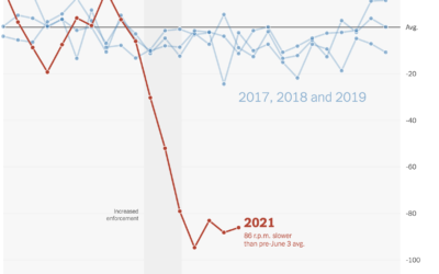
Falling spin rates in baseball after rule enforcement
NYT’s The Upshot analyzed spin rate on pitches before and after enforcing a…
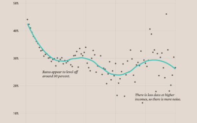
Divorce Rates and Income
Divorce rates are tied to job security, age, and occupation, so it should make sense that we see a pattern when we plot divorce rates against income.
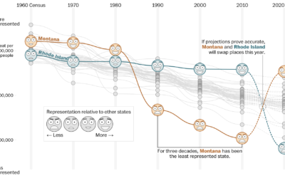
How your state might lose or gain representation with Census count
Harry Stevens, Tara Bahrampour and Ted Mellnik for The Washington Post look at…
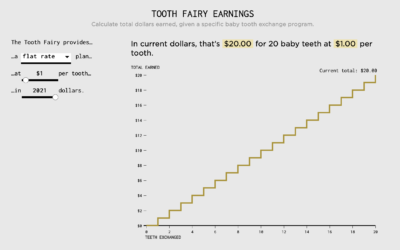
Tooth Fairy Exchange Rate
Calculating how much money a kid gets after exchanging all twenty baby teeth.
Improving vaccine distribution in all states
Lauren Leatherby and Amy Schoenfeld Walker reporting for The New York Times:
“Every…
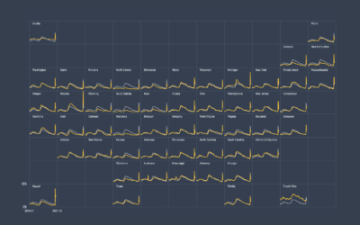
How to Make Small Multiples in Excel
Also known as trellis charts, lattice chart, or whatever you want to call them, the technique lets you compare several categories in one view.
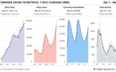
Spike past 100k Covid-19 cases in a day
Meanwhile… based on estimates from The COVID Tracking Project, the United States had…