As an experiment, Linda Dong used Keynote, typically for your everyday slide presentations,…
Infographics
Telling stories with data and graphics.
-

Motion graphics in Keynote
-
Past and future predictions of when the world will end
Wikipedia has a list of predicted dates for when apocalypse strikes, because of…
-
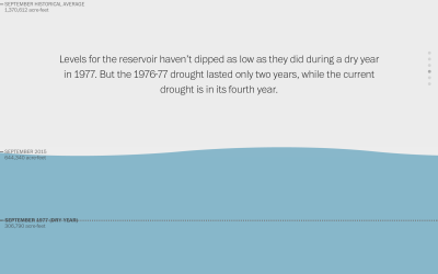
Water scroller
Here’s a nice scroller from Katie Park for the Washington Post. It shows…
-
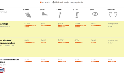
Value of body parts for injured workers
A detailed look at the state where companies can write their own workers’ compensation plans.
-
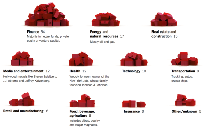
Monopoly pieces to show presidential funding
According to the New York Times, 158 families funded about half of the…
-
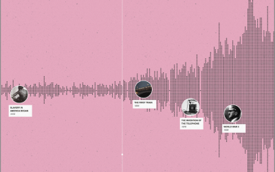
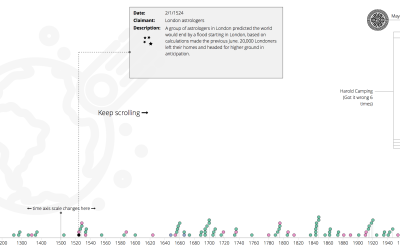
A timeline of history
“I wish there was a timeline browser for all the historical events documented…
-
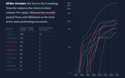
Human side of executions
On one side, a person is scheduled to die. On the other, the person did horrible things. It’s complex.
-
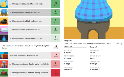
Imagining alternative iPhone power sources
Lithium-ion batteries power the iPhone (among other things), but what if we could…
-
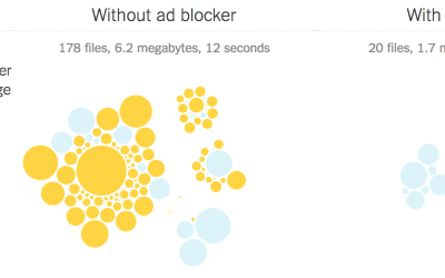
Cost of mobile ads to the consumer
The ethics and future of ads to keep sites running is still up…
-
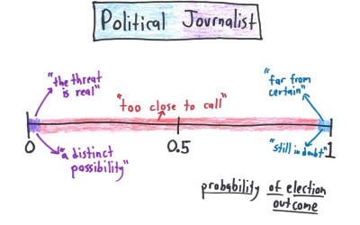
What probability means in different fields
Statistically, probability ranges from 0 to 1 — impossible to definitely without a…
-

Interactive explanation for how neurons work
Nicky Case made an interactive explanation of how neurons work. It’s part narrated…
-

Pascal’s triangle, not just a stack of numbers
SECRETS REVEALED.
-
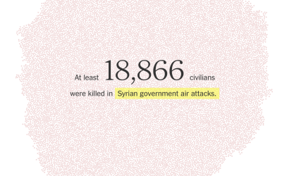
Death in Syria counted
In a striking representation by the New York Times, a dot represents each life lost.
-
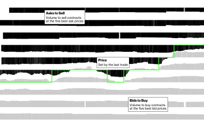
Searching for stock market spoofers
A stepper from Bloomberg that explains how spoofers put in fake orders to game the market.
-

Be a tennis line judge: Interactive tests your skills
Watch video clips from the judge’s point of view and try to make the call.
-

Same BMI, different body
The index needs an information supplement.
-
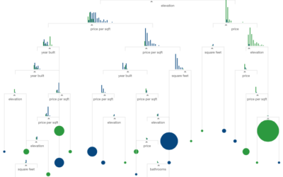
Visual introduction to machine learning
What is machine learning? It sounds like a bunch of computers get together…
-
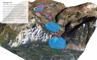
Ascent in the Tour de France
I was flipping through the channels the other night and happened on the…
Recently for Members
Second Edition
 Visualize This: The FlowingData Guide to Design, Visualization, and Statistics (2nd Edition)
 Visualize This: The FlowingData Guide to Design, Visualization, and Statistics (2nd Edition)
New tools, refined process.
Browse by Chart Type See All →


