Stereotropes, made by the Bocoup Data Visualization Team, explores the many tropes in…
Infographics
Telling stories with data and graphics.
-
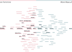
Recurring characters in film and the words used to describe them
-
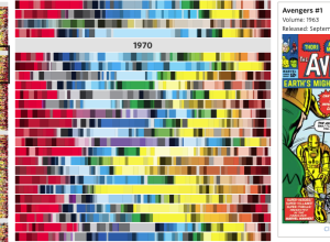
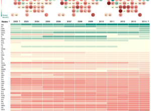
Color timeline for Avengers comic book covers
The Avengers comic has been around since 1963 and the look and feel…
-

LEGO explainer: Taxes and income inequality
LEGOs make everything better. David Wessel for Brookings Institution explains how federal taxes…
-

A tall graphic to show Mt. Everest scale
Mt. Everest is a tall mountain. How tall is it?? Glad you asked.…
-

Cocktail construction chart
Remember that engineer’s guide to drinks a while back? I think this one…
-

Every Game of Thrones death
I hear there’s a show called “Game of Thrones” on the T.V., where…
-
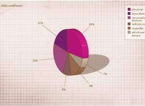
Rickrolling pie chart
From Finger Magazine a few years back, in the heyday of rickrolling and…
-
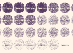
A beard scale for baseball
There are a lot of beards and other types of facial hair in…
-
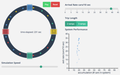
Traffic gridlock simulation
I hate all things commute- and traffic-related, and it’s probably why I like…
-
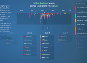
Equality for women and girls, 20-year report
In their continued work on the No Ceilings project, Fathom describes the current…
-
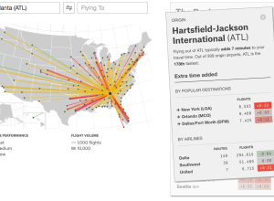
Find the fastest flight between airports
Flight arrival and departure times are often thought of in terms of “on…
-
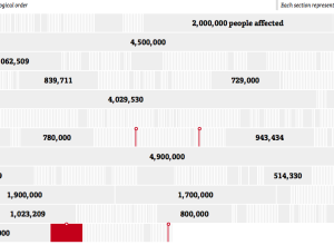
Health data breaches and fines
Sisi Wei and Charles Ornstein for ProPublica highlight reported data breaches to the…
-
Decline of workers’ compensation
Workers’ Compensation, a promise to pay medical bills and some of your wages…
-
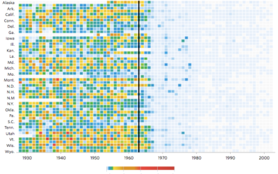
Impact of vaccines throughout history
Not that anyone who does not vaccinate their kids cares, but Tynan DeBold…
-
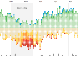
Job gains and losses over time
Andrew Van Dam and Renee Lightner for the Wall Street Journal provide a…
-
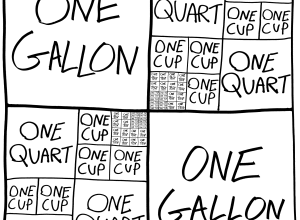
Baking units demystified
A handy chart by Andrew M.H. Alexander. Treemap conversion from one gallon, down…
-
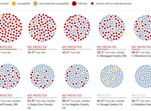
Vaccination rate and measles outbreak simulation
You’ve probably heard about herd immunity by now. Vaccinations help the individual and…
-
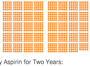
Chances that a drug treatment helps
It’s a common belief that if someone has a medical condition, a patient…
Recently for Members
Second Edition
 Visualize This: The FlowingData Guide to Design, Visualization, and Statistics (2nd Edition)
 Visualize This: The FlowingData Guide to Design, Visualization, and Statistics (2nd Edition)
New tools, refined process.
Browse by Chart Type See All →


