Daylight saving time ends in the United States this weekend and ended already…
Infographics
Telling stories with data and graphics.
-
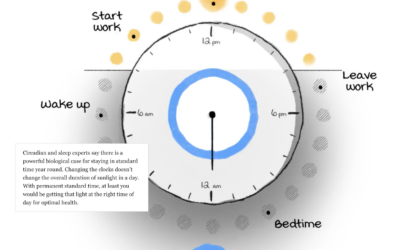
Daylight saving time and circadian rhythms
-
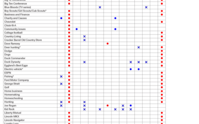
How you might vote based on what you like
By Angie Waller, this table shows how Facebook thinks you’ll vote based on…
-
What hearing loss sounds (and looks) like
Using an audiogram as a backdrop, Amanda Morris and Aaron Steckelberg, for The…
-
Chartball is sports data visualized in a playful way
With Chartball, Andrew Garcia Phillips has visualized sports data for a while, publishing…
-
K-Means clustering visually explained
Say you want to identify clusters in a scatterplot of points. K-Means is…
-
Coffee versus tea in charts
Anahad O’Connor, Aaron Steckelberg and Garland Potts, for The Washington Post, made charts…
-
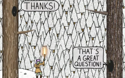
Tree Talk
Kelton Sears used a vertical scroll upwards to think about trees and time.…
-
Days-since tickers for all the natural disasters
You know those signs in workplaces that keep track of days since injury?…
-
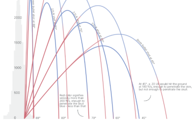
Trajectories of celebratory gunfire
When someone fires a gun into the air, the bullet travels thousands of…
-
Sonic landscape of Mexico City
Aaron Reiss and Oscar Molina Palestina, for The Pudding, explore the sounds of…
-
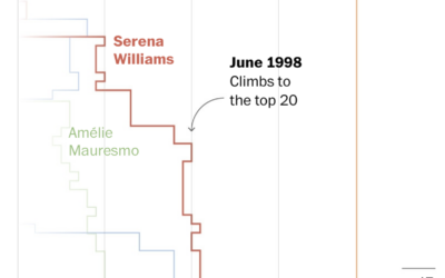
Serena Williams beat every Grand Slam champion
Serena Wiliams’ tennis career is impressive for its success and longevity, which are…
-
Animated charts to show sports results
Krisztina Szűcs likes to make animated charts to show sports results, from fencing,…
-
Science of the tennis toss
To serve the ball in tennis, a player first tosses the ball in…
-
Gerrymandering detection with simulations
Harry Stevens, for The Washington Post, how simulations can be used to detect…
-
Losses and comebacks of Serena Williams
We tend to celebrate the wins in sports and often forget about or…
-
Welcome to Meltsville
It’s getting hot in cities around the world, each city with its own…
-
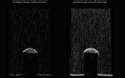
Megaflood scenario
Highlighting research by Xingying Huang and Daniel L. Swain, who studied “plausible worst…
-
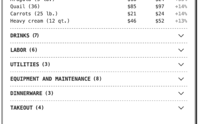
Breaking down the higher price on a restaurant receipt
If you’ve eaten at a restaurant lately, you might have noticed a substantially…






 Visualize This: The FlowingData Guide to Design, Visualization, and Statistics (2nd Edition)


