September was another good month for FlowingData. We surpassed 5,000 subscribers for the…
Nathan Yau
-
Best of FlowingData: September 2008
-
Highlights from Wired NextFest in Chicago
I was in Chicago last week for Wired NextFest – it was impressive,…
-
Thank You to FlowingData Sponsors
It’s been something like a year and a half now since I started…
-
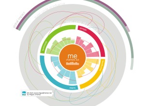
Sketching Around Personal Brand Tracking
This is a guest post by Miguel Jiménez, a user experience and interaction…
-
Maps for Advocacy – Beginner’s Guide to Mapping
In a follow up to Visualizing Information for Advocacy, the Tactical Technology Collective…
-
We Don’t Know Jack About the World – Alisa Miller TED Talk
Alisa Miller, President and CEO of Public Radio International, enlightens us on how…
-

3 Applications that Tap Into the Wisdom of Crowds
James Surowiecki writes in The Wisdom of Crowds that the group is smarter…
-
If You Could Track Anything, What Would You Track?
It’s about time we had a FlowingData open thread. We’ve seen that there…
-
Caption Contest Winner is…
While we’re on the subject of contests, lets not forget the epic battle…
-
Winners of NSF Visualization Challenge 2008 Announced
Remember the NSF visualization challenge announced at the beginning of this year? Nine…
-
Doodle Your Way Through the News – DoodleBuzz
I feel like I’ve been seeing and writing a lot about artistic visualization…
-
Have You Registered to Vote Yet?
PhD Comics has grown to be my favorite comic of the moment. It’s…
-
Visualization Workshop in Madrid – Database City
It’s hard to believe that it’s been almost a year since I was…
-
Beautiful Generative Computer Art – Metamorphosis
Glenn Marshall has released his finished version of Metamorphosis, a beautiful piece of…
-
Write a Guest Post on FlowingData
I’m headed to Chicago next week for Wired Magazine’s NextFest, “a premier showcase…
-
maeve Installation Shows Relationships Between Projects
The Interface Design Team at the University of Potsdam revealed maeve last week.…
-
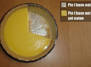
Pie I Have Eaten and Pie I Have Not Eaten
Gotta love Fridays. Have a good weekend everyone. Go have yourself a slice…
-
Caption Contest – Win The Numerati by Stephen Baker
As promised, it’s time for a FlowingData contest. To the winner goes The…
-
FlowingData Welcomes Tableau Software
I’m pleased to welcome Tableau Software as FlowingData’s newest sponsor. I know that…
-
Art of Mathematics – Visualization of Dynamical Systems
Dynamical systems are mathematical models used to describe the time-dependent position of a…
Recently for Members
Second Edition
 Visualize This: The FlowingData Guide to Design, Visualization, and Statistics (2nd Edition)
 Visualize This: The FlowingData Guide to Design, Visualization, and Statistics (2nd Edition)
New tools, refined process.
Browse by Chart Type See All →


