Last week I announced the release of Visualize This: The FlowingData Guide to…
Nathan Yau
-
Visualize This: eBook formats and sample chapter
-
Visualizing Player makes it easier to share visualization
It’s easy to share static graphics. Save an image and then upload it…
-
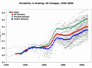
Undergraduate grade inflation
It’s a given that some colleges and programs give more A’s than others,…
-

Cell phones and cancer
xkcd pokes fun at correlation and causation again. Funny every time.…
-
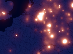
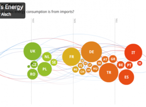
iPhone fireflies across the Europen sky
A few months ago there was a lot of hoopla around the iPhone…
-
Link
beeswarm →
Organizes overlapping points in a scatterplot so they don’t
-
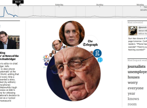
News of the World scandal unfolding on Twitter
All kinds of crazy with News of the World went down this past…
-

Netflix favorites by location
If you have Netflix, you know that there’s a section for local favorites,…
-
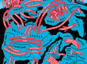
World map of useless stereotypes
We saw Europe in the eyes of different countries a while back. Christoph…
-
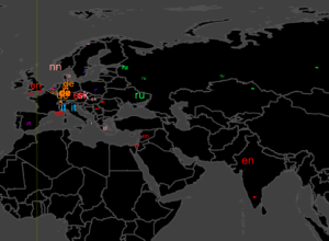
Geography of Wikipedia edits
A while back we saw the history of the world according to Wikipedia.…
-

Challenge: Visualize the impact of Wikipedia
If you’re like me, you’ve probably used Wikipedia at least once in the…
-
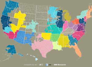
Community connections via SMS and phone call data
We often think of communities in the framework of government-set boundaries, but relationships…
-

Flickr and Twitter mapped together – See Something or Say Something?
For all the maps by Eric Fischer I’ve posted, it’s amazing how little…
-
Why learning code for data is worthwhile
There are lots of tools that have come out in the past couple…
-
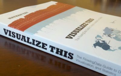
Visualize This: Published
Right now, at this very moment, I have an actual physical book on…
-
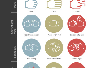
Expanded rules for Rock-paper-scissors
We already learned how to win Roshambo every time, but there’s actually more…
-
Wow vs. Ah-ha for data graphics
After attending the Eyeo Festival, Zach Gemignani of Juice Analytics noticed a difference…
-

Where the aliens are flying their UFOs
I came across some UFO sightings data on Infochimps, from the National UFO…
-
Best of FlowingData – June 2011
We’re already more than halfway through the year. Time…moving…too…fast. Is there a pause…
-
Link
Avoiding Loops in R →
Slow loops? Maybe these alternative will help
Recently for Members
Second Edition
 Visualize This: The FlowingData Guide to Design, Visualization, and Statistics (2nd Edition)
 Visualize This: The FlowingData Guide to Design, Visualization, and Statistics (2nd Edition)
New tools, refined process.
Browse by Chart Type See All →


