When you’re picking a hotel to stay at in an area you don’t…
Nathan Yau
-
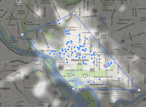
Find popular places to stay with Google Hotel Finder
-

Statistics PhD wins lottery four times
Joan R. Ginther has won the lottery four times, each time with million…
-
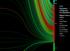
People moving
Hundreds of thousands of people immigrate every year, with some countries seeing higher…
-
Link
New York Times Opens Up Its Software Lab →
Not many people know that NYT writes a lot of their own software in-house, investing in their future
-
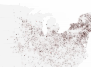
US post offices spreading over time, 1700 to 1900
Using data from the USPS Postmaster Finder and the USGS Geographic Names Information…
-
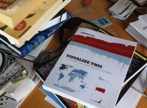
Send your pictures of Visualize This in the wild (and win a goodie)
One of the best parts since the launch of Visualize This has been…
-
Link
Visualizing Data And Telling Compelling Stories →
Look mom, I’m on Fast Company
-

Dynamic run paintings with Nike+
Personal data collection can be a tough sell at times, but with the…
-

Get a coffee, give a coffee API
Jonathan Stark, a mobile application consultant, is running an interesting social experiment with…
-
FlowingData is brought to you by…
FlowingData’s readership continues to grow (which is great), but that also means it…
-

Flowchart: Should you argue on the Internet?
With the anonymity on the Internet and all, I know it can be…
-
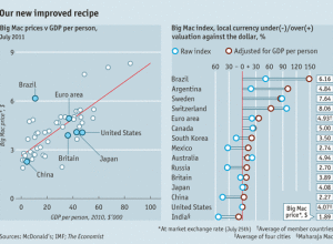
Big Mac Index
The Economist updates their Big Mac Index, which as we all know, is…
-
On the Launch of Visually
A couple of weeks ago, Visually, a new infographics-based startup, launched with a…
-

Why Census matters to you
Census is any country is important in making major policy decisions and can…
-

Fly through a survey of the universe
Paul Bourke, a research professor at the University of Western Australia, provides us…
-
Flowing Datathon updates
Many of you now have Visualize This in your hands and have probably…
-
Best of FlowingData – July 2011
With the launch of Visualize This, July was a fun month. On the…
-

Digital spotlights on landmarks
Think about when you take a picture of something. It’s kind of like…
-

Maps as kaleidoscope in Rorschmap
Maps aren’t just a way to see directions from point A to point…
-

How algorithms shape our world
Kevin Slavin, chairman and co-founder of Area/Code, describes how algorithms (processing tons and…
Recently for Members
Second Edition
 Visualize This: The FlowingData Guide to Design, Visualization, and Statistics (2nd Edition)
 Visualize This: The FlowingData Guide to Design, Visualization, and Statistics (2nd Edition)
New tools, refined process.
Browse by Chart Type See All →


