In 2010, NASA released a map that shows world forest heights. Robert Simmon,…
Nathan Yau
-
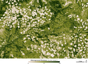
High resolution biomass map, at management scale
-
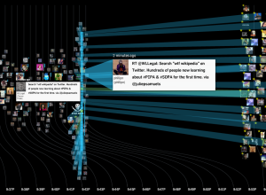
Watching ‘wtf Wikipedia’ as SOPA/PIPA blackout begins
While SOPA and PIPA are no laughing matter (join the strike), the reaction…
-
Link
Teaching stat as though it were math →
Ranty post on why stat isn’t math
-
Link
R jumps from 25 to 19 →
and statisticians rejoiced, although never satisfied until R is at the top
-
Link
Where the 0.05% Live →
Inverse population density
-
Link
Empowering Citizen Cartographers →
“Today, in the Age of Participation, it’s crowds, not scholars, who are charting their own New World.”
-
Optimized dart throwing and other games
If you play darts just trying to hit the bullseye, you aren’t playing…
-
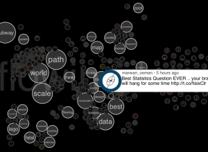
Spot visualizes tweet commonalities
Twitter is an organic online location, full of retweets, conversations, and link sharing.…
-
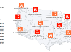
Find out what percent you are in
Accompanying an article on the variations of the wealthiest one percent, The New…
-
Link
First steps in data visualisation using d3.js →
Tutorial talk by Mike Dewar, data scientist at bit.ly [via]
-
Link
Embracing Uncertainty in Two-Line Charts →
And when a stacked area chart might be better
-
Link
How The New York Times Graphics Department Uses R →
Amanda Cox, the token statistician, talks R and its role in professional graphics [via]
-
Link
Good bye, Google Maps →
Sebastian Delmont explains why and how StreetEasy stopped using Google Maps, switching to custom maps with open source tools
-
Link
The 2012 Political Visualization Race →
Breakdown of what worked and didn’t with news trackers for the New Hampshire primaries
-
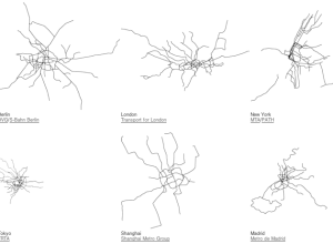
World subway paths at scale
Urban planner Neil Freeman maps the world’s subway systems to scale in a…
-
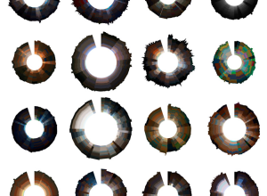
Cinemetrics creates a visual fingerprint for movies
As we saw with movie barcodes, each film has a uniqueness that can…
-
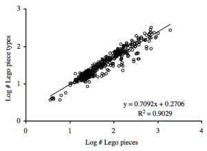
Lego mathematics and growing complexity in networks
Legos are the best toys ever invented. That’s indisputable fact. So it’s no…
-
Link
Mining of Massive Datasets →
-
Link
Let’s Keep Symbol Maps Clean And Tidy →
Math to reduce overlap and increase readability [via]
-
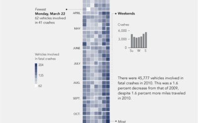
Vehicles involved in fatal crashes
After seeing a map in The Guardian, I was curious about what other data was available from the National Highway Traffic Safety Association. It turns out there’s a lot.
Recently for Members
Second Edition
 Visualize This: The FlowingData Guide to Design, Visualization, and Statistics (2nd Edition)
 Visualize This: The FlowingData Guide to Design, Visualization, and Statistics (2nd Edition)
New tools, refined process.
Browse by Chart Type See All →


