Julian Koschwitz uses a typewriter linked to data from the Committee to Protect…
Nathan Yau
-

Typewriter installation remembers killed journalists
-
America Revealed on PBS
I’m not sure how I missed this, but PBS’s America Revealed, which has…
-
Link
Why no one reads stat literature →
Because most people don’t give a crap
-
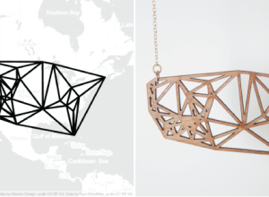
Meshu makes physical objects with your location
Location data typically stays within the realm of online maps and digital check-ins,…
-
Hans Rosling one-minute TED talk
Screw the sword swallowing and giant screen of moving bubbles. Just get Rosling…
-
Link
Piktochart →
Another infographic-building site. Not optimistic, but maybe worth a look.
-
Walt Disney: Story of Menstruation
A previously banned Disney cartoon on menstruation. So informative.
[Thanks, Kevin]…
-
I’m Back
After a couple of weeks of phone-only Internet, I’ve got my hands on…
-
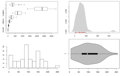
How to Visualize and Compare Distributions in R
Single data points from a large dataset can make it more relatable, but those individual numbers don’t mean much without something to compare to. That’s where distributions come in.
-
Welcome Kim Rees
I’m going to be away for a couple of weeks, with little to…
-
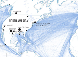
Global shipping network
Nicolas Rapp dives into the patterns and growth of worldwide shipping in a…
-
Link
Information is Lost When Transforming 2D Data into 1D →
Part of a series on the challenges of null hypothesis significance testing
-
Automated infographics with easel.ly
I’m pretty sure I’m not in their target audience, but my main takeaway…
-
Link
Questions to ask →
Things to consider before you make a graphic
-
A Future Without Key Social and Economic Statistics for the Country
Robert Groves, director of the U.S. Census Bureau, on the Appropriations Bill:
The… -
Link
How to Choose the Best Chart for Your Data →
Forgot to include exploration in the beginning, otherwise fine
-
Link
Apple drops Google Maps →
In-house maps coming to iOS6; was just a matter of time
-
TV anachronisms
Princeton history graduate student Benjamin Schmidt explores changes in language through TV anachronisms.…
-
Link
Hadley Wickham interview →
“challenge is balancing the tension between exploration and presentation”
-
Stop motion music video
Music visualization with stop motion board games. You can’t go wrong.
[via @jcukier]…
Recently for Members
Second Edition
 Visualize This: The FlowingData Guide to Design, Visualization, and Statistics (2nd Edition)
 Visualize This: The FlowingData Guide to Design, Visualization, and Statistics (2nd Edition)
New tools, refined process.
Browse by Chart Type See All →


