The Chronicle of Higher Education has a look at the percentage of academic…
Nathan Yau
-
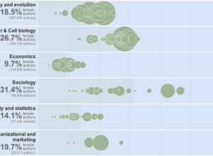
Women as academic authors over the years →
-
Link
D3 map projections →
A collection by Jason Davies of the map projections possible with D3
-
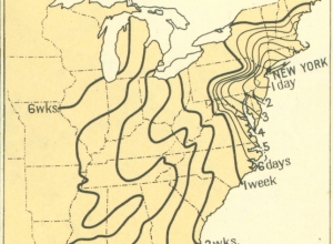
Time of travel in the 1800s
From the 1932 Atlas of the Historical Geography of the United States, these…
-
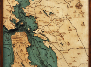
Wood charts reveal layers of underwater world →
Below the Boat produces beautiful laser-cut wood maps:
Starting with a bathymetric chart… -
Link
R and Data Mining: Examples and Case Studies →
Download the book as a PDF with R code supplement
-
Link
Eyeo Festival 2013 →
Tickets don’t go on sale until February, but the first half of the speaker list was revealed. Looks great.
-
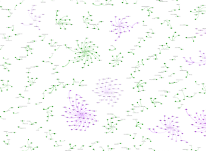
Wine industry network in the US
A group of researchers at Michigan State University, led by Phil Howard, explored…
-
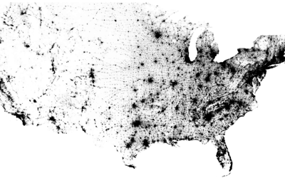
Map of every person counted in 2010 US Census
In the 2010 United States Census, 308,745,538 were counted, and Brandon Martin-Anderson from…
-
Link
NYT year in graphics →
Highlights from the world’s best graphics department in journalism
-
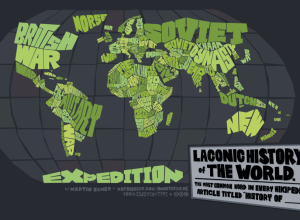
Map: Laconic history of the world
Cartographer Martin Elmer made a truncated history map of the world:
This map… -
Link
Donorschoose hires data scientist →
Using powers for good to improve education
-
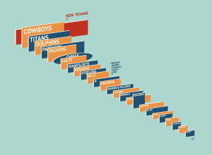
NFL video screens compared
On news of the Houston Texans getting ready to build the largest video…
-
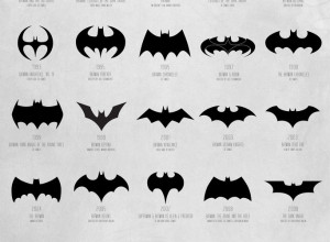
Evolution of Batman logo, 1940-2012
Available in print. See also: a video version. Still no confirmation for whether…
-

Earth as Art book from NASA
The Earth as Art is a compilation of NASA satellite imagery that shows…
-
Link
D3 3.0 →
Built-in geographic projections, better transitions, and more extensive asynchronous requests
-
Data Analysis (with R) on Coursera
Jeff Leek, an Assistant Professor of Biostatistics at the Johns Hopkins Bloomberg School…
-
Link
An Illustrator to TileMill workflow →
It usually moves the other direction.
-
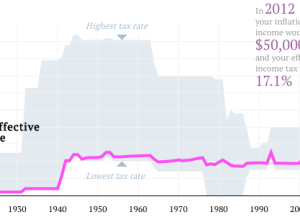
Your tax rate in 2012, and past rates since 1913
What is your effective tax rate now versus years past? Ritchie King made…
-
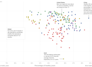
Longer life expectancy, more years of disease
Bonnie Berkowitz, Emily Chow and Todd Lindeman for the Washington Post plotted life…
-
Link
Twitter archive download →
Finally, Twitter rolls out a feature to download all of your tweets as one file. They’re slowly making it available to users.
Recently for Members
Second Edition
 Visualize This: The FlowingData Guide to Design, Visualization, and Statistics (2nd Edition)
 Visualize This: The FlowingData Guide to Design, Visualization, and Statistics (2nd Edition)
New tools, refined process.
Browse by Chart Type See All →


