I’m not sure how I just came across this now, but the Truth…
Nathan Yau
-

Truth Facts comic
-
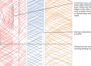
A visual analysis of the Boston subway system
For a graduate project, Michael Barry and Brian Card explored the Boston subway…
-
How to Make Government Data Sites Better
Accessing government data from the source is frustrating. If you’ve done it, or…
-

Mercator projection with pole shifted to where you live
Drew Roos made a thing that lets you move the poles of the…
-

Personal smart garden system tracks soil and water conditions
Edyn, a new project on Kickstarter, aims to make gardening easier by tracking…
-

What a few thousand fake followers gets you
There are a lot of fake, spammy accounts on Twitter that come in…
-
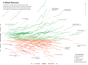
Jobs recovery and loss, by industry →
Jeremy Ashkenas and Alicia Parlapiano for The Upshot just plopped this interactive sucker…
-
GDP rises in the UK after spending on illegal activities counted
The gross domestic product for the United Kingdom rose by 5% seemingly overnight,…
-
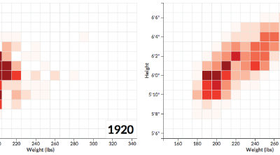
NFL players getting bigger
Football players are getting bigger. Noah Veltman, a developer for the WNYC Data…
-

Using open data to find the perfect home
Justin Palmer and his family have lived in a dense urban area of…
-
Members Only

How to Make Gridded, Equal-Distance Dot Maps
For when your geographic data is evenly spread rather than aggregated by government boundaries.
-
A decade of college degrees
North by Northwestern looked closer at degrees awarded by their university over the…
-
Evolution and history of London
Using data from the National Heritage List for England, the London Evolution Animation…
-
Gotham City map
In 1998, artist Eliot R. Brown created a map of Gotham City for…
-
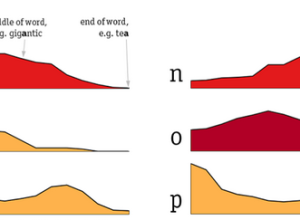
Distribution of letters in the English language
Some letters in the English language appear more often in the beginning of…
-
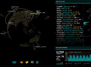
Tron-style dashboard shows Wikipedia and GitHub streams
As a fun learning exercise, Rob Scanlon made a dashboard that shows GitHub…
-
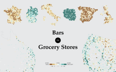
Where Bars Outnumber Grocery Stores
A closer look at the age old question of where there are more bars than grocery stores, and vice versa.
-
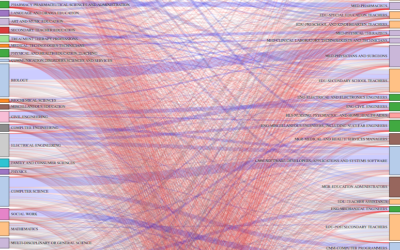
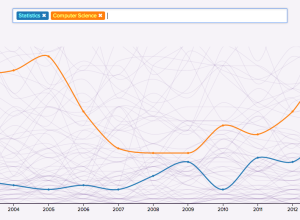
Careers after the college degree
Ben Schmidt, an assistant professor of history at Northeastern University, was curious about…
-

Death penalty, the executed and the victims →
The Washington Post provides a look at the death penalty in the United…
-
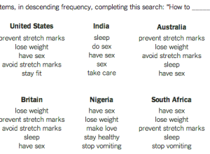
What pregnant women want
In another take on the game of what Google suggests while searching, Seth…
Recently for Members
Second Edition
 Visualize This: The FlowingData Guide to Design, Visualization, and Statistics (2nd Edition)
 Visualize This: The FlowingData Guide to Design, Visualization, and Statistics (2nd Edition)
New tools, refined process.
Browse by Chart Type See All →


