Mapzen, which offers a vector tile service, made Tile Exporter, so that you…
Nathan Yau
-
Send map tiles to 3-D printer
-
Hurricane simulations show severe flooding in Houston
In 2008, Hurricane Ike blew just past the Houston Ship Channel, “home to…
-
Marrying Age
People get married at various ages, but there are definite trends that vary across demographic groups. What do these trends look like?
-
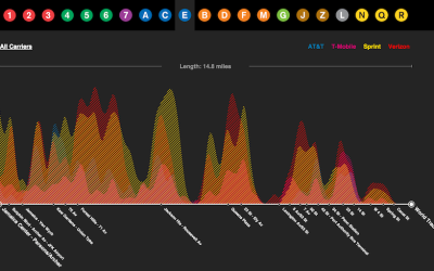
Cell reception on the subway, mapped
Daniel Goddemeyer and Dominikus Baur grew interested in cell reception while on the…
-
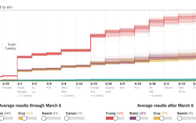
Super Tuesday simulation to show uncertainty
As we know, there are various outcomes during election season, with uncertainty in…
-
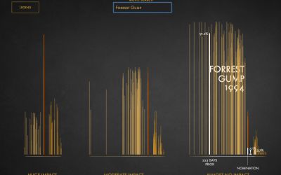
Impact of Best Picture Oscar nomination on profit
I think the general assumption is that getting an Oscar nomination for Best…
-
Possible paths for a Trump nomination loss or win
It pains me to imagine a time when Donald Drumpf earns a Republican…
-
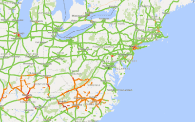
Screen-capping Google Maps for traffic
Alyson Hurt quickly wrote some code to take screen captures of a Google…
-
Vega-Lite for quick online charts
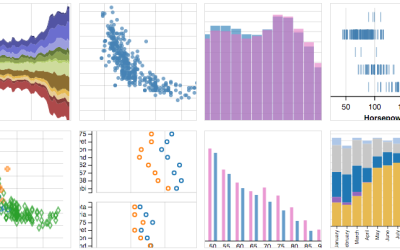
A few years ago, Trifacta released Vega, a “visualization grammar” that lets you…
-
Link
Perceptual Scaling of Map Symbols →
Scale circles by area or by how they are actually perceived?
-
Code as microorganism
Taking a step beyond 2-D glyphs, Codeology depicts GitHub user activity based on…
-
How much warmer your city was in 2015
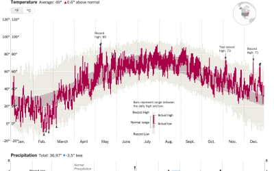
It was hotter in 2015 than any other year ever. K. K. Rebecca…
-
Social network of Earth’s plants and animals
Plants and animals interact with each other to stay alive, which in turn…
-
The Daily Mail Stole My Visualization, Twice
Last month, I published an interactive visualization that simulates how and when you…
-
Supreme Court shifts in power
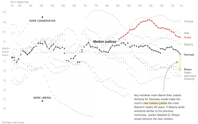
The Upshot has been doing a good bit on the Supreme Court dynamics…
-
Data scientists mostly just do arithmetic
Noah Lorang, a data scientist at Basecamp, explains the key for most companies…
-
Emergency room data in R
For my graphic on emergency room visits over time and the other on…
-
Math of crime and terrorism
Numberphile, from the Mathematical Sciences Research Institute, is one my new favorite YouTube…
-
Million to One Shot, Doc
Between 2009 and 2014, there were an estimated 17,968 visits to the emergency room for things stuck in a rectum. Here are those things’ stories.
-
Predictive policing
Crime and data have an old history together, but because there are new…










 Visualize This: The FlowingData Guide to Design, Visualization, and Statistics (2nd Edition)


