From 2010, Steve Jobs on data privacy:…
Nathan Yau
-
Steve Jobs on data privacy
-
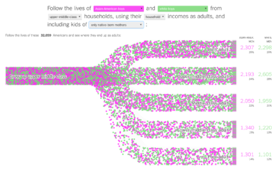
Income mobility for different groups
Building on their previous visualization work on black boys dropping income levels in…
-
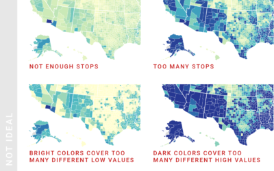
Choropleth map design considerations
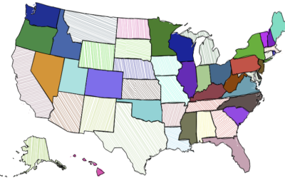
Lisa Charlotte Rost for Datawrapper provides guidance for designing choropleth maps that most…
-
Most Common Occupation by Age
As we get older, job options shift — along with experience, education, and wear on our bodies.
-
Citizenship question returning to Census
Emily Baumgaertner reporting for The New York Times:
But critics of the change… -
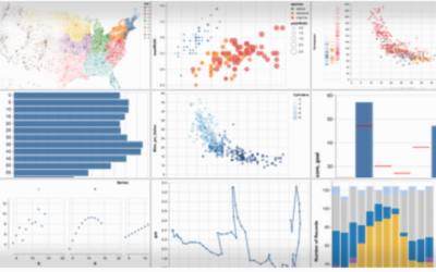
Altair for visualization in Python
Vega-Lite is a grammar for interactive graphics primarily used for analysis. Altair is…
-
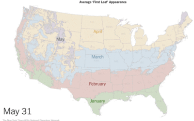
Average first leaf appearance, as animated map
The USA National Phenology Network uses a computer model to estimate heat build-up…
-
Charts, maps, and statistics helped stop gerrymandering in Pennsylvania
Issie Lapowsky for Wired:
The change that’s already come to Pennsylvania may not… -
Apollo 11 conversations on the way to the moon
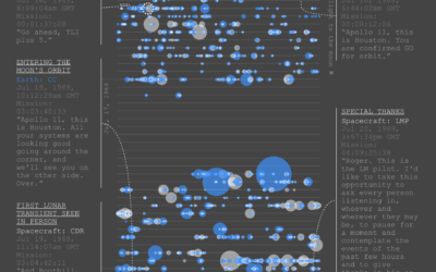
As you can imagine, there was plenty of conversation between Earth and Apollo…
-
Black boys dropping income levels as adults
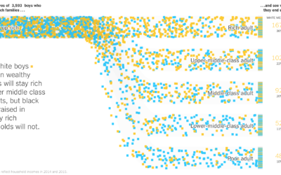
Research by Raj Chetty, Nathaniel Hendren, Maggie Jones, and Sonya Porter from the…
-
Army ant bridge-buliding algorithm
Army ants function without a leader and yet accomplish very organized-looking things, such…
-
Machine learning to estimate when bus and bike lanes blocked
Frustrated with vehicles blocking bus and bike lanes, Alex Bell applied some statistical…
-
Bot or Not: A Twitter user classifier
Michael W. Kearney implemented a classifier for Twitter bots. It’s called botornot:
Uses… -
Needle of uncertainty
The Upshot has used a needle to show shifts in their live election…
-
Link
Rough.js →
Create graphics with a hand-drawn, sketchy, appearance.
-
Using data to help end malnutrition
Kofi Annan for Nature on the importance of data in ending poverty and…
-
One-way tickets out for homeless people
Many cities provide free bus tickets for homeless people who want to relocate.…
-
Outlier detection in R
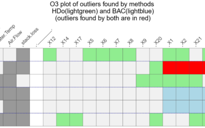
Speaking of outliers, it’s not always obvious when and why a data point…
-
What a neural network sees
Neural networks can feel like a black box, because, well, for most people…
-
Visualizing Outliers
Step 1: Figure out why the outlier exists in the first place. Step 2: Choose from these visualization options to show the outlier.








 Visualize This: The FlowingData Guide to Design, Visualization, and Statistics (2nd Edition)


