In a compare-your-preconceptions-against-reality quiz, The Upshot asks, “Are you rich?” Enter your nearest…
Nathan Yau
-
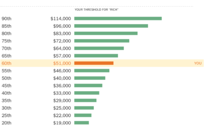
A quiz to see if you’re rich
-
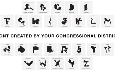
Gerry, a font based on gerrymandered congressional districts
Gerry uses congressional district boundaries as letters. Hahahahaha. Oh wait.…
-
Members Only
Visualization Tools and Resources, July 2019 Roundup (The Process #50)
Every month I collect useful visualization tools and resources. Here’s the good stuff for July.
-
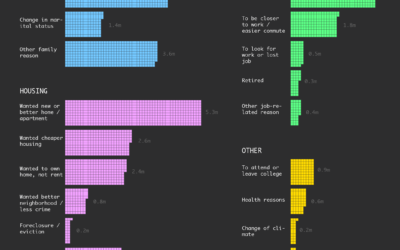
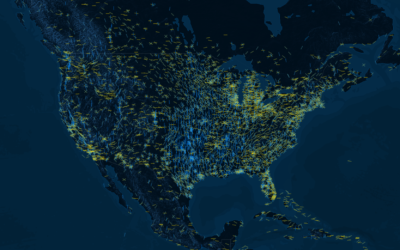
Why People Move
Here are the estimates from the Current Population Survey for the most recent time segment between 2017 and 2018.
-
Members Only
How to Make Baseline Charts in R
By shifting the baseline to a reference point, you can focus a line chart on relative change, which can improve the visibility of smaller categories.
-
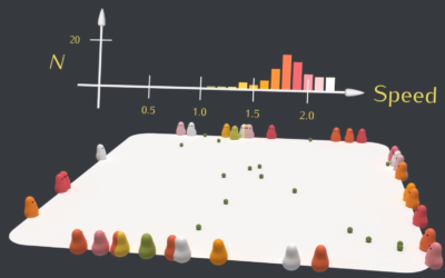
Natural selection simulation
Using blobbies with varying traits such as size, speed, and food gathering ability,…
-
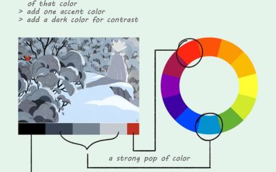
Illustrated color theory
Lauren Baldo illustrated how he applies color theory in his paintings and illustrations.…
-
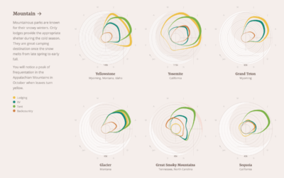
Peak accommodation type at national parks
When staying at national parks, some people choose a tent. Some bring an…
-
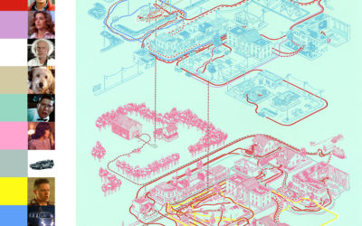
Maps of the movies and their characters
Andrew DeGraff painted maps that show the geography in movies and their characters’…
-
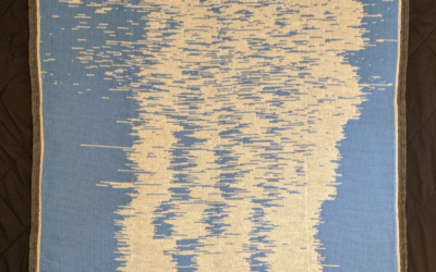
Blanket pattern visualizes baby’s sleep data
Seung Lee collected sleep data for his son’s first year. Then he knitted…
-

Isotype, a picture language
Jason Forrest delves into the history of a single Isotype and a bit…
-
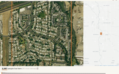
Searching for the densest square kilometer in different cities
Based on data from Gridded Population of the World, geographer Garrett Dash Nelson…
-
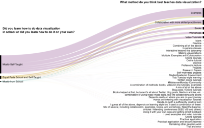
How practitioners learned data visualization
Visualization is still a relatively young field, so people learn about and how…
-
Airport runway orientation reveals wind patterns
Airport runways orient certain directions that correlate with wind direction in the area.…
-
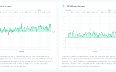
Exploration of players’ shot improvement in the NBA
Wondering whether if a player’s shot improves over the course of his career,…
-
Members Only

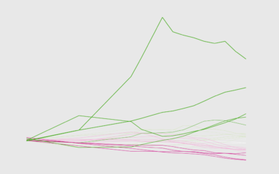
Adjusting the Point of Reference to Highlight Different Aspects of the Data (The Process #49)
They provide an anchor in your charts, and you compare everything else against the anchor. Where you set the anchor changes your chart completely.
-
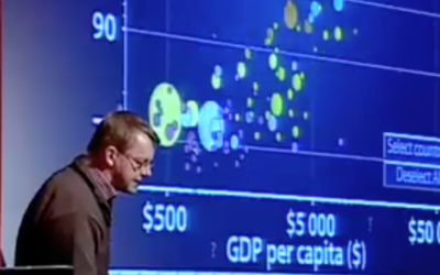
Animation in visualization, revisited a decade later
Rewind to 2006 when Hans Rosling’s talk using moving bubbles was at peak…
-

Machine learning to erase penis drawings
Working from the Quick, Draw! dataset, Moniker dares people to not draw a…
-
How the American Work Day Changed in 15 Years
The American Time Use Survey recently released results for 2018. That makes 15 years of data. What’s different? What’s the same?
-
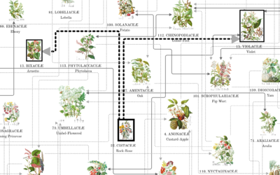
Modern reproduction of an 1868 catalog of flower illustrations
Nicholas Rougeux, who has a knack and the patience to recreate vintage works…
Recently for Members
Second Edition
 Visualize This: The FlowingData Guide to Design, Visualization, and Statistics (2nd Edition)
 Visualize This: The FlowingData Guide to Design, Visualization, and Statistics (2nd Edition)
New tools, refined process.
Browse by Chart Type See All →


