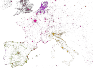
Imagine that those with immigrants in their family tree left the country. Almost everyone, basically.
Results for eric fischer
-
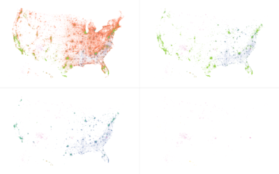
If We All Left to “Go Back Where We Came From”
-
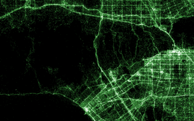
Shazam music recognition maps
Shazam is a service with an app that lets you point your phone…
-
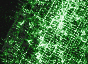
Make your own detailed tweet maps
Eric Fischer, known around these parts for his detailed dot maps, describes his…
-

Extra Credit →
…
-

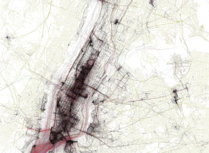
New York City taxi trips mapped
While we’re on the topic of NYC taxi data, Eric Fischer for Mapbox…
-
Members Only
How to Make Dot Density Maps in R
Choropleth maps are useful to show values for areas on a map, but they can be limited. In contrast, dot density maps are sometimes better for showing distributions within regions.
-

Explorations of People Movements
A new data source gave rise to a different set of visualization projects. We see people.
-
Mapping Twitter demographics
MapBox, along with Gnip and Eric Fischer, mapped 3 billion tweets and a…
-
Geographic connectedness via Twitter locations
Eric Fischer has mastered the art of making use of geotagged things from…
-
Abstract maps of the United States
Esquire invited a handful of map-makers to represent the United States outside its…
-
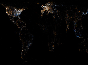
World atlas of Flickr geotaggers is maptastic
In a different look to the let’s-map-geotagged-photos idea, photographer Eric Fischer maps picture…
-

Where the tourists really flock
A couple of weeks ago you saw Eric Fischer’s maps of Flickr photos…
-

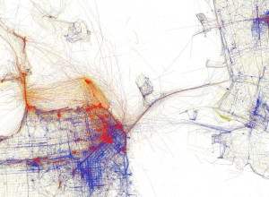
Bus movements in San Francisco animated
Eric Fischer has been having a good bit of fun with maps lately.…
-

Social life of Foursquare users mapped
Foursquare, the location-based social network, lets people share their location with others in…
-
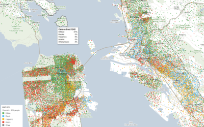
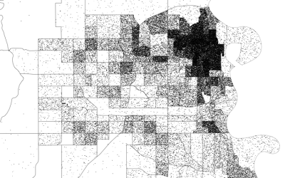
Mapping demographics of every block and city in America
Government data technology has felt behind the times the past few years with…
-
Flickr and Twitter mapped together – See Something or Say Something?
For all the maps by Eric Fischer I’ve posted, it’s amazing how little…
-
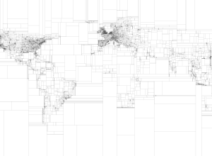
Rectangular subdivisions of the world
Eric Fischer, who continues his string of mapping fun and doesn’t even do…
-
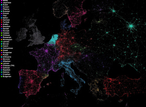
Language communities of Twitter
Eric Fischer maps language communities on Twitter using Chrome’s open-source language detector. Each…
-
The Best Data Visualization Projects of 2011
I almost didn’t make a best-of list this year, but as I clicked…
-
10 Best Data Visualization Projects of the Year – 2010
Data visualization and all things related continued its ascent this year with projects…
Recently for Members
Second Edition
 Visualize This: The FlowingData Guide to Design, Visualization, and Statistics (2nd Edition)
 Visualize This: The FlowingData Guide to Design, Visualization, and Statistics (2nd Edition)
New tools, refined process.
Browse by Chart Type See All →


