Glaciers are big, slow-moving objects, and it might seem that not much is…
2012
-
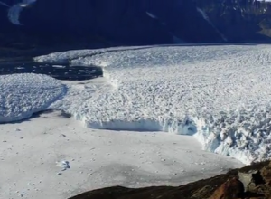
Extreme ice time-lapse
-
Link
Bit rot →
The slow decay of digital content, and as a result, history
-
Link
Growth of the Data Scientist →
Short interview with Hilary Mason
-
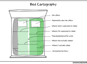
Bed cartography
Doghouse Diaries maps bed regions. I relate to this. [Thanks, Robert]…
-
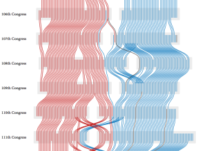
Agreement groups in the US Senate
PhD student Adrien Friggeri demonstrates a new clustering algorithm with a visualization of…
-
Link
Setting expectations in data science projects →
Setting expectations in data science projects. Wide range of possibilities, set concrete goals
-
Link
Visualization round table →
Discussing data and online journalism
-

Open source Data Journalism Handbook launched
What used to be a small specialty in a few newsrooms has grown…
-
Easter spending patterns in Spain, animated
The MIT SENSEable City Lab, in partnership with BBVA, visualizes spending in Spain…
-
Link
How to lie with smoking statistics →
Author of “How to Lie with Statistics” was a consultant to the tabacco industry
-
Link
Titanic infographics from 1912 →
Fourth one is the best, shows travel times to cross the Atlantic
-

Data and visualization blogs worth following
About three years ago, I shared 37 data-ish blogs you should know about,…
-
Link
A Very Short History of Data Science →
Collection of notable articles on the budding field in chronological order, beginning in 1974
-
Members Only

How to Make a Sankey Diagram to Show Flow
These tend to be made ad hoc and are usually pieced together manually, which takes a lot of time. Here’s a way to lay the framework in R, so you don’t have to do all the work yourself.
-
Link
Animations in R →
Probably better ways to do this not in R, but you can create a bunch of GIFs and string them together
-
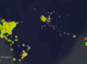
Eating healthiness mapped over 24 hours
The Eatery app by Massive Health lets people snap pictures of their food…
-
Link
Extra Oceans →
Improper map boundaries make extra bodies of water in the world
-
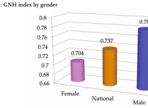
World Happiness Report makes statisticians unhappy
It feels oh so wrong posting about bad charts in a report about…
-
Link
osmar →
Import OpenStreetMap geographic elements into R [via]
-

Learning data visualization
I listen to a lot of podcasts. They make my workouts much more…
Recently for Members
Second Edition
 Visualize This: The FlowingData Guide to Design, Visualization, and Statistics (2nd Edition)
 Visualize This: The FlowingData Guide to Design, Visualization, and Statistics (2nd Edition)
New tools, refined process.
Browse by Chart Type See All →


