Television actors can make boat loads of money. Some more than others. Hugh…
Visualize This
Challenges to improve your data skills.
-

Visualize This: TV’s top earners
-
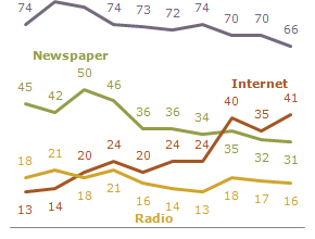
Visualize This: Where the public gets its news
According to polls from the Pew Research Center, the Internet gained on Television…
-
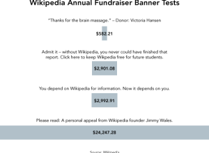
Visualize This: Winning Wikipedia fundraiser banners
Wikipedia’s annual fundraiser is in progress. If you haven’t noticed already, when you…
-
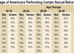
Visualize This: Sexual health data from national survey
It’s been a while since I ran one of these, so you must…
-
Challenge: Graphing obesity trends
Here we have a case of worthwhile data and an interesting story about…
-
Visualize This: Class Size and Quality of Education. Your Turn
Photo by Night Owl City
Last week I posted some parallel coordinate plots… -
From the FlowingData Forums [June 10-16]
Visualize This (and win)
This round of Visualize This is a fun one.… -
10 Visualizations for Number of Days to Pay Your Taxes
A couple weeks ago, FlowingData ran another Visualize This challenge. I posted a…
-

Visualize This: Days Spent Working to Pay Taxes
It’s time for another segment of Visualize This. For new readers, this is…
Recently for Members
Second Edition
 Visualize This: The FlowingData Guide to Design, Visualization, and Statistics (2nd Edition)
 Visualize This: The FlowingData Guide to Design, Visualization, and Statistics (2nd Edition)
New tools, refined process.
Browse by Chart Type See All →


