Our World in Data compared causes of death in the United States against…
Statistical Visualization
Finding patterns, distributions, and anomalies.
-
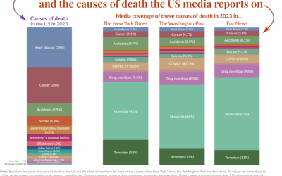
Mortality in the news vs. what we usually die from
-
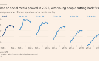
Passed peak social media, maybe
As we descend towards slop-based social media, where the videos are fake and…
-
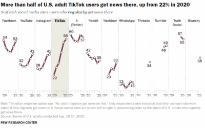
Getting more news from the TikTok
Pew Research surveyed U.S. adults about news consumption on social media and found…
-

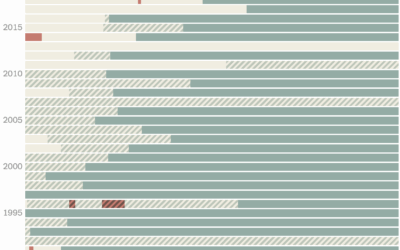
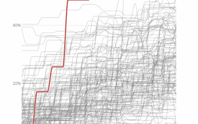
Length of government funding gaps
The government shutdown of 2025 begins. Here is a quick table by Nigel…
-
Government shutdowns and disagreements in federal funding
As one might expect, Congress is having trouble figuring out how to fund…
-
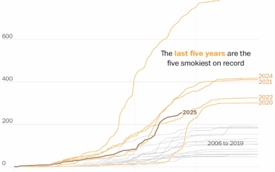
More wildfire smoke, pollution, and days
The wildfires keep coming, and the smoke pollution keeps filling the air. It…
-
Chartle, a daily guessing game with charts
Chartle, by Erwan Rivault and Adnaan Jiwa, is a game to test and/or…
-
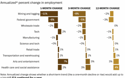
Getting more difficult to find a job
For the Washington Post, Taylor Telford, Jaclyn Peiser, and Federica Cocco report on…
-
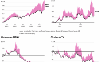
Seeking dividends over long-term investment
There is a growing trend among investors to put money in places with…
-

Fourier transform history in mathematics
For Quanta Magazine, Shalma Wegsman provides a history of Jean-Baptiste Joseph Fourier’s transform.…
-
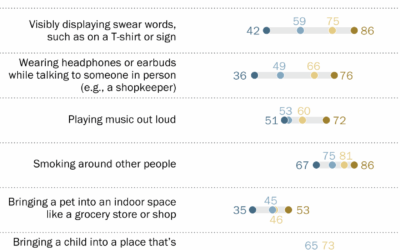
What counts as rude behavior in public, by age group
Pew Research asked U.S. adults if certain behaviors in public, such as cursing…
-
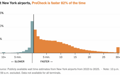
Checking TSA PreCheck time savings
TSA PreCheck allows U.S. travelers to skip the part of airport security where…
-
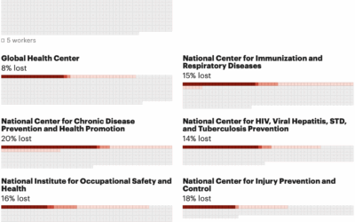
Counting the reduction of federal health workforce
The U.S. federal government does not release official numbers for the cuts to…
-

Most American and British words
For WaPo’s Department of Data, Andrew Van Dam goes looking for American and…
-
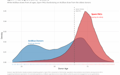
Deceiving seniors for political fundraising, like a Nigerian prince
Adam Bonica analyzed the age of donors across different groups and politicians. For…
-
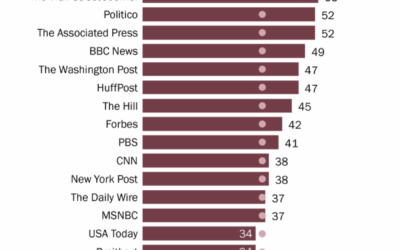
By news source, education levels of the audience
You probably have a rough idea of education levels for each audience, but…
-
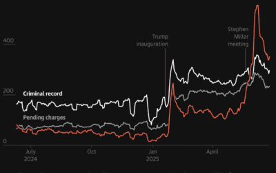
Increased immigration arrests and deportations
For the Guardian, Maanvi Singh, Will Craft, and Andrew Witherspoon show the sharp…
-
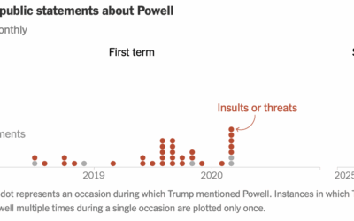
Counting Trump’s comments about Powell
For the New York Times, Christine Zhang counted Trump’s comments about Jerome Powell,…
Recently for Members
Second Edition
 Visualize This: The FlowingData Guide to Design, Visualization, and Statistics (2nd Edition)
 Visualize This: The FlowingData Guide to Design, Visualization, and Statistics (2nd Edition)
New tools, refined process.
Browse by Chart Type See All →


