Visual.ly analyzed the top 30 infographics posted on their site and determined that…
Discussion
Get your conversation on. What works? What doesn’t?
-
Data visualization doesn’t matter
-
Open thread: Are we drowning or swimming in data?
After reading another article about the flood of data that we’re drowning and…
-
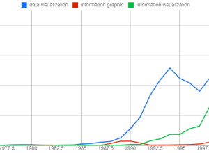
The Many Words for Visualization
There are a lot of words to describe visualization and visualization-related things. It…
-
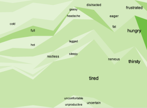
Open thread: Is it OK to confuse if that’s the message?
Earlier this week we saw two versions of mobile patent lawsuits. The original…
-
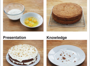
Open thread: Data as cake and frosting?
Mark Johnstone uses a cake metaphor to represent data, presentation, and what you…
-
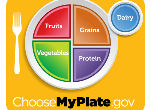
Open thread: Is the Food Plate better than the Pyramid?
In an effort to decrease obesity and improve general health, the US government…
-
Challenge: Spot the mistakes in the figures
During production of the 2011 USAID annual letter from Rajiv Shah, someone said…
-
Open thread: What data do you want to see visualized?
There is so much data available and new data released every day, but…
-
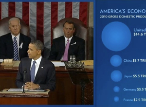
Open thread: Charts during the State of the Union address
President Barack Obama delivered his State of the Union address yesterday, and this…
-
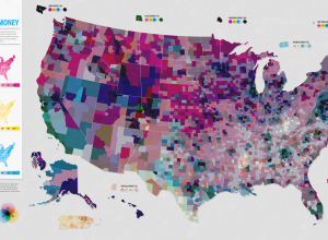
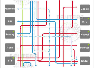
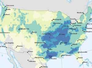
Open thread: Is this map too confusing?
This map, a collaboration between Good and Gregory Hubacek, shows three metrics from…
-
Open thread: What’s the difference between a visualization and an infographic?
Interesting thread on Quora. I never gave it much thought, although I do…
-
Open thread: How do you start working on a data graphic?
People approach data in different ways, especially across different fields. When you’re presented…
-
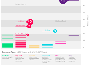
Discuss: Graphs on Old Spice YouTube campaign
I trust we’ve all seen the OldSpice YouTube campaign by now? This graphic…
-
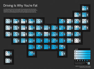
Discuss: Driving is why you’re fat?
In a collaboration between GOOD and Hyperakt, they come out with a bold…
-
Discuss: Why collect data about yourself?
Personal data fascinates me. I collect data about myself mostly as a way…
-
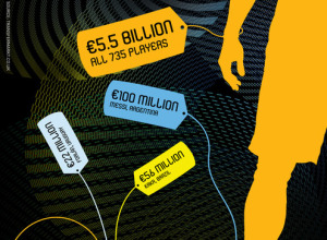
Challenge: What is a FIFA player’s worth?
I really want to like this graphic on the “worth” of FIFA players.…
-
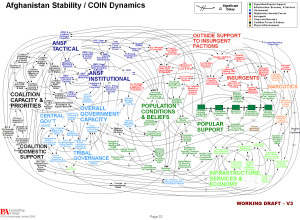
Discuss: Powerpoint is the enemy?
In reference to the above, Gen. Stanley A. McChrystal, leader of the American…
-
Discuss: Flowchart on drinkable water in the world
March 22 was World Water Day, and TreeHugger posted this graphic on drinking…
-
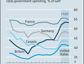
Challenge: make this graph easier to read
The Economist discusses the return of big government and includes this graph showing total government spending as a percentage of Gross Domestic Product. Is there a better way to represent the time series?
-
Open thread: What visualization tutorials do you want to see?
After the county map tutorial a few months ago, I decided to write…
Recently for Members
Second Edition
 Visualize This: The FlowingData Guide to Design, Visualization, and Statistics (2nd Edition)
 Visualize This: The FlowingData Guide to Design, Visualization, and Statistics (2nd Edition)
New tools, refined process.
Browse by Chart Type See All →


