Some colors represent different things in different parts of the world, while others…
2010 April
-
Cultural colors of emotion and character
-
Seeing the art in cartography
In much of the same spirit of the recent Cartographies of Time, the…
-
Connections among Twitter employees
Because you can never get enough Twitter visualizations, Jason Stirman takes a look…
-
Challenge: Graphing obesity trends
Here we have a case of worthwhile data and an interesting story about…
-

Visualizing data: ask a question first
There is no way to think up an original and extraordinary design—it can…
-

Twitter data buffet is back in business
Almost a year and a half ago, Infochimps, the data repository slash marketplace,…
-
Review: indiemapper makes thematic mapping easy
It’s finally here. Indiemapper brings easy and flexible thematic mapping online. I’ve been…
-
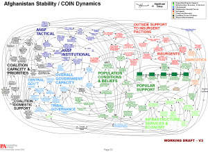
Discuss: Powerpoint is the enemy?
In reference to the above, Gen. Stanley A. McChrystal, leader of the American…
-
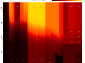
Tax brackets over the past century
Stephen Von Worley’s Weather Sealed is one of my new favorites. In his…
-
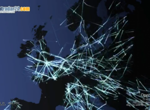
Air traffic rebooted in northern Europe
Air traffic has returned to normal levels in northern Europe, and planes fill…
-
Conversational Twitter threads visualized
Add another piece to the ever-growing list of Twitter visualizations. What makes Moritz…
-
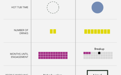
Data Underload #19: First Date vs. Reality TV First Date
Want more? Catch other Data Underloads.…
-
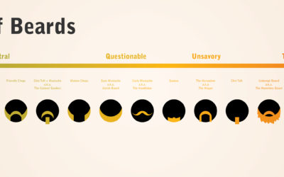
Trustworthiness of beards
Matt McInerney of pixelspread describes the trustworthiness of the people behind their facial…
-
R is an ‘epic fail’ – or how to make statisticians mad
Statisticians are mad and out for blood. Someone called R an epic fail…
-
A guide to geostatistical mapping with open-source tools
Mapping with R and other free and open-source programs feels clunky and hacked-together…
-
Local neighborhood infographics
Good Mag put on an infographic contest not too long ago that asked…
-
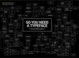
A flowchart to decide what typeface to use
A typeface can make or break your graphic. Use Comic Sans, and no…
-
World data released ‘is a dream come true’
In another step towards open data and all that jazz, the World Bank…
-
Clothing color palette
Jacobo Zanella makes a color palette every day, based on the clothes he’s…
-
Cartographies of Time: A History of the Timeline
I don’t often give in to impulse buys, but I just ordered Cartographies…
Recently for Members
Second Edition
 Visualize This: The FlowingData Guide to Design, Visualization, and Statistics (2nd Edition)
 Visualize This: The FlowingData Guide to Design, Visualization, and Statistics (2nd Edition)
New tools, refined process.
Browse by Chart Type See All →


