Like everyone, I’ve been watching the Olympics, and it continues to amaze me…
2010 February
-
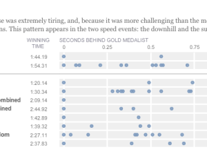
Olympic musical – how fractions of second make all the difference
-
Weekend Fodder
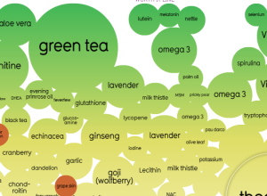
Snake oil? Scientific evidence for health supplements – Some work as advertised. Others…
-
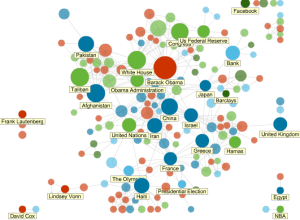
News Topics as Social Network
All news is connected in some way or another. News Dots from Slate…
-

Evolution of Olympic Pictograms
Every Olympics since 1936 has had a series of pictograms (i.e. icons that look like restroom signs) that represents the events.
-
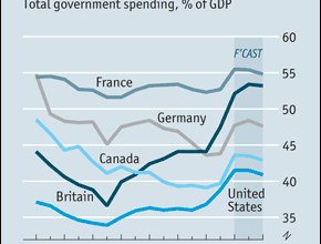
Challenge: make this graph easier to read
The Economist discusses the return of big government and includes this graph showing total government spending as a percentage of Gross Domestic Product. Is there a better way to represent the time series?
-
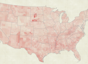
An Exploration of Biological Records
The Natural Science Museum of Barcelona has a growing database of 50,000 records…
-

Spirit of graph and dance is alive
A good portion of my time in high school was spent trying to…
-
Cleaning house.
I’m transitioning to a new server right now, and let me tell you.…
-

Man as Industrial Palace, Animated
In 1926, Fritz Kahn illustrated man as a working factory in his famous…
-
Sunlight Labs releases mapping framework, ClearMaps
Open data is great, but it’s useless if you don’t know what to…
-
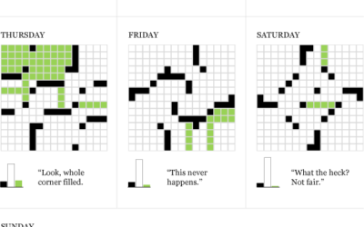
Data Underload #10 – Daily Crossword
Working towards the ultimate Sunday crossword.
-
Thank you, FlowingData sponsors
A big thank you to FlowingData sponsors. They help keep the blog running…
-
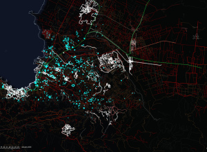
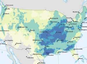
OpenStreetMap Edits Towards Haiti Relief
ITO world, who you might remember from a year of OpenStreetMap edits, come…
-
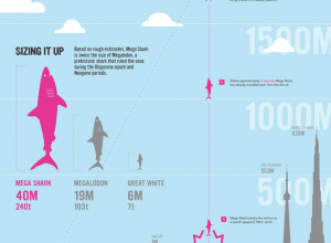
How a Giant Shark Took Down an Airplane
This graphic from designer Stephen Taubman is entertaining in so many ways. It…
-
NSF Announces 2009 Visualization Contest Winners
The National Science Foundation announced the 2009 winners of their annual visualization challenge.…
-
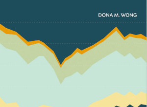
Review: The Wall Street Journal Guide to Information Graphics
Add another book to the growing library of guides on how to make information graphics the right way. Dona M. Wong provides the dos and don’ts of data presentation.
-
Open thread: What visualization tutorials do you want to see?
After the county map tutorial a few months ago, I decided to write…
-
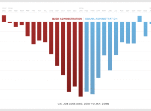
Road to Recovery – Is the Recovery Act working?
The Obama administration just posted a graph showing monthly job loss from December…
-

Build Online Visualization for Free with Tableau Public
Tableau Software, popular for making data more accessible, mainly in the business sector,…
-
Data Underload #9 – Big Graphic Blueprint
Go big or go home.
Recently for Members
Second Edition
 Visualize This: The FlowingData Guide to Design, Visualization, and Statistics (2nd Edition)
 Visualize This: The FlowingData Guide to Design, Visualization, and Statistics (2nd Edition)
New tools, refined process.
Browse by Chart Type See All →


