Jeffrey Heer et al. writes in Design Considerations for Collaborative Visual Analytics about a couple of models for social visualization -- information visualization reference model and the sensemaking model. The former is a simpler, more straightforward model starting with raw data -> processed data -> visual structures -> actual visualization; while the latter is a bit more complicated with similar stages but with feedback loops. My main reflections weren't so much with the ideas proposed by the paper. Rather, I'm more interested in what was not mentioned -- not only in this paper but in other social data analysis papers.
2008
-
Going Beyond Collaborative Visual Analytics with Statistics
-
A Primer on Information and Data Visualization
On We Make Money Not Art is a summary of Jose-Luis's talk on some of the history of visualizing data and some more modern pieces.
It begins with Charles Joseph Minard's march of Napoleon and then onto John Snow's cholera map, both of which were made ever so popular by Tufte. By now, if you've cracked open an infovis book, you've seen both.
Moving on to more modern stuff, there's The Dumpster, 10x10, Listening Post among some other interesting pieces. If you're new to visualization, it's a good "intro to vis" post. If you've been around for a while, you've probably seen most of the examples, but there might be a couple you haven't.
On a semi-related note, there's also an interview with Miguel on WMMNA discussing our humanflows project. Thanks, Regine!
-
New Hampshire Graphic from The Times
-
8 Reasons Why I Do Not Like Data360
Data360 is a social data site similar to Swivel and Many Eyes but without any of the bells and whistles. It markets itself as a site designed for
- organizational reporting
- intelligence databases, and
- collaborative analysis
Unfortunately, Data360 fails in the above three categories, and here are my 8 reasons why. Continue Reading
-
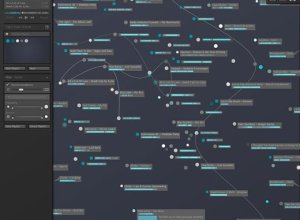
Organizing Your Music Visually
I'm not a music downloading monster like some, so I personally haven't had any problems organizing and finding my music. However, for those who are downloading music every day (legally, I hope), I can imagine your music collection is getting quite out of hand. You probably can't even remember what songs and albums you've downloaded over the past two years. What's that High School Musical album doing there?
That's why this tool is in development. I haven't tried it out, but from the screenshots, it looks like there is potential. Although it looks like the screen can get cluttered very quickly, and with too many songs, you might just end up with a big bubble cloud. If that actually is a problem, it kind of defeats the tool's purpose since I don't really care about visualizing only 20 songs. But like I said, I haven't tried it.
-
Stamen Design Puts Out Another Good One in Digg Pics
In the usual fashion that we've come to expect from Stamen Design, Digg Pics shows us what pictures are being dugg as well as provides an opportunity to discover new pictures. As with its Digg Labs siblings, Digg Pics offers three streams -- popular, newly submitted, and all activity.
I always like to read posts that discuss the experimental phases and how a viz came to whatever it is; it's kind of like when you know the history of a piece of art, you can appreciate it more. Eric goes into the design process at the Stamen blog. There's screenshots of Stamen's experimental layouts, and from what I see on Digg, I'd say everything came together quite nicely.
The picture streams are split up into Digg categories where the number of times a picture is repeated represents the number of times the picture was recently dugg. The display is clean and smooth, and of course the interaction is quite nice (and useful).
Another good one, Stamen!
-
Symbiosis of Engineering, Statistics, Design and Data Visualization
Andrew Vande Moere writes in his 2005 paper Form Follows Data:
[W]e can perceive a current trend in portable input and output devices that trace, store and make users aware of a rich set of informational sources. So-called ubiquitous computing is moving into the direction of location-based information awareness, enabling users to both access and author dynamic datasets based upon a geographical context through electronic communication media.
With this growing trend of streaming data in mind, Andrew goes on to say
Building automation services enable spaces to react to dynamic, physical conditions or external data sources in real time. Currently, these interactions are programmed by engineers, and imply simple action-reaction rules, such as the control of lights, security or climate control: what would be possible if these tools are offered to designers, concerned with the emotional experience of people?
If you're an engineer, you might be wondering, "Hey! Why can't I design ambient systems? I care about emotional experience too. Somewhat. Sort of." As someone who majored in electrical engineering and computer science and still works with a lot of engineer types, I will tell you why. Engineers are generally not very good at the visual display of data. To engineers, the most beautiful part of a data visualization installation might be the hardware, elegant code, or the hours spent tweaking the system's logic. Engineers are fascinated with the guts of the system.
-
25 Highest Grossing Films of All Time (Wallpaper)
I love to look at how the current week's movies are doing at the box office. I'm not really sure what it is. I think it's kind of like a gauge for what good movies are out; or maybe I'm just constantly amazed by the millions of dollars that movies make; or I think it could be my addiction to numbers?
Something that always strikes me as interesting is how movies are always breaking records at the box office. So and so movie just broke the record for most money made over a single weekend or a month or a long holiday weekend or for a Thursday when there was at least 2 inches of rain and a dog skateboarded two miles.
I took a look at the 25 highest grossing American films, adjusted for inflation. I'm so tired of hearing statistics for money comparisons over time that don't adjust for inflation. Wow, gasoline prices are at an all time high. Well guess what -- so are milk, bread, burgers, televisions, light bulbs, paper, cars, and everything else on the planet. Sorry, slight tangent.
Download the Wallpaper
As an early birthday gift to you, here are my results in wallpaper form:
The movie titles are color coded for genre and the higher grossing films are in a larger font. Drama and action/adventure clearly dominate -- The hills are alive. Luke, I am your father. Phone home. I'll never go hungry again.
Surprisingly (at least to me), only 7 of the top 25 films won the Oscar for best picture and of the top 50, only 9 won best picture.
-
John Tukey and the Beginning of Interactive Graphics
With the start of a new year, it only seems right to open with John Tukey and his work with interactive graphics. In 1972, when computers were giant and screens were green, John Tukey came up with PRIM-9, the first program to use interactive dynamic graphics to explore multivariate data. PRIM-9 allowed picturing, rotation, isolation, and masking. In other words, PRIM-9 allowed users to see multivariate data from different angles and identify structures in a dataset that might otherwise have gone undiscovered (kind of like the more recent GGobi). To fully appreciate the revolutionary nature of PRIM-9 one has to view it against the backdrop of its time. When Statistics was widely taken to be synonymous with inference and hypotheses testing, PRIM-9 was a purely descriptive instrument designed for data exploration. When statistics research meant research in statistical theory, employing the tools of mathematics, the research content of PRIM-9 was in the area of computer-human interfaces, drawing on tools from computer science. When the product of statistical research was theorems published in journals, PRIM-9 was a program documented in a movie.
John W. Tukey's Work on Interactive Graphics. The Annals of Statistics, Vol. 30 No. 6. 2002.
Luckily, you can appreciate Tukey's work here at the ASA video library. It's even more amazing when you consider where computers and technology were at back then. Who knows where Statistics would be if it weren't for Tukey and his brilliance and creativity. I can't imagine, or maybe I just don't want to.
Tukey was someone who truly understood data -- structure, patterns, and what to look for -- and because of that, he was able to create something amazing.
How recruiters look at your resume
Data and visualization blogs worth following
Bed cartography
Metal bands per capita
Under the Sea, Under the Sea
Pancake Venn
Interactive Islands of Mankind
Visualize This