Data360 is a social data site similar to Swivel and Many Eyes but without any of the bells and whistles. It markets itself as a site designed for
- organizational reporting
- intelligence databases, and
- collaborative analysis
Unfortunately, Data360 fails in the above three categories, and here are my 8 reasons why.
User Interface is Poorly Designed
It’s not especially easy figuring out what to do or what you’re supposed to do once you get to the site. Basically, you can upload data and then make some graphs with it. Outside of that though, it’s all pretty clunky.
For example, I clicked around a little, and then went to “My Data360,” which is supposed to be like a personal homepage. I ended up getting stuck on a login page that wouldn’t accept my username and password. Instead, I jumped back to the homepage. From there, I was able to login to my homepage just fine. It’s lots of small buggy problems like this that add up to too many annoyances.
Blog is not Updated
It’s understandable that an application still in the alpha version is going to have a lot of bugs and be a bit rough around the edges, but the Data360 blog hasn’t been updated with any useful site enhancements for some time now (since May of last year). This makes me think that there’s not a whole lot of development going on nor is there any planned. If there is something planned, then the blog should be updated. Otherwise, what’s the point?
Also, a small pet peeve of mine is when business or corporate blogs use the default WordPress template. That’s just lazy. OK, maybe I’m just weird. It still bothers me though.
Data Spreadsheets are Slow to Load
You might notice from the Data360 homepage that there’s some datasets in the database. I’m not going to get into why they have to list like every dataset that they have on the homepage (but seriously, come on).
When you click on a dataset, you get taken to a page that shows that dataset in the form of an HTML table. That’s all well and good for a dataset of 20 observations, but Data360 shows an HTML table with hundreds of observations. That takes forever to load. Instead, they should maybe just try a sample of the data as an HTML table, and the complete dataset would be downloaded as a file.
To make things worse, the giant HTML table also contains bars (by default) for every value:
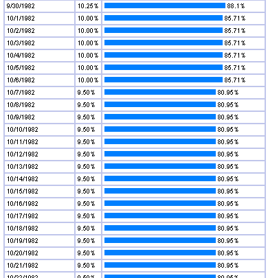
This doesn’t help the slowness, and doesn’t really provide me with a whole lot of useful information either.
Data Analysis is Not Really Collaborative
I wouldn’t call the “analysis” especially collaborative. You basically have a bunch of graphs in front of you, and other users can make comments in the comment box. Outside of that, there’s not a whole lot of interaction with the data or anything of that nature.
YouTube Video on the Homepage
There’s a YouTube video on the homepage that I think is supposed to explain what Data360 is for. Other than the fact that Data360 isn’t mentioned until about the last quarter of the video, it just seems ridiculous. Honestly, all I could think about was Michael Scott from The Office. The video just seems like fluff, and if something is not useful, you should get rid of it.
Visualization is Poor
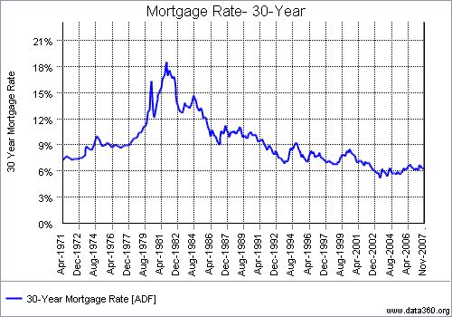
The visualization (i.e. graphs) are clearly from some boiler plate graphing package. There’s nothing custom about them, and to be frank, they’re ugly.
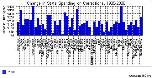
Do you notice anything odd about the x-axis in the above line chart? Observations are for every 20 months. What’s that about? Alright, maybe it’s not that bad, but take a look at this bar chart that was on the homepage:
It Makes Data Seem Boring
There’s no such thing as boring data. Every dataset has its own story to tell, but the whole setup and design of Data360 makes data feel boring. From the YouTube video, to the lengthy “About” page, to the drab graphics and slideshows, I feel bored looking at it. I’ve criticized Swivel enough, but at least they make the data somewhat appealing.
No Advantage Over Using and Emailing Excel Spreadsheets
Finally, what it all comes down to — is their any advantage to using Data360 over emailing spreadsheets? It doesn’t look like it so far. If Data360 wants to be of any use (i.e. profitable) it’ll need to up the ante and give some deep thought to the design and implementation and what is important to users.
 Visualize This: The FlowingData Guide to Design, Visualization, and Statistics (2nd Edition)
Nathan – well, you’ve certainly given us some things to think about and some things to improve upon.
User Interface is Poorly Designed – I agree it’s not perfect, but we are working on improving this.
Blog is not updated – you are right. We’ve got another business we are running and we ARE focused on development. (And we have no overhead!)
Data Spreadsheets are slow to load – You are right again and we are going to change this.
Data analysis is not really collaborative – This one I take exception to. It has not been fully utilitized yet, but what we have built is a semantic product that allows people to have their own platforms and specifically compare their data to the data of others.
YouTube Video on Home Page – You are right. I’m honored by the comparision. I think The Office is hilarious and I will take it down….until I come up with something that is more Data360 focused.
Visualization is Poor – maybe…I subscribe to the Craig’s List approach – show things with integrity and intelligence, not with bling. As far as that x-axis every 20 months, our charts are quite robust in terms of the ability to adjust each axis. It may not be pretty, but it does work and, with the right person behind the wheel, can “clarify the current condition.”
It Makes Data Seem Boring – Well, you and I might just have different views of what is boring. Again, I go back to the Craig’s List approach: Get the job done. Make it functional first, pretty second. Functional to me means that the graph (or graphs) accurately represents the condition.
No Advantage Over Using and Emailing Excel Spreadsheets – Relative to spreadsheets, Data360 is a tool that allows anyone with an internet connection anywhere to be part of a data gathering and reporting effort. It also allows data gathered by different sources to be compared (in formulas and graphs) against each other. It also allows the graphs of the data (from your own or other sources) to be strung together in slide-show reports.
All that said, we are thinking hard about future development of Data360 and I do appreciate your comments.
Tom
P.S. I suppose being Michael Scott is better than Dwight Schrute.
Visualization — I’m not suggesting an addition of anything really. I just think there’s a way of designing graphs so that they’re more readable.
Excel — in that regard, how about the advantage over Google spreadsheets, which allows synchronous and asynchronous collaboration as well as easier to read graphs?
Pingback: Data360 needs a lot of work « Open Analysis
Right on the mark, Nathan. There are a couple of good ideas in Data360, particularly the strong data source metadata. Unfortunately, the execution of the site is so awful that it becomes painful just to explore.
-Jason