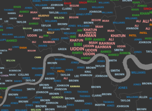
James Cheshire, a geography lecturer at the University College London, mapped common surnames…
interactive
-
Most common London surnames mapped →
-
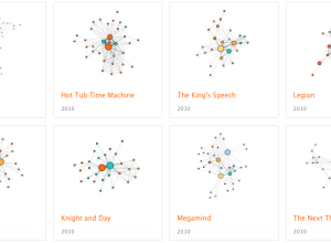
Character social networks in movies
We’ve seen a lot of network charts for Twitter, Facebook, and real people.…
-
How to Make an Interactive Network Visualization
Interactive network visualizations make it easy to rearrange, filter, and explore your connected data. Learn how to make one using D3 and JavaScript.
-
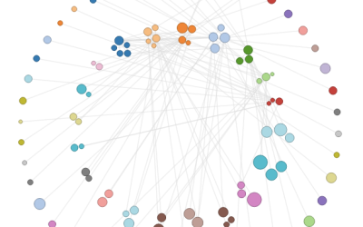
Map of the Internet
Ruslan Enikeev created a searchable Internet map of links and bubbles, showing over…
-
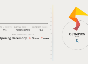
Worldwide mood around London 2012
No doubt there is going to be a lot of tweeting about the…
-
Tracking the spread of AIDS →
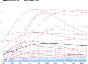
Adam Cole and Nelson Hsu for NPR plotted the percentage of people, ages…
-
Stop-and-frisk hotspots mapped →
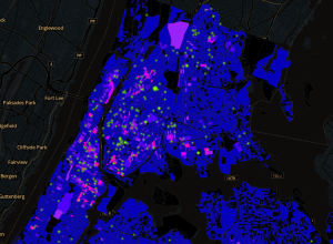
WNYC mapped all street stops that resulted in the recovery of a gun,…
-
Where you measure up against Olympians →
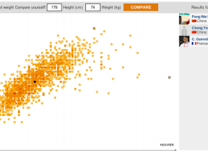
I think the theme of this year’s Olympic graphics is how you relate…
-
A graphical summary of Euro 2012 on Twitter
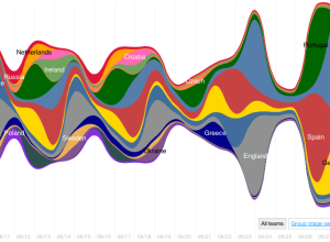
Nicolas Belmonte, a data visualization scientist at Twitter, visualized the change in tweet…
-
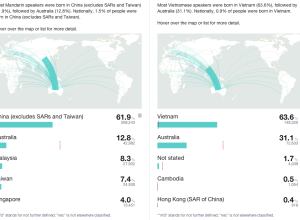
Side-by-side comparisons for Australian Census
Last week, Australia released data for their 2011 Census. Small Multiples, in collaboration…
-
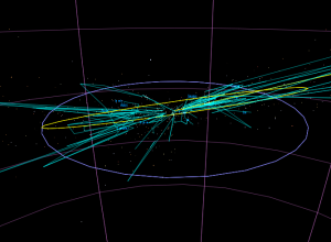
Stars in the zodiac constellations, from Earth and space
While we’re on the subject of stars, developer Riley Davis modeled the ones…
-
An interactive view of star constellations
When we look up at the night sky to gaze at the stars,…
-
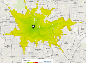
Commute times in your area, mapped
When you look for a place to live, there are outside factors to…
-
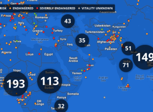
Endangered languages project
Google, in collaboration with Vizzuality, are trying to catalog endangered languages before they…
-
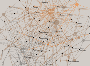
Network of data visualization references
Developer Santiago Ortiz explores visualization references through Delicious tags and puts them in…
-
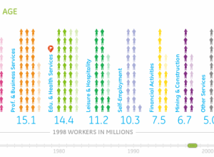
Working in America over the decades
Information visualization firm Periscopic, in collaboration with GE, explores the makeup of the…
-
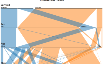
Parallel Sets for categorical data, D3 port
A while back, Robert Kosara and Caroline Ziemkiewicz shared their work on Parallel…
-
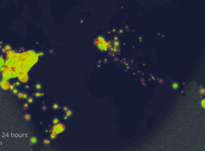
Eating healthiness mapped over 24 hours
The Eatery app by Massive Health lets people snap pictures of their food…
-
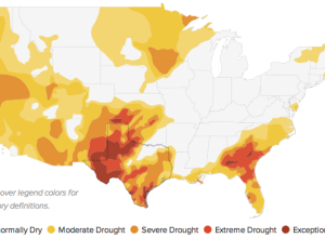
Tracking drought in the US
NPR has a look at weekly drought figures over the past couple of…
-
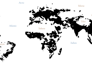
Interactive Islands of Mankind
Geography graduate student Derek Watkins has some fun with population densities in an…



 Visualize This: The FlowingData Guide to Design, Visualization, and Statistics (2nd Edition)


