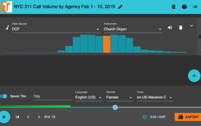
TwoTone, by Datavized and supported by the Google News Initiative, is a straightforward…
-
TwoTone is a tool to sonify your data
-
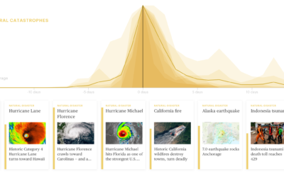
News story lifespan charts
A wideout view of the news cycle can look like a series of…
-
Members Only
Google Fusion Tables Shutdown, Lack of Preservation, and Finding Alternatives
Google announced that Fusion Tables will be laid to rest, which highlights a need for preservation of visualization for the long-term.
-
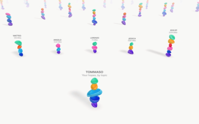
Building statues of hope in augmented reality
Accurat, in partnership with the Google News Initiative, built an augmented reality app…
-
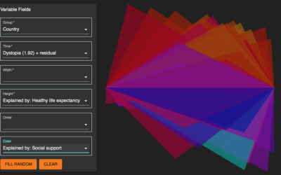
Morph, an open-source tool for data-driven art without code
Morph, by Datavized in collaboration with the Google News Initiative, is a tool…
-
Members Only
Google Dataset Search Impressions, the Challenges of Looking for Data, and Other Places to Find Data
Google released Dataset Search to the world last week. Here are my first impressions.
-
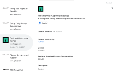
Google Dataset Search now in public beta
Datasets are scattered across the web, tucked into cobwebbed corners where nobody can…
-
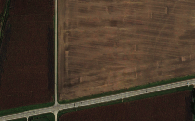
Shapes we make, seen from the sky
Look from the above at the shapes and geometry we use for cities,…
-
What Facebook and Google know about you
Facebook and Google (among other companies) know a lot about you through the…
-
What a neural network sees
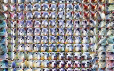
Neural networks can feel like a black box, because, well, for most people…
-
Chart search popularity
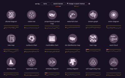
Anna Vital, in collaboration with the Google News Lab, shows the search popularity…
-
Google collected Android users’ location without permission
Keith Collins reporting for Quartz:
Since the beginning of 2017, Android phones have… -
Google maps street-level air quality using Street View cars with sensors
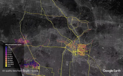
Google equipped their Street View cars with air quality sensors and sent them…
-
Statistical diversity in US newsrooms
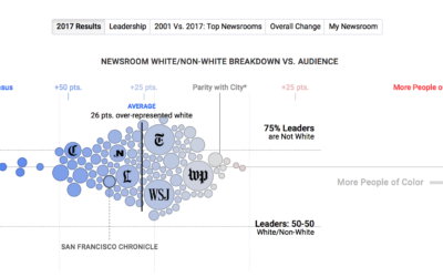
If a news organization wants to talk about the world in a fair…
-
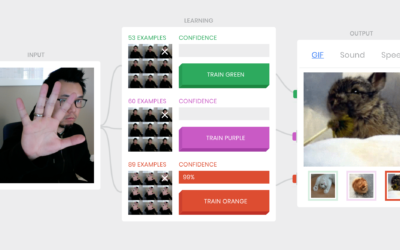
Machine learning demo with your webcam and GIFs
The Teachable Machine from Støj, Use All Five, and Google is a fun…
-
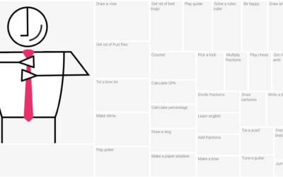
Most frequent how-tos we search for
Xaquín G.V., in collaboration with the Google News Lab, investigated what people around…
-
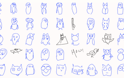
A thousand ways to draw a thing
Google released the Quick, Draw! dataset, so the closer looks at the collection…
-
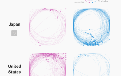
Circle drawing as an indicator for culture
Thu-Huong Ha and Nikhil Sonnad for Quartz looked at the doodling dataset from…
-
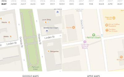
Comparing Google Maps and Apple Maps Over a Year
Google collects much of their own data to construct their maps, whereas Apple…
-
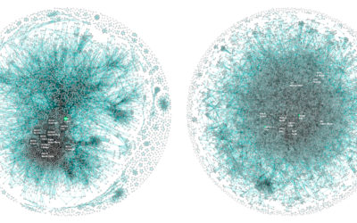
Apple vs. Google company structure, as seen through patents
For Co.Design, Periscopic compared patent ownership between Apple and Google, which ends up…


 Visualize This: The FlowingData Guide to Design, Visualization, and Statistics (2nd Edition)


