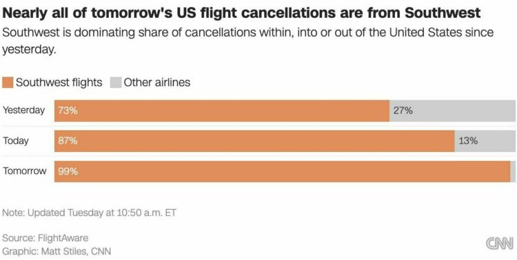
People have been having fun with generative AI lately. Enter a prompt and get a believable body of text, or enter descriptive text and get a photorealistic image. But as with all things that are fun on the internet, there are those who are looking to exploit the popularity. Maggie Appleton discusses the trade-offs:
There’s a swirl of optimism around how these models will save us from a suite of boring busywork: writing formal emails, internal memos, technical documentation, marketing copy, product announcement, advertisements, cover letters, and even negotiating with medical insurance companies.
But we’ll also need to reckon with the trade-offs of making insta-paragraphs and 1-click cover images. These new models are poised to flood the web with generic, generated content.
You thought the first page of Google was bunk before? You haven’t seen Google where SEO optimizer bros pump out billions of perfectly coherent but predictably dull informational articles for every longtail keyword combination under the sun.


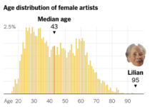 Tom Brady, the quarterback for the Tampa Bay Buccaneers, is 45 years old, which makes him the oldest player in the National Football League. Francesca Paris, for NYT’s The Upshot,


 Visualize This: The FlowingData Guide to Design, Visualization, and Statistics (2nd Edition)


