Trulia, the real estate search site, launched Trulia Snapshot today in collaboration with Stamen Design. It’s a pretty mapping interface that lets you view pictures of properties on a map in a very interactive way i.e. it’s fun to use and super fluid.
First, you type a location you want to find properties at.
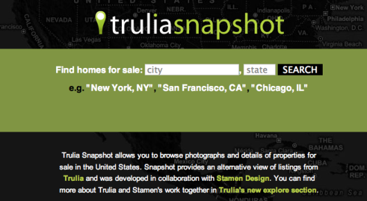
From there you can browse properties by newest/oldest or most/least expensive with the map or with the histogram at the bottom.
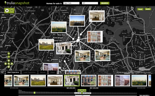
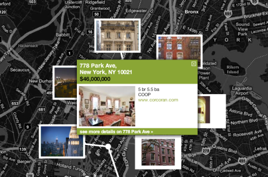
If you just want to sit back and watch, press play and the real estate properties will highlight automatically by the order you’ve selected, and the map will move back and forth by location. See something you like? Press pause. If not, just let the animations keep running – your own personal real estate agent.
My favorite part of the visualization is how the bottom images blur as you whiz by. It’s a very small part and not the focal point, but it’s one of those little design things that make it that much better. Nice touch.
Ultimately, success of such work is measured by (although it shouldn’t need be) whether or not users would rather browse data with the visualization or with the usual listing pages. Give it a try – what would you rather use?
 I’m headed to Washington tomorrow for the
 Mobile technology has come a long way from those foot-long phones hooked up to a shoe box sized battery pack. With bluetooth, GPS, cameras, and Internet connections, mobile phones nowadays pack a lot of power. How can we put this functionality to use?



 The more people who flock a story, the higher up the flock list the story goes. In the sidebar of each story is an interactive graphic that shows readers flocking around the news and stories getting highlighted. The larger the bubble, the more people who have flocked it; story bubbles light up orange when someone flocks it. The site isn’t showing any larger sizes, but a full screen version could be fun. Maybe a screensaver.

 Visualize This: The FlowingData Guide to Design, Visualization, and Statistics (2nd Edition)