It’s Friday. It’s summer. It’s time to relax in the backyard with an ice cold beer in hand. As you consume your beverage, here are 11 infographics about your beer, because the more you know, the more you enjoy. To start things off is a full history of beer (above). Read More
-

A large majority of us who have websites use Google Analytics as our traffic monitor, and why not? It’s free, it works, and it provides loads of data on traffic, referrals, and our content. We can then make decisions based on that data, but the trouble is there’s a fair amount of clicking before we get to the good stuff. Enter Dshbrd by DabbleDB. Yes, that’s dashboard with no vowels.
Taking the Guesswork Out of Analytics
The DabbleDB folks know data, and Dshbrd is no exception. Using data from your Google Analytics account, Dshbrd analyzes and finds the points of interest – and then shows them to you in a clear and concise way. I’ve grown incredibly tired of overused sparklines, but Dshbrd uses them well to show traffic trends alongside a vertical stacked area chart. The two are linked such that when you scroll over an event (e.g. rise in referrals from Digg), the area on the stacked chart highlights and vice versa.
View traffic from site referrals, search engines, and direct links or content popularity, etc. Basically, you can examine all of your analytics data in Dshbrd that you can in Google Analytics but in this new view. It might take a second to get used to time on the vertical axis, but once you get over that, this alternative interface is quite intuitive and more importantly, very useful.
Now if only DabbleDB would provide a reliable API I would be very happy.
Premium Analytics
Ultimately, I’m guessing DabbleDB would want to turn Dshbrd into a fee-based service if it gained enough traction. I personally wouldn’t pay for it since I really don’t need that much outside the usual Google view, but I could see how Dshbrd could be useful to others. What do you think? Would you pay for this sort of premium view into your Google Analytics data?
-
In celebration of Barack Obama’s 100th day as the 44th President of the United States, the MIT SENSEable City Lab visualized mobile phone activity during the historic inauguration. What we see is a sense of the worldwide celebration and when and where people traveled to Washington, D.C. to get to the event. They call it Obama | One People. Read More
-
Axiis, an open source data visualization framework in Flex, was released a few days ago under an MIT license. I haven’t done much in Flex, but from what I hear, it’s relatively easy to pick up. You get a lot of bang out of a few lines of code. Axiis makes things even easier, and provides visualization outside the built in Flex graph packages. Read More
-
-
Big news. Data.gov is now live. Government data is at your fingertips.
The purpose of Data.gov is to increase public access to high value, machine readable datasets generated by the Executive Branch of the Federal Government. Although the initial launch of Data.gov provides a limited portion of the rich variety of Federal datasets presently available, we invite you to actively participate in shaping the future of Data.gov by suggesting additional datasets and site enhancements to provide seamless access and use of your Federal data. Visit today with us, but come back often. With your help, Data.gov will continue to grow and change in the weeks, months, and years ahead.
I was actually expecting an API of some sort, but it’s a searchable catalog that makes it easier to find the datasets scattered across all the U.S. agency sites. I still need to explore more to figure out what exactly is there, but this is big news for data fans. What do you think of the new site? Discuss in the comments below.
[via infosthetics]
-
Axis Maps recently released indieprojector, a new component to indiemapper, their in-development mapping project to “bring traditional cartography into the 21st century.” Indieprojector lets you import KML and shapefiles and easily reproject your data into a selection of popular map projections. No longer do you have to live within the bounds of a map that makes Greenland look the same size as Africa. Read More
-
Quick announcement: I’m offline for a couple of days to attend my sister’s graduation in California (congrats, sis!). Check out the FlowingData archives when you start going through data visualization withdraw. FlowingData will return to regularly scheduled programming on Thursday.
-
I know a lot of you are new to FlowingData, so here are some of the most popular posts from the past couple of months in case you missed them:
- 27 Visualizations and Infographics to Understand the Financial Crisis
- Little Red Riding Hood, the Animated Infographic Story
- Pixel City: Computer-generated City
- 37 Data-ish Blogs You Should Know About
- Maps of the Seven Deadly Sins
- Legal Drinking Age Around the World
- 17 Ways to Visualize the Twitter Universe
- Web Trends Map from Information Architects, 4th edition
- Visual Representation of Tabular Information – How to Fix the Uncommunicative Table
- AIG Bailout: Where $173 billion Went
One thing you might have noticed about these top posts is that many of the topics were reader-suggested. Thanks to all of those who’ve sent me pointers via email and del.icio.us. Keep ’em coming. FlowingData would not be the same without you.
-
I always chuckle a little bit whenever I get an email from someone who thinks FlowingData is a big design firm. I’m totally flattered that it comes off that way. I mean, I must be doing something right. In reality though, I’m just one statistics graduate student working towards my PhD, so FlowingData wouldn’t be around today, if it weren’t for these generous sponsors (and the best readers around) who help FlowingData not suck.
NetCharts — Build business dashboards that turn data into actionable information with dynamic charts and graphs.
IDV Solutions — Create interactive, map-based, enterprise mashups in SharePoint.
InstantAtlas — Enables information analysts to create interactive maps to improve data visualization and enhance communication.
Tableau Software — Data exploration and visual analytics for understanding databases and spreadsheets that makes data analysis easy and fun.
Want to be a FlowingData sponsor? Get in touch, and I’ll send over the details.
-
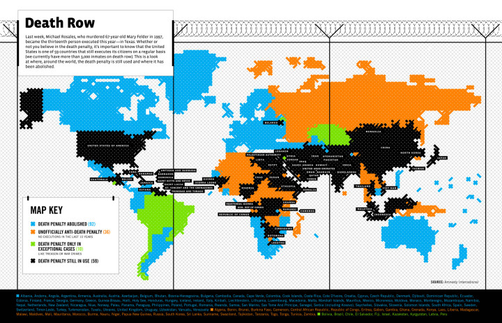
With their usual flare, GOOD Magazine maps the death penalty around the world according to Amnesty International. Here we see that the philosophy varies quite a bit from country to country; however, most countries have either abolished the death penalty or only use it in exceptional cases. The death penalty is still in use in about 30 percent of countries. Like the map of drinking age though, I suspect laws vary within the countries. Read More
-
Pixel City is a procedurally-generated city by Shamus Young. For the non-coders out there, this essentially means that based on a certain set of rules, this 3-D city is generated dynamically each time the program runs. Here, the video that shows the Young’s process will make it more clear:
Check out the very detailed 10-part explanation for more on how Pixel City was built. Hopefully more comes out of it than just a screensaver. If it does become a screensaver though, I’d gladly use it.
-
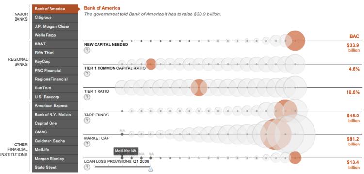
Andrew Garcia Phillips and Stephen Grocer of The Wall Street Journal compare the financial health of 19 major banks according to recent government stress tests. Each row represents a metric, each bubble represents a bank, and the size of a bubble represents the value of a metric for that bank. Roll over bubbles for more information or select a specific bank in the left sidebar. I know a lot of you don’t like bubbles in your viz, but this one works for me.
[Thanks, Vikram]
-
Geographers from Kansas State University map the spatial distribution of the seven deadly sins in the United States. These types of maps are always kind of iffy as they draw from data from various sources gathered with different methods and usually use some kind of researcher-defined metric. Still interesting though… right?
Read More -
Flygbussarna, a Swedish coach bus company, in partnership with the Acne marketing group, assembled 50 cars into one bus to highlight the production of carbon emissions. Assuming slightly more than one person per car on average, one coach bus could potentially replace 50 cars on the road and reduce carbon emissions some 10 times over. Read More
-
In a collaborative initiative between Copenhagen Institute of Interaction Design and The Danish Design School, the Interaction Design Pilot Year brings together students and faculty from various disciplines for a unique brand of education. Read More
-
It’s time for a FlowingData poll. I want to know what data-ish things you’re interested in. Design? Statistics? Analytics? Select your answer in the poll below. If you select other, let us know what that other thing is in the comments.
{democracy:8} -
You might not know it, but there are actually a ton of data and visualization blogs out there. I’m a bit of a feed addict subscribing to just about anything with a chart or a mention of statistics on it (and naturally have to do some feed-cleaning every now and then). In a follow up to my short list last year, here are the data-ish blogs, some old and some new, that continue to post interesting stuff. Read More
-
Jack Schulze provides this horizonless view of Manhattan:
Here & There is a project by S&W exploring speculative projections of dense cities. These maps of Manhattan look uptown from 3rd and 7th, and downtown from 3rd and 35th. They’re intended to be seen at those same places, putting the viewer simultaneously above the city and in it where she stands, both looking down and looking forward.
Imagine a person standing at a street corner. The projection begins with a three-dimensional representation of the immediate environment. Close buildings are represented normally, and the viewer himself is shown in the third person, exactly where she stands.
It takes a minute to wrap your head around the concept, but it’s an interesting one. It bet it’d be especially awesome if it were an interactive map that you could use while you roamed around a dense city. What do you think, cartographers?
-
A couple weeks ago, FlowingData ran another Visualize This challenge. I posted a dataset on the number of days it takes the average person in each state to pay his or her taxes and asked you to visualize it. The number of days vary, because tax burden varies state-by-state. The day all taxes have been paid is dubbed Tax Freedom Day. Alaska has the earliest Tax Freedom Day while Connecticut has it last.
Here are the interesting results you all came up with. Thanks to those who participated. Nice work all around. Read More
Recently for Members
Second Edition
 Visualize This: The FlowingData Guide to Design, Visualization, and Statistics (2nd Edition)
 Visualize This: The FlowingData Guide to Design, Visualization, and Statistics (2nd Edition)
New tools, refined process.
Browse by Chart Type See All →


