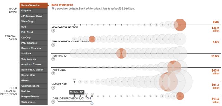
Andrew Garcia Phillips and Stephen Grocer of The Wall Street Journal compare the financial health of 19 major banks according to recent government stress tests. Each row represents a metric, each bubble represents a bank, and the size of a bubble represents the value of a metric for that bank. Roll over bubbles for more information or select a specific bank in the left sidebar. I know a lot of you don’t like bubbles in your viz, but this one works for me.
[Thanks, Vikram]
 Visualize This: The FlowingData Guide to Design, Visualization, and Statistics (2nd Edition)
Without enterying a mass rant about why I think this is a bad visaulaition for this data. I’ll ask the calm and calculated question.
Why does this work for you mate?
Matt
I don’t mind bubbles (or colors) when they serve a purpose, but here aren’t they duplicating the information provided by the line. If you place items on a line in ascending order it is implicit that the next item on the line will be bigger than the previous item.
The bubbles would only really have been useful if they were on a cartesian graph where the bubble represents a different metric from the x and y. All this does is crowd the line.
It’s great to see the Wall Street Journal putting out this kind of complex graphic, and the technology worked flawlessly for me. But in the spirit of constructive criticism, here are some comments on the design…
What’s weird here is the way the x-axis works. It looks like they simply sort the values on each axis, then put equal space between items. The result is something parallel coordinates, but with less quantitative information.
I think this would have been better either as a traditional parallel coordinates display or as a set of linked histograms for each dimension.
Sets of bars would have been more effective. No overlap, no wondering whether area or diameter encoded the value.
Pingback: The Litmus | The Dapper Alchemist
I think this is OK (the fact that all data for a single bank is highlighted s you move the mouse around is particularly helpful), but not as good as it could be.
I nominate this dataset for a FlowingData redo contest.
i’m with Nathan, works for me.
I looked at it and within a second or two I knew what it does, and then I explored a little and quickly found the nuggets.
Always using bar charts is like always using missionary position. It might be more practical, but it gets boring!
@Tim, Nathan
You can look at reams of data in a table and explore it to find the nuggets but this doesn’t make it the ‘best’ visualization. The fact you had to explorer was bad, wasn’t it? I found myself flicking between banks continually to compare stats which means it wasn’t visualized in the way I was looking to interpret it.
I thought it looked good and esthetic but I think you can have esthetic and effective. I think this fails on the effective rather than the esthetic.
Tim using your brilliant analogy. Which made me laugh out loud!
It may be better than the missionary but is it the best position? Probably not
You need it to be exciting but you also need to deliver the goods.
Matt
Pingback: Inconsequential Foreplay
Well it’s an interactive piece, so I assume the creator wanted people to interact with it and explore. So I am not sure it is bad in that sense.
Tim “Always using bar charts is like always using missionary position. It might be more practical, but it gets boring!”
– rather than changing positions in order to spice it up, change parters instead.
I meant ‘partners’.
Whenever I see a bubble chart, I’m reminded of Eddie Murphy’s quip about bubble baths while growing up poor, in “Trading Places”.
Hey Tim –
Re the “missionary” line, which was clever by the way:
Sometimes these flashy effects seem more like getting drunk and hiring a hooker. Not that I have any relevant experience of course, but charts like this leave me feeling dirty.
I think the correct word is measurement, not metric. Using “metric” is just more flash. Like putting rouge on Jon’s hooker.