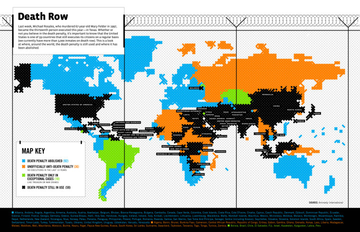
With their usual flare, GOOD Magazine maps the death penalty around the world according to Amnesty International. Here we see that the philosophy varies quite a bit from country to country; however, most countries have either abolished the death penalty or only use it in exceptional cases. The death penalty is still in use in about 30 percent of countries. Like the map of drinking age though, I suspect laws vary within the countries.
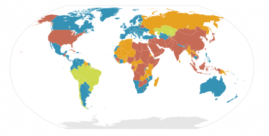
From a design perspective, let’s look at this version from Wikipedia:

GOOD’s map is highly stylized (like a prison fence). Wikipedia’s is a straightforward map with a more accurate projection. Which version of the death penalty map do you prefer?
[via Simple Complexity]


 Visualize This: The FlowingData Guide to Design, Visualization, and Statistics (2nd Edition)

All self-respecting Irishwomen, Irishmen, and James Joyce fans will have to side with me on the side of Wikipedia. A swing and a miss for GOOD this time. If the number of Xs somehow contained a layer of data, I might jump the fence.
Hands down prefer the wikipedia map. Although the prison look is stylised, it loses the picture when coming down to the smaller area countries. An easy example is where Lesotho is sitting…
It took a long time to get away from clunky raster graphics – why do designers embrace them for a graphic like this? The jagged edges are distractions from the real story. I don’t mind the bolder colors for GOODs use, and using black is more of a ‘lights out’ color than red, but the projection choice is poor, the harsh raster effect is not helpful, and the overall graphic design decisions do not help the reader better understand the data.
Death penalty laws do vary in the US by state. 34 states plus the federal courts have active death penalties, and have performed at least one execution since the mid 70s. 3 states and the US military have death penalties in law but have not used it since the mid 70s (though they could at any time execute someone, and I think each have inmates in prison for whom some prosecutors are seeking the death penalty). However, unfortunately only a few states have explicitly banned it constitutionally (meaning it is almost permanently banned), and the others simply omit it as a the valid punishment.
http://en.wikipedia.org/wiki/Capital_punishment_in_the_United_States
I generally don’t like GOOD’s work, and this is no exception. It looks like needlepoint, not like an infographic.
well, I see 2 bias in that presentation.
One is the arbitrary distinction between categories. In my book, either your country’s constitution makes it impossible to sentence a person to death AND has taken international commitments to never revert that decision. For those countries, the death penalty is abolished. Or this is not the case, and a person found guilty of a heinous crime could be sentenced to death, even if there has been no execution for a long period of time. A “middle ground” is an arbitrary invention.
The other one is the map representation. Actually, it’s 2 bias in one. Countries with large areas (Russian Federation or Canada) have a lot of visual impact. Converserly, countries with low population count as one in the legend, and in the caption below. They, too, are given more prominence than they should have.
But countries like Iran, where there are 10x more executions than in the USA, do not stand out.
Variables which would be interesting to map, such as year of abolition, or public opinion of the death penalty, are absent. More significantly, prison population, death row inmates and number of executions are not represented either.
So Nathan, if you’re willing to open a challenge for a better representation on “death penalty around the world”, I’ll give it a go. I expect submissions would look very different from this map
Mapping by country also fails to population weight. Is the right measure to graph:
– Raw numbers of countries? (one country, one vote)
– Geographic area?
– Population?
I like the idea of mapping the death penalty to population weight. With the US, India, China and Indonesia supporting the death penalty a much larger percentage of the world’s population is under the threat of the death penalty, than the map would imply.
Of course, the Wikipedia map is missing pretty basic design elements like, oh, source information and a legend. But I guess that’s the Wikipedia way? It seems like most of their maps look a lot like this with explanatory text on a separate page. Too bad, though; it’s confusing.
I do prefer the Wikipedia projection and color scheme, though. My first thought about the chain-link fence effect was that it was some sort of histogram map, but it’s actually just simply confusing. And that color scheme…oof.
The ‘GOOD’ colour scheme is very counterintuitive – with my first glance at the map I learned nothing, then using my prior knowledge I was able to deduce what a black and blue probably meant, then I had to click through to read the legend before I could be sure. If you’re going to come up with intermediate categories then I’d like some sort of intuitive gradation such as green (likely to live) through to red (likely to die).
For pure communication of information, I like the wikipedia one. But for a magazine infographic meant to grab attention and provoke interest, the good magazine graphic has it’s merits. I don’t understand why they choose that color code though: black is common death penalty, green is occasional death penalty, and blue is abolished? Weird choices.
On a purely random note, I like how the wikipedia entry’s full svg version is slowly rendered in firefox, with the individual countries popping up and forming the worldmap: http://upload.wikimedia.org/wikipedia/commons/8/80/Death_Penalty_World_Map.svg
I also prefer the Wikipedia map because the countries remain identifiable. I also think that another representation would be useful. I don’t see much correlation between land mass and number of people potentially subject to the death penalty. India and China have much larger populations than the great northern reaches of Canada, for example, although the land mass is roughly similar.
The ideological bias in the GOOD graphic annoys me – colors with some level of ban, but for countries that still use the penalty a foreboding *black.* Like holes in the map of *truly* civilized society.
Incidentally, I’m against the death penalty. But I don’t need an infographic *telling* me what my opinion on the matter is.
another vote for wiki’s map. I like the more objective nature of the coloring also.
104 countries have the death penalty, 93 don’t
Even in Western Europe, that collection of governments most opposed to capital punishment, their citizens actually do support the death penalty.
from the French daily Le Monde, December 2006 (1):
Percentage of respondents in favor of executing Saddam Hussein:
France: 58%
Germany: 53%
Spain: 51%
Italy: 46%
same poll
Great Britain: 69%
USA: 82%
We are led to believe there isn’t death penalty support in England or Europe. European governments won’t allow executions when their populations support it: they’re anti democratic. (2)
Death penalty support is much deeper and much wider than we are often led to believe, with significant percentages of those who say they, generally, oppose the death penalty, actually supporting it when it is a true death eligible crime.
(1) The recent results of a poll conducted by Novatris/Harris for the French daily Le Monde on the death penalty shocked the editors and writers at Germany’s left-leaning SPIEGEL ONLINE (Dec. 22, 2006). When asked whether they favored the death penalty for Saddam Hussein, a majority of respondents in Germany, France and Spain responded in the affirmative.
(2)An excellent article, “Death in Venice: Europe’s Death-penalty Elitism”, details this anti democratic position (The New Republic, by Joshua Micah Marshall, 7/31/2000). Another situation reflects this same mentality. “(Pres. Mandela says ‘no’ to reinstating the death penalty in South Africa – Nelson Mandela against death penalty though 93% of public favors it, according to poll. “(JET, 10/14/96). Pres. Mandela explained that “. . . it was necessary to inform the people about other strategies the government was using to combat crime.” As if the people didn’t understand. South Africa has had some of the highest crime rates in the world in the ten years, since Mandela’s comments. “The number of murders committed each year in the country is as high as 47,000, according to Interpol statistics.” As of 2006, 72% of South Africans want the death penalty back. (“South Africans Support Death Penalty”, 5/14/2006, Angus Reid Global Monitor : Polls & Research
NOTE: Some recent polls – with no mention of specific crimes.
97%+ of Guatemalans support the death penalty. 2.6% oppose
(telephone survey, newspaper Prensa Libre, 2/14/08)
www(dot)latinamericapress.org/article.asp?lanCode=1&artCode=5545
79% support the resumption of hanging in Jamaica. 16% oppose. (Bill Johnson Polling for The Gleaner (Jamaica) Newspaper, 1/12-13/08
Two-thirds of Czechs for death penalty reintroduction – poll
Prague- Almost two-thirds of Czechs believe that death penalty should exist in the Czech Republic, while one-third believes the opposite, according to a poll the CVVM agency conducted in May and released. June 12, 2008, Ceskenoviny.cz/news/
Pingback: Newsfilter » Το Top 5 της εβδομάδας (11 ΜαÎου - 16 ΜαÎου 2009)
A terrible map (the GOOD one). Only such a misleading projection could lead Flowing Data to look at a map that shows the US, large swaths of Africa, the Middle East, south Asia, east Asia, and Indonesia as all having the death penalty and conclude that “most countries have either abolished the death penalty or only use it in exceptional cases.”
this is very sad!