I know a lot of you are new to FlowingData, so here are some of the most popular posts from the past couple of months in case you missed them:
- 27 Visualizations and Infographics to Understand the Financial Crisis
- Little Red Riding Hood, the Animated Infographic Story
- Pixel City: Computer-generated City
- 37 Data-ish Blogs You Should Know About
- Maps of the Seven Deadly Sins
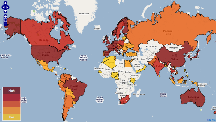
- Legal Drinking Age Around the World
- 17 Ways to Visualize the Twitter Universe
- Web Trends Map from Information Architects, 4th edition
- Visual Representation of Tabular Information – How to Fix the Uncommunicative Table
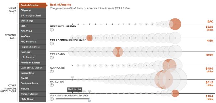
- AIG Bailout: Where $173 billion Went
One thing you might have noticed about these top posts is that many of the topics were reader-suggested. Thanks to all of those who’ve sent me pointers via email and del.icio.us. Keep ’em coming. FlowingData would not be the same without you.

 Visualize This: The FlowingData Guide to Design, Visualization, and Statistics (2nd Edition)


