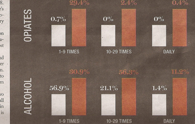
No clue where this is from, but something seems sort of off, no? I guess we should take the title literally. By the numbers… only.
I’m going to give the benefit of the doubt though, and assume this was just an honest mistake. Here’s my guess about what happened. A deadline was coming up quick, and a graphics editor put this together to get a feel for what the final design would look like. He then saved it as a different file, and then went to work. Except when it came time to send the file to the printers, the editor sent the wrong file. Actually, now that I think about it, I’m surprised this doesn’t happen more often.
[via @EagerEyes]


 Visualize This: The FlowingData Guide to Design, Visualization, and Statistics (2nd Edition)


