It’s been a while since I ran one of these, so you must be dying to do some visualizing. For those new around here, Visualize This is a little fun practice we like to run around here to exercise our visualization skills. I post a small dataset, and then you can try visualizing it. Do you have what it takes?
Deadline: October 27, 2010
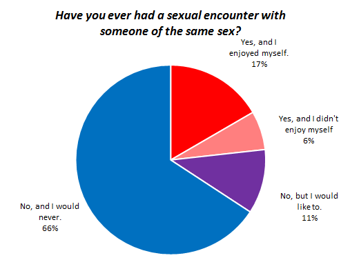
For this round, we’ll take a look at results from the National Survey of Sexual Health and Behavior conducted by Indiana University. They asked over 5,000 participants if they’ve engaged in certain behaviors in the past year. They also asked age and gender.
Read More


 Visualize This: The FlowingData Guide to Design, Visualization, and Statistics (2nd Edition)


